Quick summary
- Data slides fail not because of bad charts, but because they show raw numbers instead of a clear point of view.
- Choose your chart based on what your data is trying to say — not what looks impressive.
- Every data slide needs a headline that states the insight, not just a label.
- Less data per slide, more visual clarity — your audience reads faster than you speak.
7 rules for data slides that inform, persuade, and keep the room awake
Most data slides fail for the same reason. Not because the data is bad. Not because the chart is wrong. But because the presenter never decided what the data actually means before building the slide.
When you put a table of numbers on a screen and read it aloud, your audience does the math faster than you can speak — and then stops listening. Data slides bore people not because data is boring, but because showing numbers is not the same as making an argument.
The goal of a data slide is never to display data. It is to show what the data means, and why it matters to the people in the room.
The right chart
Matching your chart type to your data’s story, not to habit or personal preference.
The right headline
Writing slide titles that state the insight, not just the topic.
The right amount
Knowing how much data to show, and what to move to the appendix.
Quick overview
Jump to any rule:
Start with the insight, not the data

Before you open PowerPoint, answer one question: what does this data mean?
This sounds obvious. Most presenters skip it anyway. They pull data from a spreadsheet, paste it into a chart, and assume the audience will draw the right conclusion. They rarely do.
Every data slide should be built around a single insight — a clear, defensible claim that the data supports. Everything else on the slide exists to prove that claim.
If you cannot state the insight in one sentence before building the slide, you are not ready to build the slide yet. Work out the meaning first. The chart comes second.
This also determines which data to include. Once you know what you are arguing, it becomes obvious which numbers support the argument and which are noise. Cut the noise.
Choose the right chart for your message

The most common chart selection mistake is choosing a chart type based on habit or aesthetics rather than the shape of the story the data is telling.
Every dataset has a primary narrative. Matching the chart to that narrative is the single highest-leverage design decision on a data slide.
Here is a simple framework:
- Comparison (how things rank against each other) → bar chart or column chart
- Trend over time (how something changed) → line chart or area chart
- Composition (how a whole breaks into parts) → stacked bar, pie chart (for 2–3 segments only), or treemap
- Relationship (how two variables correlate) → scatter plot or bubble chart
- Distribution (how values are spread) → histogram or box plot
- Single key number (one metric that tells the whole story) → large stat callout — no chart needed
Standard PowerPoint charts handle most of these well. But for presentations where the data story is more nuanced — or where you want the visual to do more work — consider creative chart types that go beyond the defaults. Waterfall charts, Marimekko charts, slope charts, and icon arrays can communicate complex comparisons more intuitively than a standard bar chart. For non-data-driven concepts, visual metaphors like pictographs or proportion diagrams often land faster with a general audience than a technically precise chart. Browse PresentationGO’s charts and diagrams templates for data-driven and creative chart options across both categories.
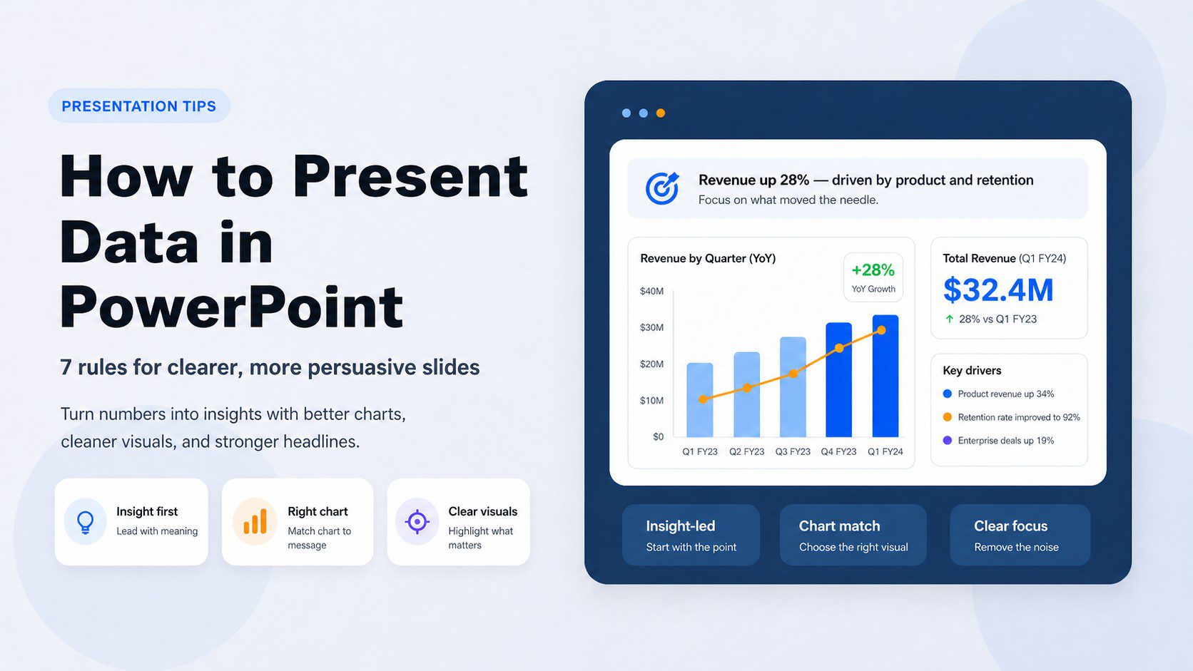
Write headlines that state the insight

This is the single change that will most immediately improve your data slides — and it takes thirty seconds per slide.
Most slide titles are labels: “Q3 Revenue”, “Customer Satisfaction Scores”, “Regional Breakdown.” These tell the audience what the slide is about. They do not tell the audience what to think.
Replace every label title with an assertion title — a complete sentence that states the insight the chart is meant to prove.
- Label: Q3 Revenue → Assertion: Q3 revenue exceeded target in every region for the first time since 2021
- Label: Customer Satisfaction → Assertion: Satisfaction scores dropped 11 points after the March product update
- Label: Regional Breakdown → Assertion: APAC now accounts for more than half of total revenue
The assertion title does three things. It tells the audience what conclusion to reach. It tells them where to look in the chart. And it makes the slide work even for someone who missed the verbal explanation — which is everyone who reads the deck later.
Write slide titles the way a newspaper writes headlines — not as topics, but as the point.
Show less data, not more
The instinct when presenting data is to show everything — to demonstrate thoroughness, to preempt questions, to prove the work was done. This instinct reliably produces slides that nobody can read.
Your audience’s working memory is limited. Research by cognitive psychologist George Miller established that people can hold roughly seven items (plus or minus two) in working memory at once. A slide with twelve metrics, three trend lines, and a data table is asking the audience to do impossible cognitive work while also listening to you speak.
The discipline is ruthless prioritization. For any given slide, ask:
- What is the one number that matters most right now?
- What would happen if I removed this data point — would the argument change?
- What belongs in an appendix rather than the main deck?
Put supporting data in backup slides. If someone asks a question, you have the answer ready. If nobody asks, you have not cluttered the main argument with data that did not need to be there.
Remove chartjunk
Chartjunk — a term coined by data visualization pioneer Edward Tufte — is any visual element that does not help the audience understand the data. It is the single biggest reason data slides look cluttered and feel hard to read.
The most common offenders:
- 3D effects — they distort proportions and make values harder to compare accurately. There is no data story that a 3D chart tells better than a flat one.
- Gridlines — if you need them, make them as light as possible. Heavyweight gridlines compete with the data for attention.
- Excessive color — using a different color for every bar adds visual noise without adding meaning. Use one color for all bars, and a second accent color only to highlight the bar that matters.
- Unnecessary legends — if your chart has one data series, label it directly. A legend forces the audience to look away from the data to decode it.
- Dual axes — two Y-axes on one chart routinely mislead audiences, intentionally or not. If the relationship between two data series is important, consider two separate charts placed side by side.
- Decorative backgrounds — a photo or texture behind a bar chart makes both harder to read. Keep chart backgrounds white or neutral.
A chart is not finished when there is nothing left to add. It is finished when there is nothing left to remove.
Use color with intention
Color in data slides has one job: to direct attention to what matters.
The most effective approach is almost embarrassingly simple. Use one neutral color for all data that is background context. Use one accent color — your brand color, or a strong contrasting color — for the single data point, bar, or line that is the point of the slide. Everything else stays gray.
A practical system for most data slides:
- Base color: medium gray for all non-highlighted data
- Accent color: your brand or presentation color for the one element being emphasized
- Text: dark neutral for labels and titles
Beyond aesthetics, color accessibility matters. According to Colour Blind Awareness, approximately 8% of men and 0.5% of women have some form of color vision deficiency. Red-green combinations — the most common default in “good vs. bad” data comparisons — are the most frequently misread. Use blue-orange or blue-yellow combinations instead, and always ensure the key message is readable without relying on color alone.
Know when not to use a chart
Not every number needs a chart. In fact, some of the most powerful data slides have no chart at all.
When a single metric is the entire point — revenue crossed a threshold, a rate doubled, a target was hit — the most effective slide is a large, bold number with a short contextual label and a headline that tells the audience what it means. A bar chart with one bar is almost always weaker than a single stat callout.
Similarly, when you need to show precise values for comparison — exact budget figures, competitor pricing, feature matrices — a clean, simple table communicates more accurately than a chart. Charts trade precision for pattern recognition. When precision is the point, use a table.
For conceptual relationships — proportions, flows, hierarchies, processes — non-data-driven visual formats often land better than technically precise charts. A well-designed infographic slide can communicate a market share story or a customer journey more intuitively than a pie chart or funnel diagram built from raw data.
The question to ask before every data visualization decision: does a chart genuinely make this clearer, or am I adding one because it looks more analytical? If the answer is the latter, trust the number or the table.
Putting it all together
Every data slide is an argument, not a report. The data is the evidence. The headline is the claim. The chart is the illustration. Once you start thinking about data slides this way, the decisions become clearer: what to show, what to cut, which chart to use, and what the title should say.
The habit to build is asking “what does this data mean?” before asking “how should I display it?” That single question, applied consistently, will make your data presentations clearer, more persuasive, and far less likely to lose the room. If you want ready-made starting points that already follow these visual principles, browse PresentationGO’s charts and diagrams templates and business presentation templates — free for PowerPoint and Google Slides.
Quick reference: 7 rules for presenting data in PowerPoint
- Start with the insight, not the data
- Choose the right chart for your message
- Write headlines that state the insight
- Show less data, not more
- Remove chartjunk
- Use color with intention
- Know when not to use a chart
Frequently asked questions
There is no single best chart — the right choice depends on what your data is trying to say. Use bar or column charts for comparisons, line charts for trends over time, pie charts only for 2–3 segment compositions, and scatter plots for correlations. When one number tells the whole story, skip the chart entirely and use a large stat callout instead.
Lead with the insight rather than the raw data. Replace label titles with assertion titles that state what the data means. Remove visual clutter — 3D effects, excessive colors, gridlines. Use one accent color to highlight the point. And cut any data that does not directly support the argument the slide is making.
As few as necessary to support the argument. Most presentations benefit from two to four strong, clear charts rather than ten dense ones. If you have more data to share, move it to an appendix at the back of the deck.
Chartjunk is any visual element that adds complexity without adding understanding — 3D effects, decorative backgrounds, excessive gridlines, redundant legends, and unnecessary color variation. The term was coined by data visualization expert Edward Tufte. Removing chartjunk almost always makes a chart clearer without losing any information.
Use charts when the pattern or trend is the point. Use tables when precise values and direct comparison matter more than the overall shape of the data. A table of exact quarterly figures is more useful than a bar chart when the audience needs to reference specific numbers.
Use a single accent color on the data point you want to emphasize, and keep everything else in a neutral gray. You can also use data labels, callout boxes, or annotations to draw attention to a specific bar, line point, or value. The goal is to direct the audience’s eye without requiring them to decode the entire chart first.
A report shows all the data. A presentation makes an argument using selected data. In a presentation, every slide should support a single claim and move the audience toward a conclusion or decision. If your presentation could be replaced by emailing a spreadsheet, it probably needs to be rebuilt as an argument rather than a data dump.
