Quick summary
- Font choice affects readability, tone, and credibility — often before the audience reads a single word.
- Sans-serif fonts are the default safe choice for slides; serif fonts work well for formal or editorial contexts.
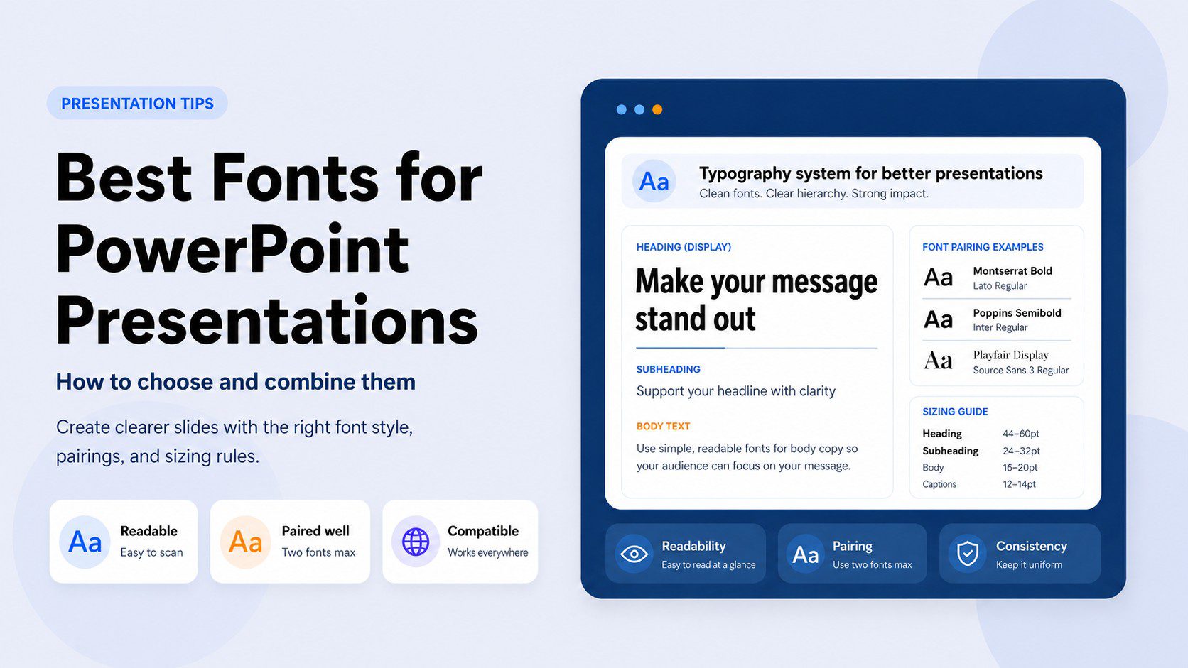
- Use two fonts maximum: one for headings, one for body text. Contrast is what makes a pairing work.
- Stick to built-in or widely available fonts unless you embed — custom fonts break when shared.
Everything you need to know about fonts for PowerPoint — from picking one to combining two
Nobody opens a presentation and thinks “great typography.” But everyone notices bad typography — even if they can’t name what bothered them.
Slides that feel cheap, hard to read, or visually chaotic almost always have a font problem underneath. Typography is not decoration. It is the first signal your audience receives about the quality of what you’re about to show them — before they read a single word.
Most people spend hours on their content and thirty seconds picking a font. This guide is an attempt to fix that.
Choosing the right font
How presentation type, audience, and context determine the best font category.
Combining fonts
The pairing logic that creates hierarchy without visual chaos.
Avoiding common mistakes
The fonts and habits that silently undermine professional slides.
Quick overview
Jump to any section:
Why font choice matters more than you think

Here is something that takes most non-designers by surprise: font choice communicates meaning independently of the words it’s setting.
A slide deck set in a thin geometric sans-serif reads as modern and minimal. The same content in a heavy serif reads as authoritative and traditional. A script font reads as personal and creative — or, if used in the wrong context, as deeply unprofessional. None of that has anything to do with what the slides actually say.
This matters because your audience’s brain is processing these signals before conscious reading kicks in. By the time they read your headline, they’ve already made a subconscious judgment about whether this presentation is going to be worth their time.
The wrong font doesn’t just look bad. It creates friction — a gap between what your content is trying to say and what your visual presentation is actually communicating. A startup founder pitching a cutting-edge product in Times New Roman is sending two contradictory signals at once. A law firm presenting quarterly results in Futura is doing the same thing in the opposite direction.
Getting typography right doesn’t mean picking the most interesting font. It means picking the one that doesn’t contradict your message.
Sans-serif vs. serif: how to choose

Every font decision starts here. Everything else is detail.
Sans-serif fonts — the ones without the small decorative strokes at the ends of letters — are the default choice for presentations, and for good reason. They read cleanly on screens, they hold up when projected, and they work at the large sizes that slides demand. Calibri, Aptos, Gill Sans, Trebuchet MS, Lato, Montserrat — these are all sans-serif, and they’re all reliable.
Serif fonts — the ones with the small finishing strokes — have a different reputation. They’re traditional, authoritative, and elegant. For decades, the conventional wisdom was that serifs were for print and sans-serifs were for screens. That’s largely still true, but it has softened. High-resolution displays have made serifs perfectly legible on screen, and some presentations genuinely benefit from the gravitas they carry.
Use a serif font when the context calls for formality, tradition, or credibility — financial reports, legal presentations, academic lectures, or any setting where authority matters more than modernity. Georgia and Garamond are the two most dependable choices. Avoid serifs for startup pitches, tech demos, or anything where the tone should feel contemporary and forward-looking.
When in doubt, go sans-serif. It is harder to go wrong.
The question is not “which style is better?” It is “which style fits the room I’m presenting to?”
The best fonts for PowerPoint — and when to use each

These are fonts that actually work in presentation contexts — tested against the two things that matter most: readability at distance, and compatibility across devices.
Calibri — Microsoft’s default since 2007 and still one of the best all-purpose options. It’s clean, friendly, and works at every size. Its main weakness is that it’s extremely common — if you want your slides to feel distinctive, Calibri is not the move. But if you want slides that simply work without fuss, Calibri delivers every time. Best for: internal business presentations, reports, any context where function beats style.
Aptos — Microsoft’s newer default (introduced in 2023), designed to replace Calibri across Office apps. It’s slightly more geometric and contemporary-feeling, with better spacing at large display sizes. Worth switching to if you’re building new templates. Best for: modern business slides, anything where Calibri feels slightly dated.
Georgia — The best serif font available in PowerPoint by a significant margin. Designed specifically for screen rendering at Microsoft in 1993, it’s one of the few serifs that genuinely holds up when projected. Elegant without being fussy. Best for: finance, law, academia, editorial-style presentations, quote slides.
Garamond — A classic old-style serif with real typographic heritage. More refined than Georgia but also more fragile — it can feel thin and delicate at small sizes or on low-quality projectors. Use it large, in headings, where it can breathe. Best for: formal presentations, headings only, cultural and educational contexts.
Gill Sans — A humanist sans-serif with warmth and personality. It avoids the coldness of geometric sans-serifs without tipping into the informality of rounded fonts. A quiet workhorse. Best for: education, nonprofits, healthcare, any context where approachability matters.
Trebuchet MS — One of the original “web-safe” fonts and still a solid choice. Its slightly irregular letterforms give it more character than Arial without sacrificing readability. Best for: mid-size body text, internal slides where a little personality is welcome.
Montserrat — A Google Font, not built into PowerPoint by default, so embedding or installation is required. Geometric, bold, and excellent at large display sizes. One of the most widely used fonts in modern presentation design. Best for: title slides, headings, startup decks, anything that needs to feel contemporary.
Lato — Another Google Font. Humanist sans-serif with exceptional versatility across weights. Where Montserrat is a statement, Lato is a workhorse — it performs well at every size, in every weight, for both headings and body text. Best for: any presentation that needs a clean, professional feel without relying on system fonts.
How to combine fonts: the pairing principles

Two fonts. That’s the limit. One for headings, one for body text.
If you go beyond two, you’re not creating hierarchy — you’re creating chaos. The eye needs a consistent system to navigate a slide deck. Every time you introduce a third or fourth font, you’re adding cognitive noise that competes with your content.
The principle behind every successful font pairing is contrast. Two fonts that are too similar look like a mistake — your audience wonders if you meant to use the same font but accidentally picked a slightly different one. Two fonts with clear contrast look intentional and hierarchical. They each have a job, and they do it without stepping on each other.
Contrast can come from several places:
- Category contrast — a serif heading paired with a sans-serif body is the most reliable combination in typography. The distinction is immediate and clear.
- Weight contrast — a bold or black weight heading paired with a regular or light body creates visual hierarchy even within the same font family.
- Scale contrast — large display text and small body text from the same font can work beautifully, especially if the font has good optical scaling.
Three pairings that work:
Montserrat (headings) + Lato (body) — The most modern-feeling combination on this list. Both are geometric, both are clean, but Montserrat’s stronger personality in bold weights contrasts nicely with Lato’s quieter neutrality in regular. Feels contemporary without being fashionable. Works for: tech, startups, creative industries, modern business.
Georgia (headings) + Gill Sans (body) — A classic serif-plus-humanist-sans pairing. Georgia brings authority and elegance to the headings; Gill Sans keeps the body text warm and approachable. The contrast is clear without being jarring. Works for: education, finance, healthcare, professional services.
Aptos (headings, bold) + Aptos (body, regular) — Using a single font family across the whole presentation is underrated. A bold or extra-bold heading weight against a regular body weight creates sufficient contrast without any pairing risk. Clean, controlled, and compatible on every device since it’s a Microsoft default. Works for: any business context, internal templates, teams that share files frequently.
Two fonts, clearly contrasted, consistently applied — that is the complete typography system for most presentations. Everything beyond that is noise.
Font size rules for presentations
Here is where most presentation typography breaks down quietly. The font is fine. The pairing is fine. But the sizes are wrong, and nobody in the back row can read anything.
Slides are not documents. The reading distance is different, the screen is larger, and the rendering environment is unpredictable. What looks perfectly legible on a laptop becomes illegible on a projector six meters away.
The minimum sizes that actually work:
- Slide title / heading: 36pt minimum. 44pt is safer. If the title is the only text on a slide, go bigger.
- Body text: 24pt minimum, no exceptions. If you feel the urge to go smaller to fit more text, that’s a signal to cut the text, not reduce the font size.
- Labels, captions, footnotes: 18pt minimum. Below this, you’re designing for yourself, not your audience.
Font weight matters as much as size. Thin and ultralight weights look beautiful on a MacBook screen. On a projector, they dissolve. Stick to regular weight for body text and medium or bold for headings. Reserve light weights for purely decorative contexts where legibility is not the primary goal.
Fonts to avoid in PowerPoint
Every list of best fonts quietly implies a list of worst ones. Here is the explicit version.
Comic Sans — The most notorious bad presentation font — but the reasons people cite are usually wrong. Comic Sans is not bad because it looks childish. It’s bad because it was designed for informal digital communication and carries that association so strongly that it undermines credibility in almost every professional context. There are a handful of settings where it’s appropriate: children’s educational content, informal community notices, anything explicitly playful. Everywhere else, it signals a lack of care.
Papyrus and Brush Script — Both are decorative fonts that communicate “I opened the font menu and picked something that looked interesting.” Papyrus has cultural associations that tend to land badly. Brush Script is illegible in body text and only marginally acceptable in large headings. Neither has a legitimate use case in presentation design.
Any thin or ultralight variant for body text — This is the one that catches people who know better. Thin weights look sophisticated in design mockups. In live presentations, they become nearly invisible — especially on projectors, in brightly lit rooms, or for audience members with any degree of visual impairment. Regular weight is not boring. It is readable.
All-caps body text — Using capitals for a word or phrase creates emphasis. Using all-caps for an entire paragraph slows reading speed significantly. Studies in typography consistently show that all-caps text takes longer to read than mixed-case text. Use uppercase sparingly: for short slide labels, category tags, or single-word accents. Never for full sentences or paragraphs.
Fonts that aren’t installed on your audience’s device — This is less a font choice problem and more a workflow problem — but the effect is the same. You send a beautifully typeset deck to a colleague. They open it on their laptop, which doesn’t have your custom font. PowerPoint substitutes a fallback and your carefully designed slides reflow into something unrecognizable. The fix is either to embed the font or to build presentations using fonts you know will be universally available.
The compatibility problem: built-in vs. custom fonts
This is the section most font guides skip, and it’s the one that causes the most actual problems.
Every font you use in a PowerPoint file needs to be available on the device that opens it. Built-in Windows and Office fonts — Calibri, Aptos, Arial, Georgia, Gill Sans, Trebuchet MS, Garamond — are safe. They’ll render correctly on virtually every Windows machine running Office.
Custom fonts — including Google Fonts like Montserrat and Lato — require either installation on every device that will open the file, or embedding within the PowerPoint file itself.
How to embed fonts in PowerPoint: File → Options → Save → check “Embed fonts in the file.” You have two sub-options: embed only the characters used (smaller file, good for sharing a final version) or embed all characters (larger file, necessary if someone else will edit the deck).
Embedding has limits. Some fonts have licensing restrictions that prevent embedding. And embedded files can be significantly larger — a problem if you’re emailing a deck or uploading it to a platform with file size limits.
The practical recommendation: For presentations you’ll share or present on devices other than your own, use built-in fonts or embed explicitly. For presentations you control entirely — your own laptop, your own screen — use whatever you like. For team templates that multiple people will use and edit, stick to fonts that are universally available without installation.
Putting it all together
Typography in presentations is a system. A heading font, a body font, consistent sizing, and a pairing logic built on contrast — those four decisions, made once and applied consistently, carry through every slide without requiring another thought.
The goal is not to find the most interesting font. It is to find fonts that make your content easy to read, appropriate for the context, and consistent from the first slide to the last. When typography works, nobody notices it. That is exactly the point. If you want to start with slides where the typography is already solved, browse PresentationGO’s minimalist templates and business presentation templates — free for PowerPoint and Google Slides, built with clean, readable font systems throughout.
Quick reference
8 reliable fonts for PowerPoint presentations
- Calibri — All-purpose sans-serif, safe and dependable
- Aptos — Modern Microsoft default, good for contemporary templates
- Georgia — Best serif for screens, excellent for formal contexts
- Garamond — Refined serif, headings only, formal presentations
- Gill Sans — Warm humanist sans-serif, education and healthcare
- Trebuchet MS — Characterful sans-serif, body text and internal slides
- Montserrat — Bold geometric sans-serif, headings, modern decks (Google Font)
- Lato — Versatile humanist sans-serif, headings and body (Google Font)
3 ready-to-use font pairings
- Montserrat Bold + Lato Regular — modern, contemporary, tech-forward
- Georgia Bold + Gill Sans Regular — formal, warm, educational
- Aptos Bold + Aptos Regular — clean, safe, universally compatible
Frequently asked questions
There is no single best font — it depends on your audience and context. For most professional presentations, Calibri or Aptos are safe, reliable choices. If you want something with more personality, Montserrat for headings and Lato for body text is a strong modern pairing. For formal or traditional contexts, Georgia handles headings with more gravitas than any sans-serif alternative.
Sans-serif fonts are the safer default — they read more cleanly on screens and hold up better when projected. Serif fonts work well in formal, traditional, or editorial contexts where authority and elegance matter. When in doubt, go sans-serif.
Two. One for headings, one for body text. If you need additional variation, use different weights of the same font rather than introducing a third typeface. Three fonts is a ceiling, not a target, and most presentations do not need to reach it.
36pt minimum for slide titles, 24pt minimum for body text, 18pt minimum for captions and footnotes. These are floors, not targets — go larger whenever the content allows. If you find yourself reducing font size to fit more text on a slide, that’s a signal to cut text, not reduce the size.
Yes. Download and install them from fonts.google.com, and they’ll appear in PowerPoint like any other font. The important caveat: anyone who opens your file needs the same fonts installed, or you need to embed them via File → Options → Save → Embed fonts in the file.
Go to File → Options → Save, and check “Embed fonts in the file.” Choose “embed only characters used” for a smaller file size when sharing a final version, or “embed all characters” if someone else will need to edit the deck. Note that some fonts have licensing restrictions that prevent embedding.
Comic Sans in professional contexts, Papyrus and Brush Script in almost all contexts, ultralight font weights for body text, and all-caps for anything longer than a short label. Also avoid any custom or Google Font that you haven’t either installed on all viewing devices or embedded in the file — the fallback substitution can completely break your layout.
