These presentation design tips go beyond the usual checklist. Most people can tell a professional slide from an amateur one in under three seconds — but very few can explain what makes the difference. It is not the content, and it is not the software. It is a small set of presentation design principles, applied consistently, that separate slides that look considered from slides that look like someone opened PowerPoint and started typing. This article makes those principles explicit.
Quick summary
- Professional-looking slides are not about decoration — they are about making content easier to read, follow, and remember.
- Most amateur slides fail for the same reasons: too much text, too many colors, no visual hierarchy, and inconsistent spacing.
- Design is a system, not a series of individual decisions — the tips in this article build on each other to create slides that feel coherent rather than assembled.
- The fastest shortcut to professional design is starting with a well-designed template and understanding why it works, not just copying it.
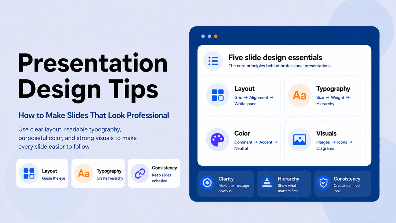
Presentation design tips that teach principles, not just rules — so every slide decision becomes faster and more confident
The best presentation design tips are not a checklist — they are a way of seeing. Once you understand why professional slides look the way they do, you stop guessing and start deciding.
This article covers the principles behind layout, typography, color, visuals, and consistency — specifically enough to apply immediately, and deeply enough to understand why each one works.
Layout and space
How alignment, whitespace, and grid logic create clarity without effort.
Color and type
The typographic and color decisions that signal professionalism before the audience reads a word.
Visuals and consistency
How to choose images, icons, and visual elements that support rather than decorate.
Quick overview
Jump to any section:
The difference between amateur and professional slide design

Before getting into specific presentation design tips, it helps to name the patterns that make slides look unfinished. Almost every amateur presentation shares the same three structural problems.
Visual clutter — too many elements competing for attention at once. Too much text, too many colors, too many images, too many bullet points. The slide is full, but nothing stands out. Clutter is usually the result of trying to include everything rather than deciding what matters most.
Inconsistency — elements that don’t follow a system. Headings that change size from slide to slide, bullet points that align differently across sections, images that vary in style and treatment. Inconsistency signals that the presentation was assembled rather than designed — that each slide was made in isolation rather than as part of a coherent whole.
Lack of hierarchy — all elements treated as equally important. When everything is the same size, weight, and color, nothing stands out. Hierarchy is the visual system that tells the audience what to read first, what to read second, and what is supporting detail. Without it, slides feel flat and hard to navigate.
These three problems are closely related — in fact, they tend to compound each other. Clutter is what happens when you don’t edit. Inconsistency is what happens when you don’t plan. Lack of hierarchy is what happens when you don’t prioritize. The presentation design tips that follow address all three — specifically and practically.
Layout tips: grid, alignment, and whitespace in presentation design

Layout is the foundation of professional slide design — and the most invisible when done well. Nobody leaves a presentation thinking “great grid work.” They simply experience the slides as clear, easy to follow, and professional. That feeling comes from three layout principles applied consistently.
Alignment
Every element on a slide should align to something — another element, a margin, or an invisible grid line. As a result, random placement, even by a few pixels, registers subconsciously as carelessness. In PowerPoint and Google Slides, the alignment tools (Format → Align) handle this automatically. The discipline is using them every time, not just when something looks obviously wrong.
Whitespace
Whitespace — the empty space on a slide — is not wasted space. It is the tool that makes everything else more visible. An element surrounded by space draws more attention than the same element packed into a crowded slide. The most common whitespace mistake is reducing margins to fit more content — which does the opposite of what’s intended. In other words, less whitespace produces less readability, not more. When a slide feels overcrowded, the fix is almost never to shrink the text. The fix is to cut content.
Slide zones
Professional slides implicitly divide the slide into zones: a title zone at the top, a content zone in the middle, and a footer zone at the bottom. Content that respects these zones feels organized. Content that bleeds across zones, on the other hand, feels messy. Browse PresentationGO’s minimalist templates to see how professional slide zones are handled in practice.
Layout is the grammar of slide design. Nobody notices good grammar — but everyone notices bad grammar.
Typography tips: size, weight, and hierarchy for professional presentations
Typography is where most amateur presentations give themselves away — not because of unusual fonts, but because fonts are used inconsistently, at the wrong sizes, and without a clear weight hierarchy.
The size system for slides
Presentation typography operates on three levels: heading, body, and caption. Each level should have a distinct and consistent size across every slide:
- Heading: 36–44pt minimum — what the audience reads from the back of the room in two seconds
- Body text: 24–28pt — if it needs to go smaller to fit, there is too much body text on the slide
- Captions and labels: 18–20pt minimum — below this, the text effectively doesn’t exist for anyone beyond the second row
The weight system
Font weight is, in fact, one of the most underused tools in presentation design. Within a single font family, the difference between Regular, Medium, SemiBold, and Bold creates visual hierarchy without requiring different fonts or colors. Furthermore, weight contrast is more reliable than size contrast alone, because it works at distance — a bold heading against regular body text communicates hierarchy clearly even from the back of the room.
One or two fonts — no more
Two fonts maximum — one for headings, one for body text. If the fonts have sufficient contrast (a bold geometric sans for headings against a neutral humanist sans for body, or a serif heading against a sans-serif body), the result creates professional hierarchy automatically. Adding a third font adds visual noise without adding information. For deeper guidance on specific choices, see PresentationGO’s guide to the best fonts for PowerPoint presentations.
Color tips: applying the three-role system in professional slide design
In the context of professional slide design, the application of color matters as much as the choice. The three-role system works as follows in practice.
The dominant color — usually the background — should cover the most area and do the least work. Its job is to set tone and provide a consistent canvas. It should be the most neutral choice in the palette: white, off-white, navy, charcoal, or deep green depending on the presentation’s register.
The accent color — used sparingly — should appear on exactly the elements that need to stand out: key numbers, calls to action, the specific bar in a chart being discussed, the one word in a headline that carries the argument. When the accent color appears, the audience’s eye goes there first. That means it must always be on the right thing.
The neutral color — for body text, secondary labels, and structural elements — should sit between the dominant and the accent without competing with either. Usually a dark gray or light gray, depending on whether the background is dark or light.
The most common color mistake in professional presentations is using the accent color too often. Once the accent appears on five different elements per slide, it stops being an accent and becomes a second dominant color. The result is visual noise rather than visual emphasis. For more detail on presentation color psychology and ready-to-use palettes, see PresentationGO’s guide to the best colors for presentations.
Visual design tips: images, icons, and diagrams for professional slides
Visuals are the element most likely to either elevate a presentation or expose its weaknesses. A well-chosen, professionally treated image makes a slide feel considered and credible. A poorly chosen or carelessly placed image, on the other hand, makes the same slide feel rushed and amateurish.
Images
Professional presentation images share three characteristics: high resolution (minimum 1920×1080 for full-bleed images), specificity rather than genericity, and consistent treatment across the deck. Generic stock photography — handshakes, lightbulbs, people pointing at whiteboards — communicates that you didn’t think carefully about the visual. Specific images, by contrast, communicate that you did. When generic imagery is unavoidable, treat it deliberately: crop tightly, apply a consistent color overlay, or use it as texture rather than subject.
Icons
Icons work best when they come from a single visual family and are used at a consistent size. Mixing line icons, filled icons, and illustrated icons on the same slide creates visual noise. Furthermore, icons should support labels rather than replace them — an icon without a label forces the audience to interpret it, which adds cognitive load.
Diagrams and charts
A well-designed diagram often communicates more in three seconds than a paragraph communicates in thirty. The principle is the same as with text: one idea per visual. A diagram trying to show five relationships simultaneously shows none of them clearly. Browse PresentationGO’s charts and diagrams templates for professionally structured visual frameworks.
The test for any visual is simple: does it make the point faster and clearer than words alone? If not, it doesn’t belong on the slide.
Consistency: the presentation design tip with the highest leverage
Of all the presentation design tips in this article, consistency is the one with the highest leverage and the least attention. A presentation with mediocre design applied consistently looks more professional than one with excellent design applied inconsistently.
Consistency means every slide operates within the same system: the same fonts, the same sizes, the same color roles, the same alignment grid, the same spacing between elements, the same image treatment. When the system holds, the audience’s brain stops processing design and focuses on content. When the system breaks — even once — the audience notices it immediately,, even if they cannot explain why.
What to make consistent
- Heading position — the same distance from the top edge on every slide
- Font sizes — heading, body, and caption sizes don’t vary across slides
- Color roles — the accent color appears only on accent elements, never on structural ones
- Image treatment — all images either have rounded corners or they don’t; shadows are consistent or absent throughout
- Spacing — the gap between the heading and first body element is the same on every slide
- Slide numbers and logos — always in the same position and at the same size
How to enforce consistency with Slide Master
In PowerPoint, the Slide Master (View → Slide Master) allows you to set default typography, spacing, colors, and positioning for every slide at once. Consequently, changes made in the Slide Master propagate to all slides automatically — eliminating both the manual consistency work and the errors that come from doing it manually. In Google Slides, Theme Builder (Slide → Edit Theme) serves the same function.
The five most common slide design mistakes — and how to fix them
Even presentations that follow most of the design principles above often fail on one of these five specific patterns. Each has a direct fix.
Bullet-point overload
The problem: slides covered in six, eight, or ten bullet points that essentially transcribe the speaker’s script. The audience reads ahead, loses track of where the speaker is, and disengages. The fix: apply the one-idea-per-slide rule. Move supporting detail to speaker notes. If multiple bullet points are genuinely necessary, limit them to three — and ensure each is a phrase, not a sentence.
Mismatched fonts
The problem: headings in one font, body text in another, captions in a third — often because different slides were built at different times or copied from different sources. The fix: define two fonts in the Slide Master and apply them globally. Never paste content from an external source without first stripping its formatting (Paste Special → Unformatted Text in PowerPoint).
Low-contrast text
The problem: gray text on white backgrounds, or dark blue text on navy backgrounds — both look refined on a laptop at close range and both become illegible when projected. The fix: reduce your screen brightness to 50% and check whether every text element is still clearly readable. If it isn’t, fix the contrast before presenting.
Decorative animations
The problem: elements flying in from the left, spinning text, and slides dissolving in random directions. These animations signal that the presenter prioritized novelty over communication. The fix: use simple fade-in animations only — and only where an animation genuinely helps. The default should be no animation. Transitions between slides should be a simple crossfade or nothing at all.
Misaligned elements
The problem: elements that almost align — a text box two pixels off the margin, an image that doesn’t quite sit on the grid. Individually invisible, collectively they create an impression of sloppiness. The fix: use PowerPoint’s alignment tools (Format → Align) consistently, and turn on the grid (View → Guides) so misalignment is visible before it becomes a problem.
Putting it all together
Professional presentation design is a system, not a list. When layout, typography, color, visuals, and consistency all follow the same logic, the result feels like a single coherent piece of work. When any one of them breaks, however, the whole system shows the crack.
The fastest way to internalize these presentation design tips is to start with a template that already embeds the system — one where the grid, font hierarchy, color roles, and spacing have been solved by a designer. Specifically, study why each decision was made, not just what it looks like. Browse PresentationGO’s business presentation templates and minimalist templates — free for PowerPoint and Google Slides — as working examples of these principles in practice.
Quick reference: presentation design checklist
| Element | What to check before presenting |
|---|---|
| Layout | Every element aligns to the grid; margins are consistent; nothing bleeds into the footer zone |
| Whitespace | Each slide has breathing room; no element is crowded against another |
| Typography | Two fonts maximum; heading ≥36pt; body ≥24pt; caption ≥18pt |
| Weight hierarchy | Heading is visibly bolder/larger than body text in grayscale |
| Color | Three colors maximum; accent used on ≤2 elements per slide |
| Images | High resolution; consistent treatment; no generic stock clichés |
| Icons | Single visual family; consistent size; always paired with a label |
| Consistency | Scrolling through the deck, every slide feels like part of the same family |
| Animations | Fade-in only or none; no decorative transitions |
| Contrast | All text readable at 50% screen brightness |
Frequently asked questions
Professional-looking presentations share four characteristics: visual hierarchy (the audience knows where to look first), consistency (every slide follows the same visual system), restraint (nothing on the slide is there without a reason), and readability (every element is legible from the back of the room). These are not about expensive tools or design training — they are about applying a small set of principles consistently.
Start with three changes that have the highest immediate impact: reduce the text on every slide by half, align every element using PowerPoint’s alignment tools, and limit your color palette to three colors. These three changes alone will improve the visual quality of most amateur presentations significantly. After that, address font consistency, whitespace, and image quality.
The most reliable layout keeps the slide title at the top, the main content in the center, and the bottom 15% of the slide empty or reserved for a page number. Within the content area, a Z-pattern layout — headline top-left, visual top-right, supporting text bottom-left — aligns with natural reading patterns. For data-heavy slides, a full-width chart with a single headline above it is almost always cleaner than a chart-plus-bullets layout.
Less than you think. The 6×6 rule — no more than six bullet points, no more than six words per bullet — is a useful floor, not a ceiling. The best presentations often have no body text at all on key slides, letting the visual carry the message. If a slide needs more than 50 words to make sense, it probably needs to be split into two slides or moved to the speaker notes.
Sparingly, and only where they serve a communicative purpose. Revealing bullet points one at a time to control pacing is legitimate. Spinning text and flying elements are not. The default position should be no animation — add only when it genuinely helps the audience follow the argument. For transitions between slides, use a simple crossfade or nothing at all.
36pt minimum for slide titles, 24pt minimum for body text, and 18pt minimum for captions and footnotes. These are absolute floors — never go below them regardless of how much content needs to fit. If the content doesn’t fit at minimum sizes, cut content rather than reducing font size. Always test on the actual display device.
Use the Slide Master in PowerPoint (View → Slide Master) or Theme Builder in Google Slides (Slide → Edit Theme) to set default fonts, colors, sizes, and spacing for every slide at once. Any change made in the Slide Master propagates automatically to all slides. Before presenting, scroll through the entire deck looking only at the visual pattern — not the content — and fix any slide that jars visually against the others.
