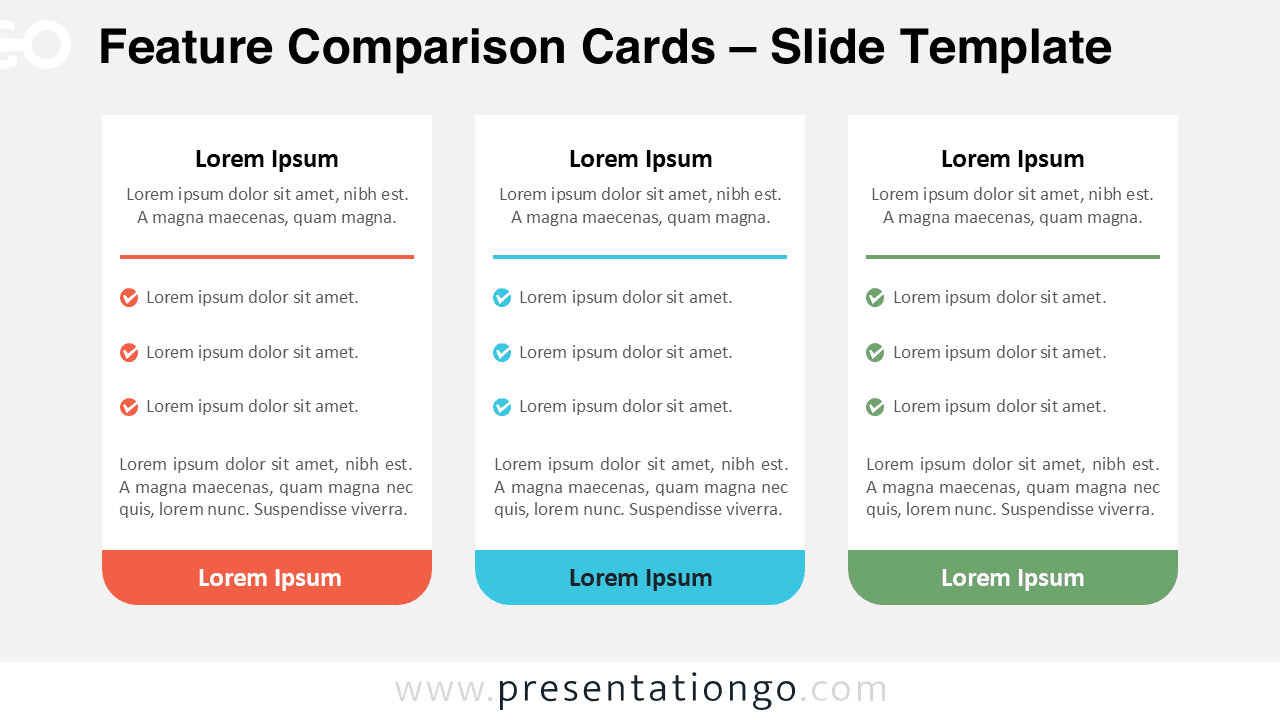
The Feature Comparison Cards diagram provides a clean and structured way to present side-by-side comparisons in your presentations. Designed for PowerPoint and Google Slides, this layout helps you clearly communicate differences between options, making it ideal for business, marketing, and product-related content.
Diagram Preview
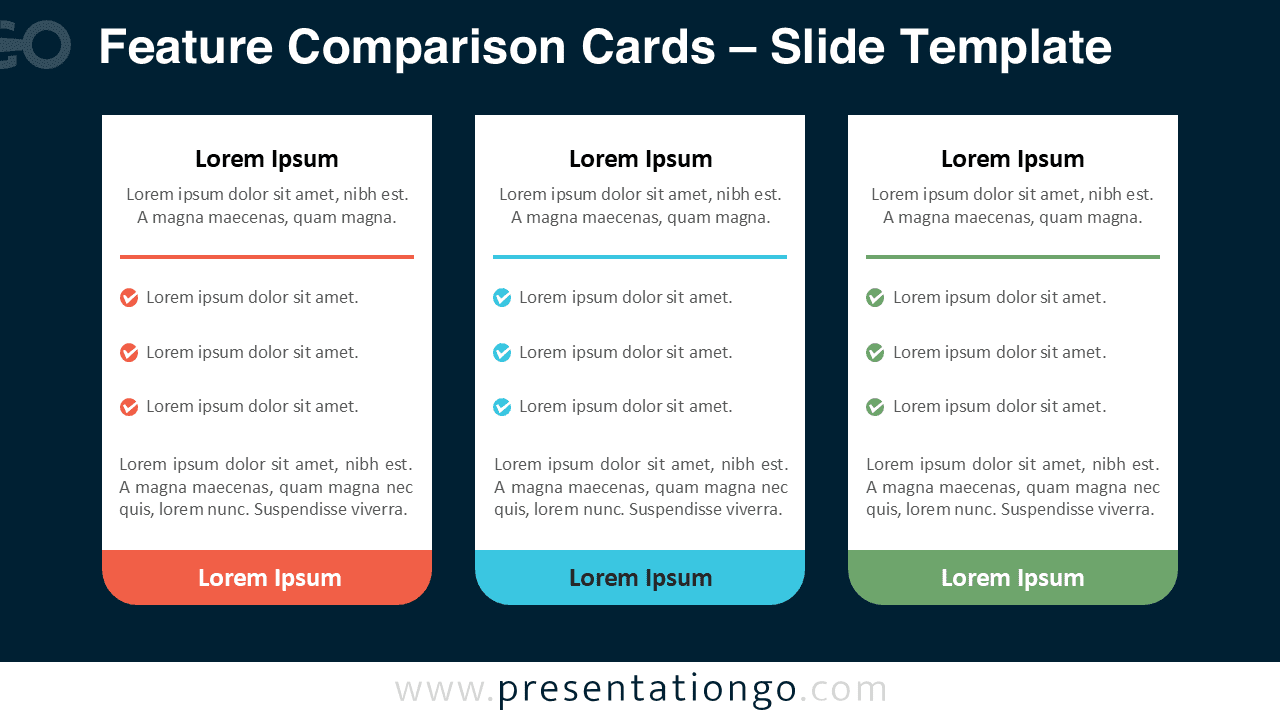


Features and Customization Options
- Three-column card layout for clear comparisons
- Editable text placeholders for titles and descriptions
- Color-coded sections to differentiate each option
- Includes editable icon placeholders for bullet points
- Fully customizable shapes, colors, and text
- Compatible with both PowerPoint and Google Slides
Design and Structure
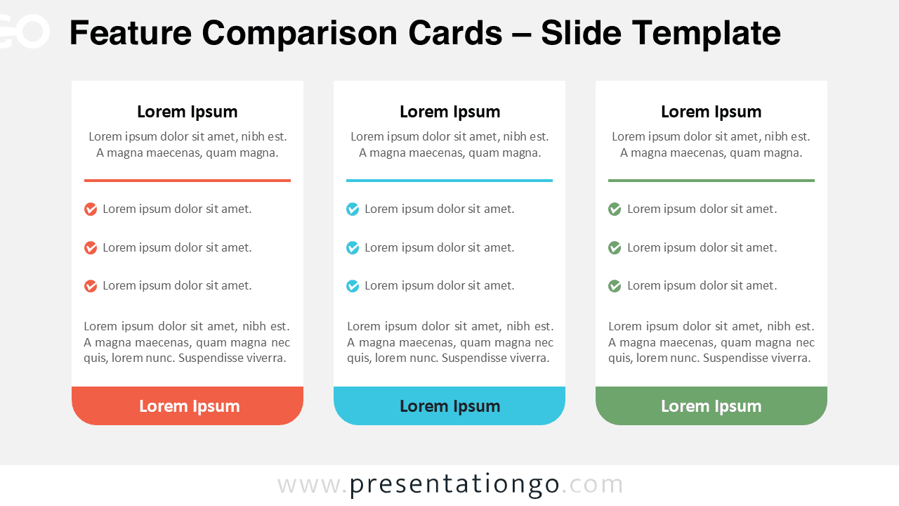
This diagram uses a card-based layout divided into three vertical sections, each representing a different option or category. Each card includes a title, short introduction, checklist-style bullet points, and a supporting description. The colored accents help visually separate each column, making the content easier to scan and understand.
The design is minimal and modern, ensuring that your audience focuses on the content rather than distractions. The balanced spacing and alignment improve readability, while the consistent structure across all cards maintains a professional appearance.
Practical Applications
- Compare pricing plans such as Basic, Standard, and Premium
- Highlight product features across multiple offerings
- Present service packages or subscription tiers
- Analyze pros and cons of different strategies
- Showcase competitive comparisons in business presentations
Summary
The Feature Comparison Cards diagram is a versatile and effective tool for presenting structured comparisons. Its clean layout, customizable elements, and compatibility with PowerPoint and Google Slides make it suitable for a wide range of professional uses. Whether you are comparing products, services, or strategies, this diagram ensures your message remains clear and impactful.