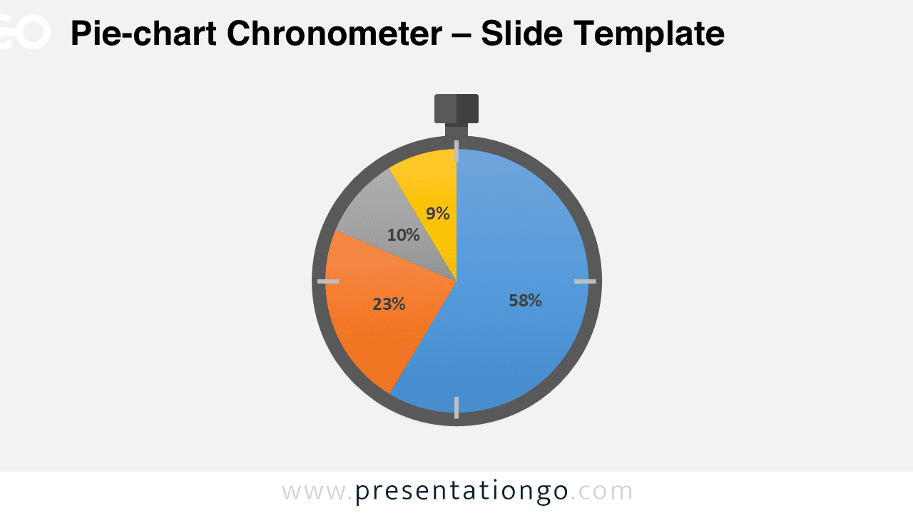
Free pie-chart PowerPoint chronometer. PowerPoint diagram using the chronometer shape as the contour of a built-in data driven pie-chart.
As a built-in data driven PowerPoint chart, you can easily change data series and format:
Change the data series:
You can change the data series in two ways:
- Use chart filters to show or hide data in your chart.
- Use the Select Data Source dialog box to edit the data in your series or rearrange them on your chart.
Chart filters
1. Click anywhere in your chart.
2. Click the Chart Filters button Chart Filters button next to the chart.
3. On the Values tab, check or uncheck the series or categories you want to show or hide.
Values tab in the Chart Filters gallery
4. Click Apply.
5. If you want to edit or rearrange the data in your series, click Select Data, and then follow steps 2-4 in the next section.
Select Data Source dialog box
1. Right-click your chart, and then choose Select Data.
You can also get to this dialog box from the Value tab in the Chart Filters gallery.
Select Data Source dialog box
2. In the Legend Entries (Series) box, click the series you want to change.
3. Click Edit, make your changes, and click OK.
Changes you make may break links to the source data on the worksheet.
4. To rearrange a series, select it, and then click Move Up Move Up button or Move Down Move Down button.
Change the format:
You can also replace the pie-chart by a ‘Doughnut chart‘
Like a pie chart, a doughnut chart shows the relationship of parts to a whole, but it can contain more than one data series.
Doughnut charts show data in rings, where each ring represents a data series. If percentages are shown in data labels, each ring will total 100%.
This ‘Pie-chart Chronometer’ template features:
- 1 unique slide
- Data-driven pie-chart for dynamic data representation
- Standard (4:3) and Widescreen (16:9) aspect ratios
- PPTX file (PowerPoint)
Free font used:
- Calibri (System Font)


Comments are closed.