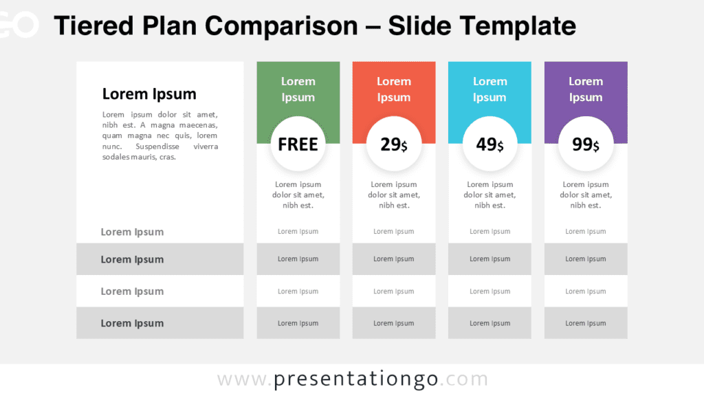
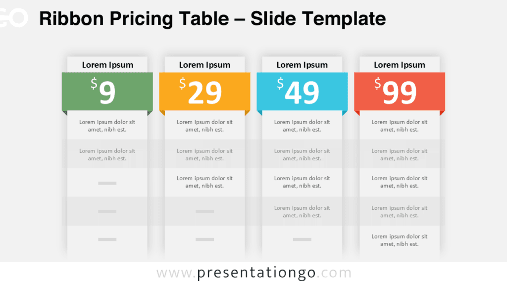
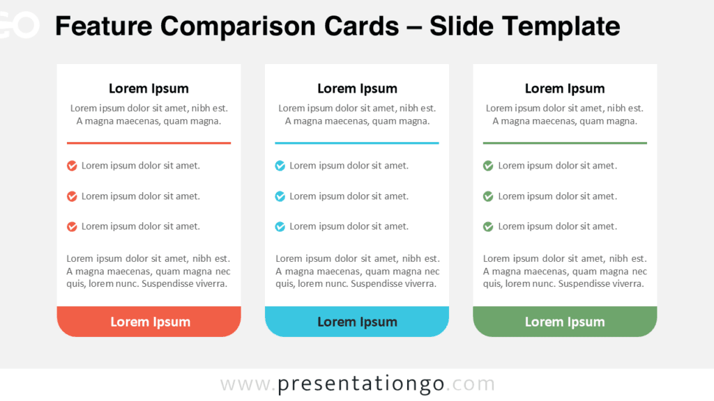
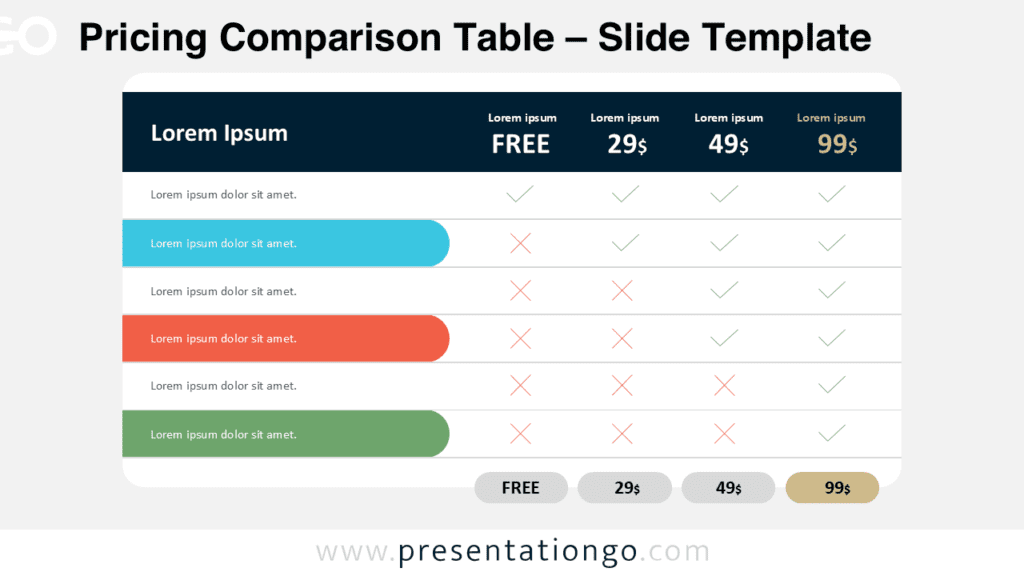
The Three-Tier Pricing Cards diagram is a practical visual tool designed to present pricing plans and service packages with clarity and balance. This diagram helps audiences quickly compare options by displaying three distinct pricing tiers side by side.
It works seamlessly in PowerPoint and Google Slides, making it suitable for business, sales, and marketing presentations.
Diagram Preview


Diagram Features and Customization Options
- Three clearly separated pricing cards for direct comparison
- Editable text placeholders for titles, descriptions, and prices
- Balanced layout that keeps all tiers visually aligned
- Optimized versions for both light and dark presentation themes
- Fully customizable colors to match your brand identity
Design and Structure
The diagram is built around three vertical cards with rounded corners and soft spacing. Each card contains a title area, a list of key features, and a highlighted price badge at the bottom. The curved shape at the base of each card adds visual interest without distracting from the content.
This structure naturally guides the viewer’s eye from top to bottom, helping them understand each offer quickly.
Practical Applications
- Pricing tables for products or services
- Subscription plan comparisons
- SaaS or software package presentations
- Sales pitches and commercial proposals
- Marketing decks and business overviews
Summary
The Three-Tier Pricing Cards diagram is an effective way to present pricing information in a clean and professional format. Its structured layout supports clear decision-making while remaining flexible for many presentation contexts.
Whether you are building a sales pitch or explaining service levels, this diagram helps you communicate value with confidence.