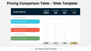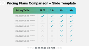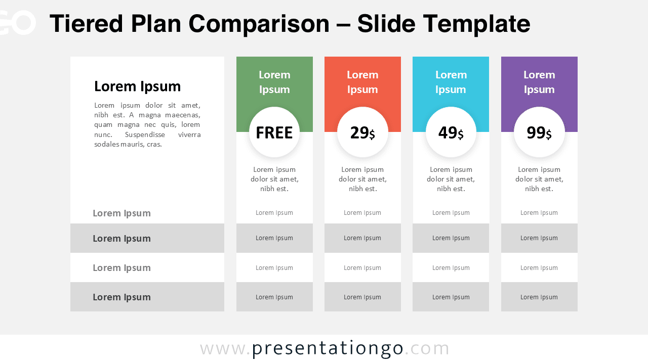
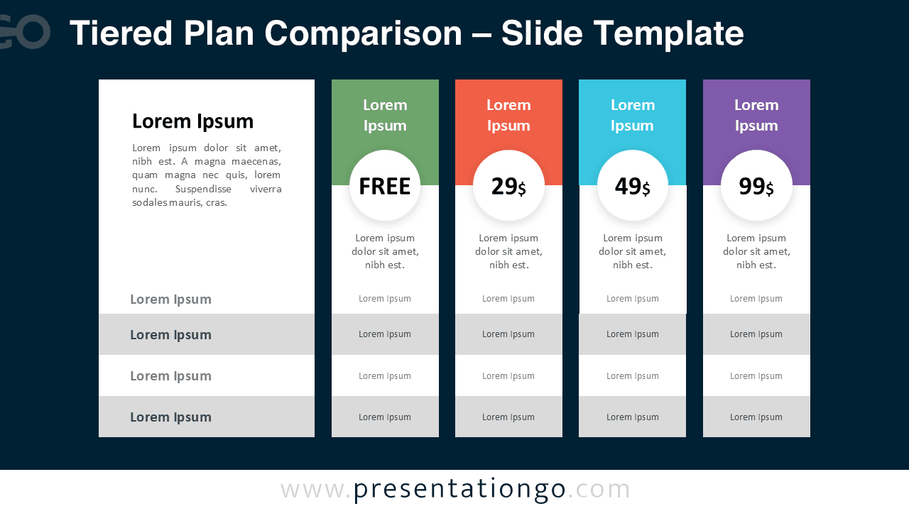
The Tiered Plan Comparison diagram helps you present pricing structures in a clear and professional format. Designed for PowerPoint and Google Slides, this layout makes it easy to compare multiple service or product tiers in a single slide.
Whether you are presenting SaaS subscriptions, consulting packages, or membership levels, this diagram ensures your audience quickly understands the differences between each plan.
Diagram Preview


Features and Customization Options
- Four clearly structured pricing columns
- Editable text placeholders for plan names and descriptions
- Circular price highlight areas for strong visual emphasis
- Alternating row backgrounds for improved readability
- Fully customizable colors and typography
- Compatible with both PowerPoint and Google Slides
Design and Structure
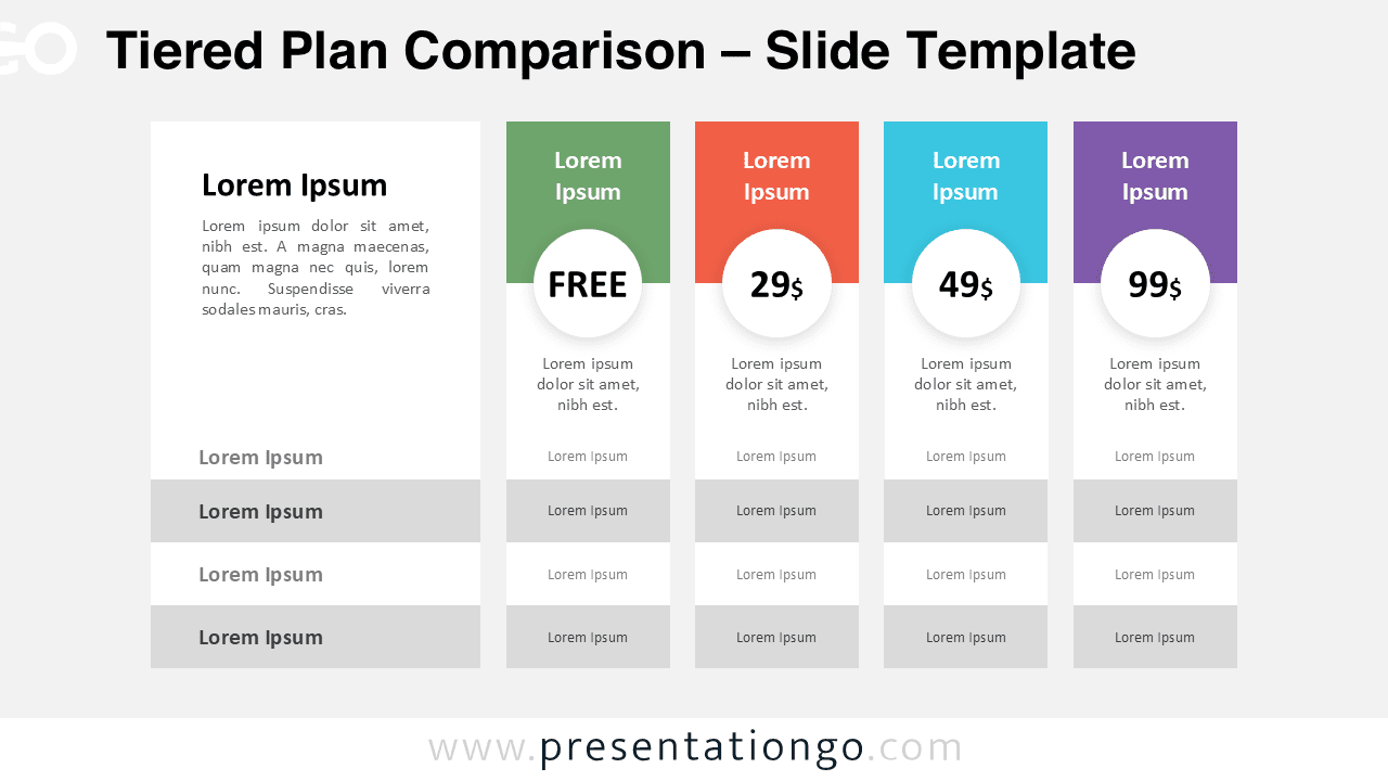
This pricing diagram uses a vertical card layout to organize information logically. Each column represents a distinct plan, starting with a bold header area and followed by a prominent circular price element. This structure draws immediate attention to the pricing while maintaining visual balance.
The feature comparison rows are aligned horizontally, making it simple to compare benefits across all plans. Alternating background tones improve clarity and reduce visual fatigue during presentations.
Two versions are included: one optimized for light presentations and one designed for dark presentation environments. Both maintain the same clean grid alignment and professional styling.
Practical Applications
- SaaS subscription pricing presentations
- Product package comparisons
- Marketing and sales proposals
- Service tier breakdowns
- Membership plan overviews
- Business strategy discussions
Summary
The Tiered Plan Comparison diagram provides a structured and visually appealing way to communicate pricing strategies. Its clean design ensures clarity, while its flexibility allows full customization to match your branding. Use it to present pricing tiers confidently and help your audience make informed decisions.