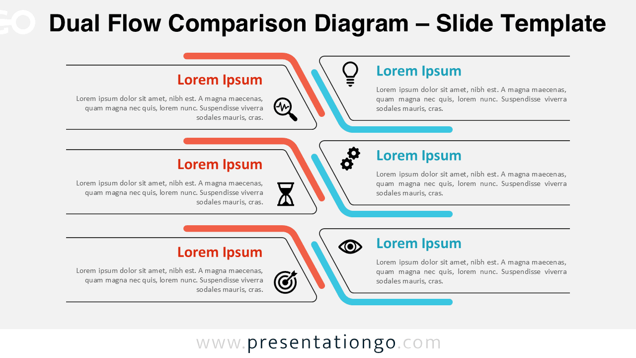
The Dual Flow Comparison Diagram is a professional visual tool designed to help presenters compare two parallel processes clearly and effectively.
This diagram works perfectly in both PowerPoint and Google Slides, making it easy to present structured comparisons in business, education, or consulting contexts.
Diagram Preview
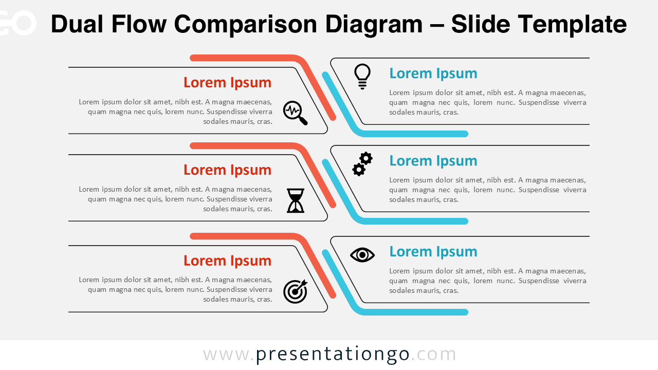
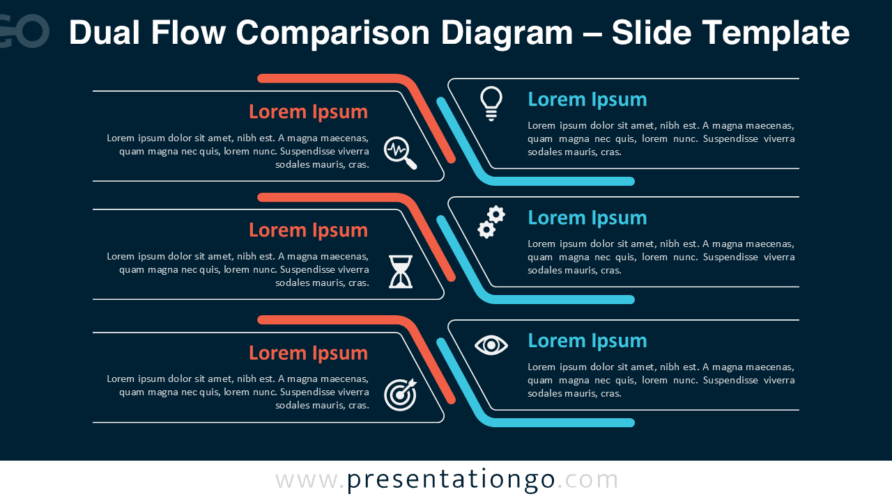


The layout is built around a horizontal dual-flow structure that guides the audience from left to right.
Each row highlights a pair of related concepts, allowing viewers to quickly understand similarities, differences, or relationships between two approaches.
Features and Customization Options
- Fully editable shapes, lines, and text elements
- Includes editable icon placeholders for visual reinforcement
- Available in light and dark slide versions
- Consistent spacing for clean visual hierarchy
- Works seamlessly in PowerPoint and Google Slides
All elements are vector-based, which means you can resize and recolor the diagram without losing quality.
The icons can be replaced or customized to better match your presentation theme or brand identity.
Design and Structure
The diagram uses a repeated row structure to maintain rhythm and readability across the slide. Curved connectors in the center visually link both sides, reinforcing the idea of comparison and relationship. Accent colors help separate the two flows while maintaining a cohesive overall design.
Practical Applications
- Comparing two strategies or business models
- Presenting advantages versus challenges
- Explaining cause-and-effect relationships
- Showing current versus future states
- Training and educational presentations
This diagram is especially useful when you need to communicate structured information quickly and clearly.
Summary
The Dual Flow Comparison Diagram offers a clean and flexible way to visualize parallel ideas. Its professional design and ease of customization make it a reliable choice for high-impact presentations.