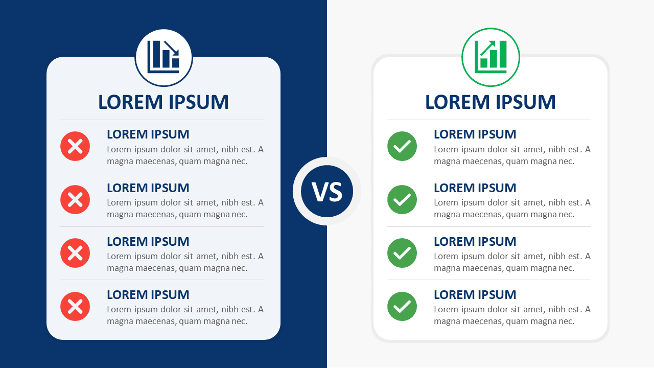
The Split-Screen Comparison Cards diagram gives you a clear way to compare two options within one slide. Its balanced side-by-side structure helps viewers evaluate differences without jumping between separate layouts. Each card provides four distinct comparison points, making the design useful for structured business discussions, reviews, and decision-making presentations.
A central “VS” element visually connects both sides while keeping each option easy to scan. Short headings, supporting text, and status icon placeholders create a repeatable visual hierarchy. The diagram works in PowerPoint and Google Slides and can be adapted for many comparison scenarios.
Diagram Preview
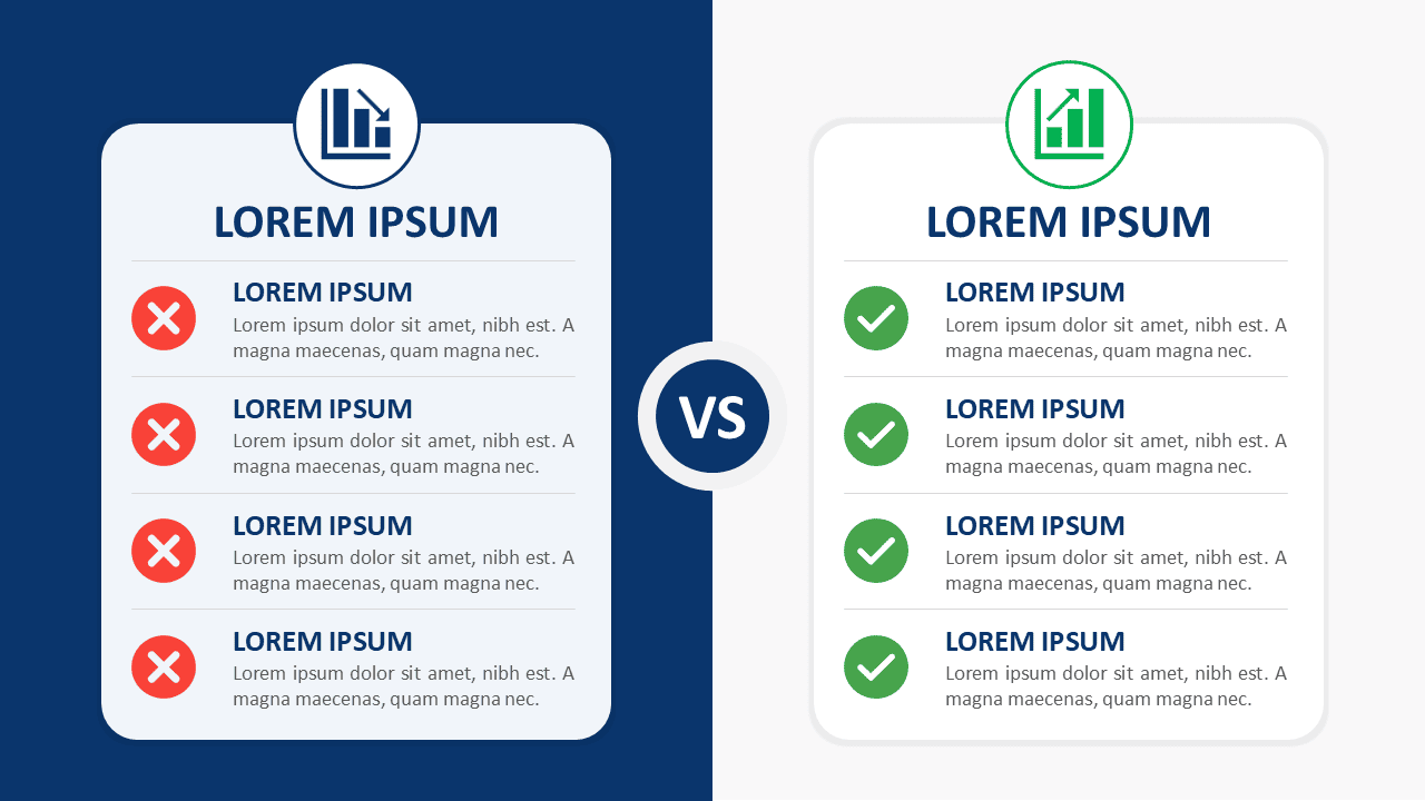

The layout places two comparison cards opposite each other, creating an immediate visual relationship between both choices. Each card contains four separated rows for concise arguments, features, conditions, or outcomes. The consistent structure lets presenters keep information balanced while highlighting meaningful differences.
Features and Customization Options
- Compatible with Microsoft PowerPoint and Google Slides
- Single-slide template, ready to drop into any deck
- Editable text, shapes, and icon placeholders
- Icon-and-text layout for comparing concepts
- Four comparison points on each side
- 100% editable vector shapes — no quality loss when resized
Design and Structure
The Split-Screen Comparison Cards use a symmetrical two-column composition that makes direct comparison intuitive. Each side follows the same hierarchy, with a main heading followed by four supporting rows. This mirrored structure helps audiences compare equivalent points quickly and reduces visual clutter.
The icon placeholders add another layer of visual guidance without overwhelming the content. You can replace them with symbols that fit your topic or remove them when a text-only comparison works better. The layout also supports concise messaging, so each point can remain focused and easy to present.
Practical Applications
- Option A versus Option B comparisons
- Current state versus future state
- Pros and cons presentations
- Before-and-after evaluations
- Product or service comparisons
- Strategy and decision reviews
- Old process versus new process
- Feature-by-feature comparisons
Summary
Split-Screen Comparison Cards provide a practical framework for comparing two choices across four structured points. The mirrored card layout keeps both sides balanced while helping viewers understand differences at a glance. Editable text, shapes, and icon placeholders make the slide easy to adapt for business, strategy, product, and process presentations.
Use the diagram when you need a direct visual comparison without adding unnecessary complexity. Its compact structure works especially well for presentations where clarity, consistency, and fast decision-making matter.