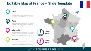
The France Dotted Map Infographic is a clean and modern visual tool designed to help you present geographic data clearly and effectively.
Built with a dotted silhouette of France, this infographic is ideal for highlighting regional statistics, key performance indicators, or geographic insights in a visually engaging way.
Dotted Map Preview


Diagram Features and Customization Options
- Editable dotted map shapes with clean, scalable vector elements
- Fully editable arrows, connectors, and callout shapes
- Customizable text placeholders for labels, values, and descriptions
- Includes editable icon placeholders that can be replaced or removed as needed
- Light and dark background versions included
- Easy color customization to match your branding or theme
- Compatible with both PowerPoint and Google Slides
Design and Structure
This infographic uses evenly spaced dots to form the outline of France, creating a modern and minimalist map representation. Strategically placed circular markers allow you to emphasize key regions or data points, while connector lines guide attention without cluttering the layout. The balanced composition ensures strong readability on both light and dark backgrounds, making it suitable for a wide range of presentation styles.
Practical Applications
- Presenting regional business performance in France
- Displaying demographic or population data
- Supporting logistics, supply chain, or market coverage visuals
- Educational presentations focused on French geography
- Strategic reports requiring clear geographic context
Summary
The France Dotted Map Infographic offers a professional and flexible way to visualize geographic data.
Its minimalist dot-based design keeps the focus on your message while allowing full customization to match your branding and presentation goals.