The Poland Dotted Map Infographic offers a clear and professional way to present location-based information in PowerPoint and Google Slides. It combines a recognizable map silhouette with bold percentage markers, text areas, and a clean dotted structure. As a result, it helps you explain regional insights quickly and clearly in many types of presentations.
You can use this infographic for market analysis, tourism, transportation, education, or demographic reporting. Because the layout is simple and visually balanced, it helps your audience focus on the most important information without distraction.
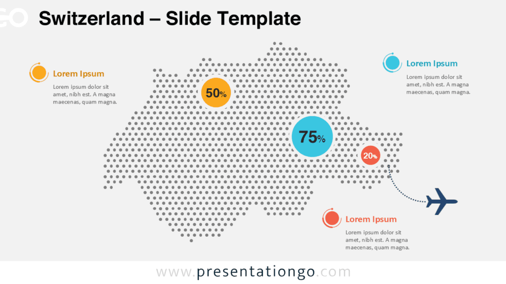
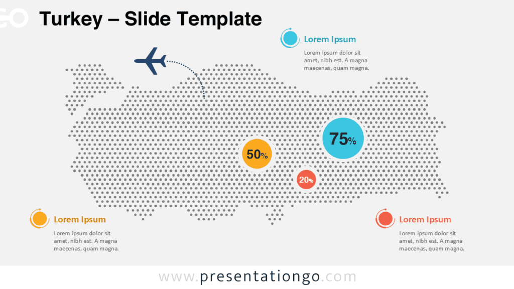
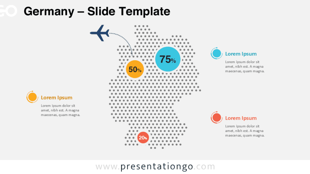
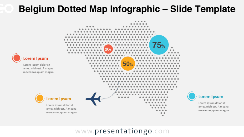
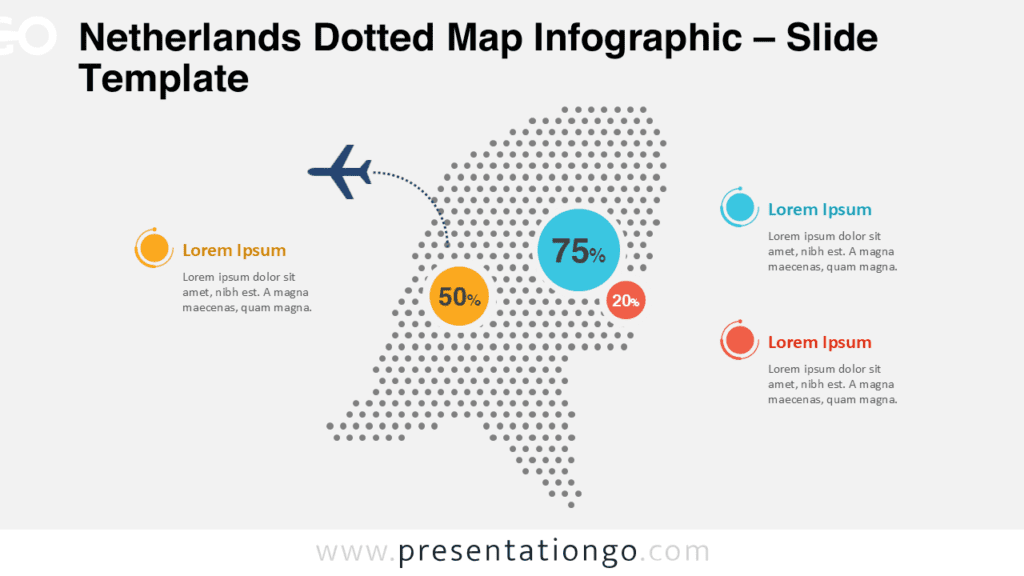
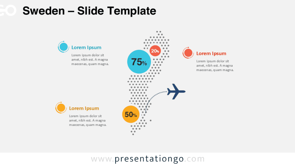
Map Preview


The design includes two ready-to-use versions, making it easy to adapt the infographic to different presentation styles. Both slides keep the same overall structure, so you can maintain a consistent look throughout your deck while choosing the version that best fits your theme.
Features and Customization Options
- Editable dotted map layout of Poland
- Two slide versions for different presentation themes
- Percentage markers for key regional data
- Text placeholders for short explanations
- Clear callout areas that help organize information
- Useful for PowerPoint and Google Slides
You can easily adapt the text, data values, and layout elements to match your own topic. The circular markers help viewers identify the key figures immediately, while the surrounding text blocks provide space for supporting explanations. This structure keeps your message focused, readable, and easy to scan.
Geographic Coverage and Design Structure
This infographic focuses on Poland and uses a dotted pattern to create a modern geographic view. The central map shape draws attention first, while the surrounding callouts guide the audience toward the most important figures and observations. This balance works especially well when you need to connect numbers to places in a clear visual format.
The design also includes a travel-style visual cue, which makes it suitable for topics such as mobility, tourism, trade, and logistics. Because the composition remains uncluttered, you can present several insights on a single slide without overwhelming your audience.
Practical Applications
- Show regional performance across Poland
- Highlight sales coverage or market penetration
- Present tourism flows and destination insights
- Explain logistics routes and delivery areas
- Compare statistics between locations
- Support classroom lessons about Poland
This infographic works especially well in reports, pitch decks, and educational presentations. It gives your content a strong geographic anchor while keeping the slide simple and easy to understand. Therefore, it is a practical option for anyone who wants to turn raw location-based information into a polished visual.
Summary
The Poland Dotted Map Infographic helps you present geographic information with clarity and style. Its modern dotted layout, bold data markers, and dual-version format make it a practical asset for many presentation needs. Use it to turn regional data into a visual story that your audience can understand quickly.