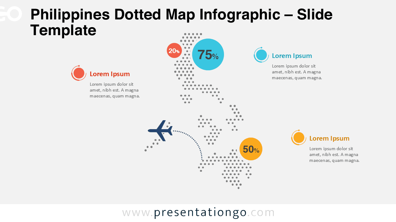
The Philippines Dotted Map Infographic is a clean and modern geographic visual designed to support clear data presentation and regional storytelling. It uses a structured dot pattern to outline the Philippine archipelago, making it ideal for highlighting locations, regions, or distribution data in a visually balanced way.
This infographic works well in professional, educational, and institutional contexts where clarity and flexibility matter. With a minimalist style and adaptable layout, it integrates smoothly into reports, presentations, and strategic documents.
Map Preview


Features and Customization Options
- Accurate dotted representation of the Philippine archipelago
- Clean and minimalist design suitable for professional presentations
- Editable shapes, arrows, and text placeholders
- Includes editable icon placeholders for markers and highlights
- Fully customizable colors to match brand or project needs
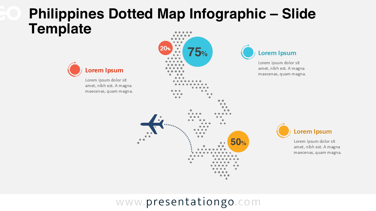
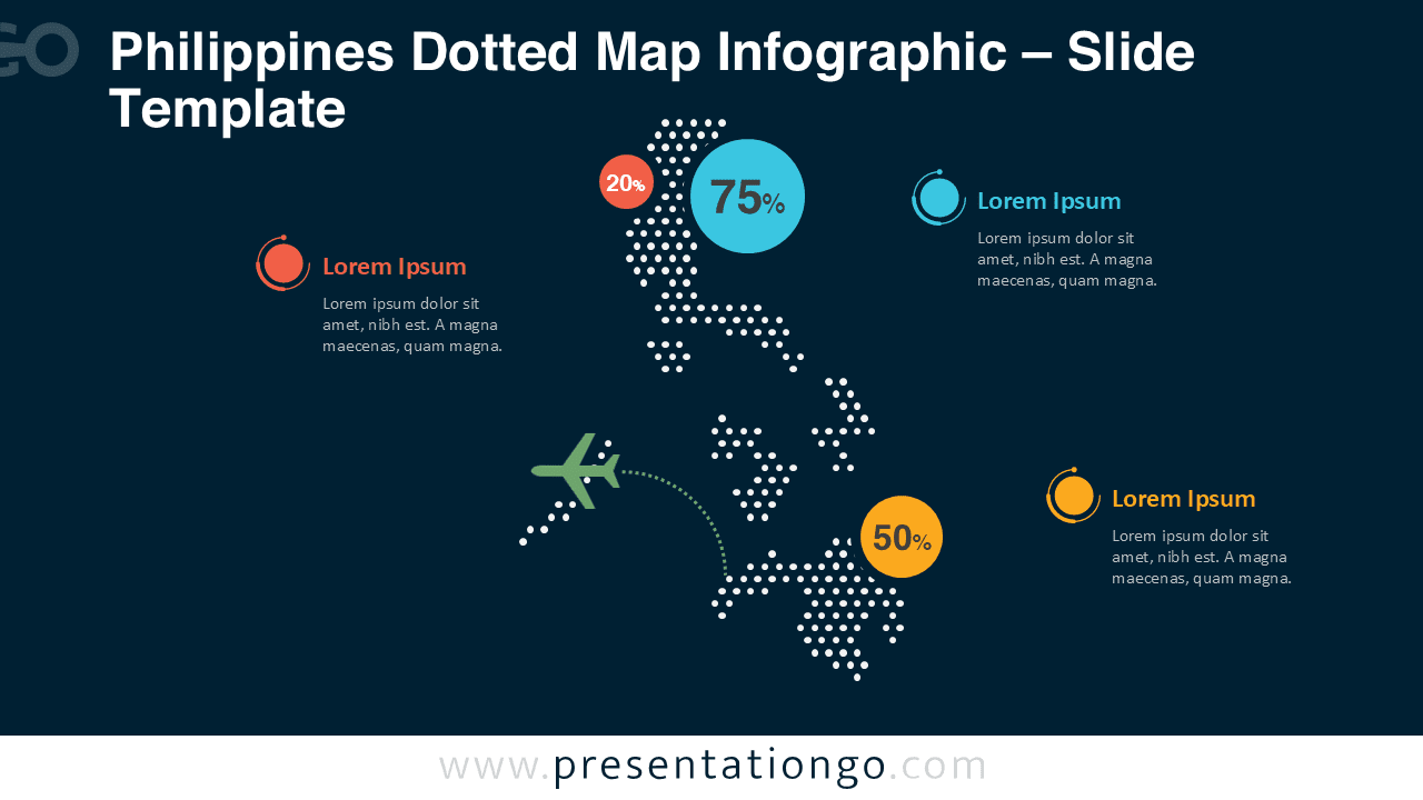
- Light and dark background versions included
- Compatible with PowerPoint and Google Slides
Design and Structure
The dotted structure creates a balanced visual rhythm while preserving the recognizable geography of the Philippines. The design avoids unnecessary decoration, allowing viewers to focus on the message rather than the styling. Both background versions ensure strong contrast and readability in different presentation environments.
Practical Applications
This dotted map infographic can be used for regional analysis, market coverage presentations, logistics planning, educational materials, tourism overviews, and public sector reporting. It adapts easily to both high-level summaries and detailed geographic explanations.
Summary
The Philippines Dotted Map Infographic offers a flexible and professional way to present geographic information. With editable elements, light and dark versions, and full compatibility with PowerPoint and Google Slides, it provides a reliable solution for location-based communication.