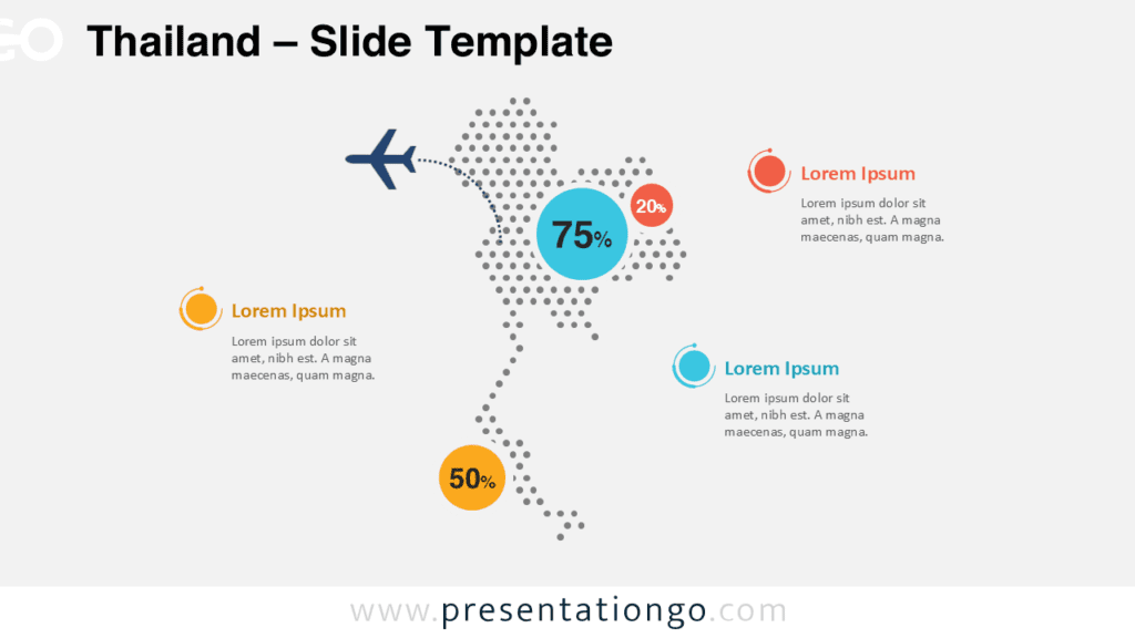
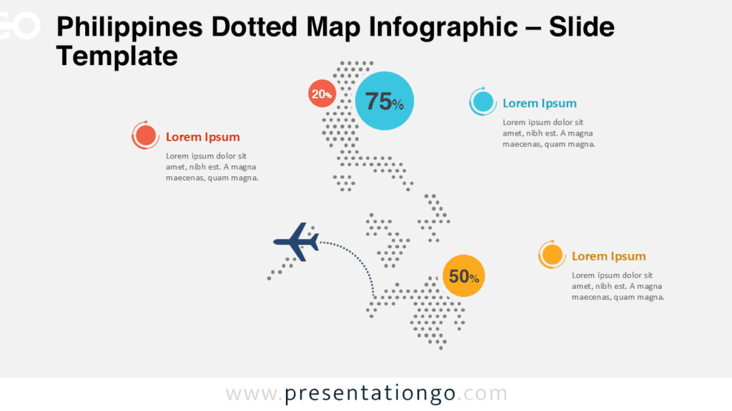
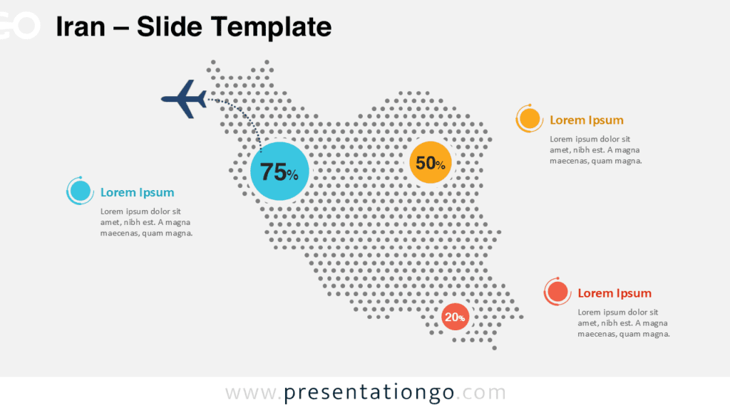
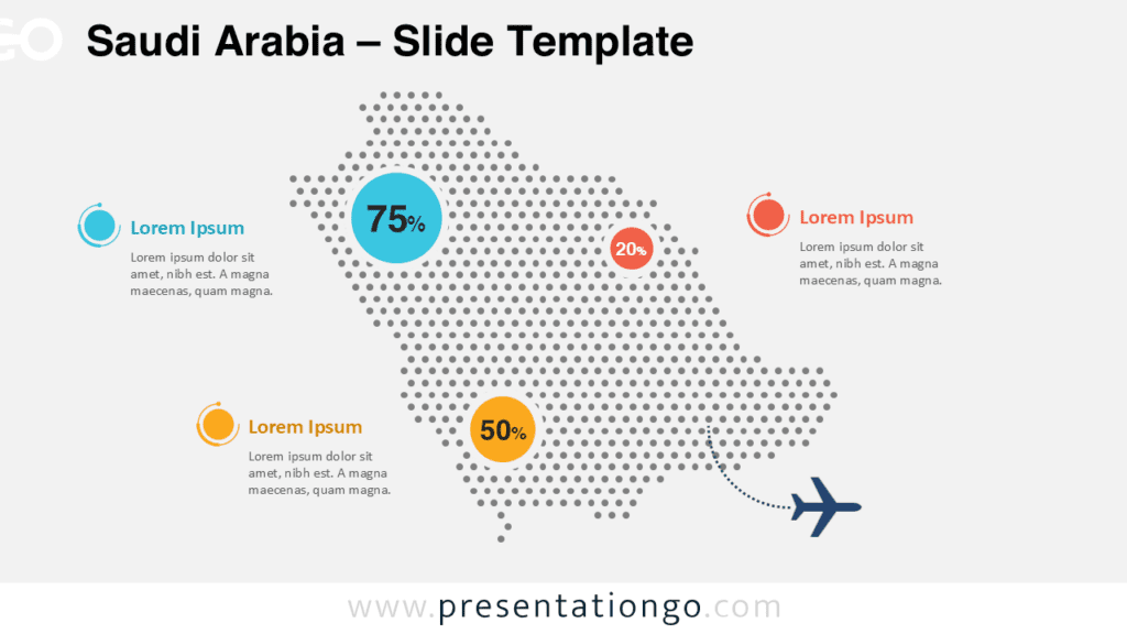
The Singapore Dotted Map Infographic gives your audience a clear view of the country at a glance. It combines a recognizable Singapore outline with dotted styling, bold data circles, and clean callout areas. You can use it in PowerPoint and Google Slides to present facts, locations, and regional insights with clarity.
Map Preview


This infographic places the map of Singapore at the center of the slide and surrounds it with clear text zones. The layout helps readers connect each statistic to a location or highlighted area without effort. Its simple structure keeps the content readable, even when you want to display several data points at once.
Features and Customization Options
- Editable dotted Singapore map layout
- Customizable percentage circles and text blocks
- Works in both PowerPoint and Google Slides
- Clean composition for data, geography, and business topics
- Suitable for professional, educational, and travel presentations
The design uses strong contrast, generous spacing, and a balanced composition to guide attention toward the most important numbers and notes. You can quickly adapt the text, data markers, and emphasis areas to match your presentation goals. This flexibility makes the infographic practical for both simple overviews and more detailed reporting.
Design Overview
This Singapore map infographic uses a dotted pattern to create a modern and structured visual. The central map shape stays easy to recognize while leaving enough room for supporting information around it. Large circular markers help key figures stand out, while the surrounding callouts provide space for explanations, labels, and additional context.
The composition also supports storytelling. You can move from geography to statistics and then to conclusions in a smooth sequence, which makes the slide useful for both quick summaries and deeper presentations. Because the layout feels organized and direct, it helps audiences understand each point without distraction.
Practical Applications
- Market analysis for Singapore-focused reports
- Tourism and travel presentations
- Education and geography lessons
- Logistics, transport, or route planning slides
- Corporate updates about operations in Singapore
Because the layout is flexible, you can use it for many audiences and topics. Teachers can explain place-based facts, business teams can present sales regions or expansion plans, and travel presenters can highlight destinations or visitor data. The same structure also works well for public information, demographic summaries, and operational reporting.
Summary
The Singapore Dotted Map Infographic offers a clean way to visualize country-specific information. It balances geographic context with clear data emphasis, which makes each point easier to understand. For PowerPoint and Google Slides users, it provides a practical and attractive solution for location-driven presentations.