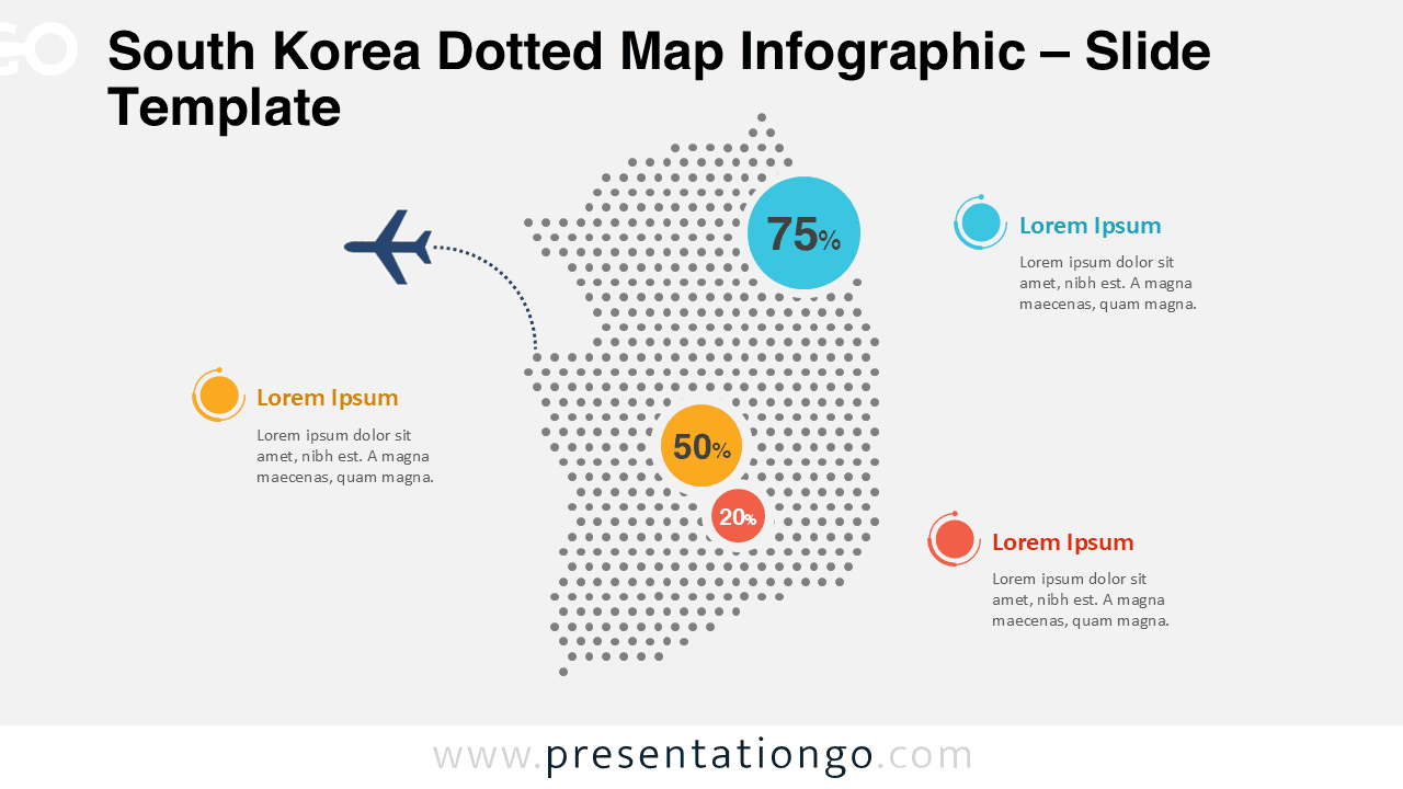
The South Korea Dotted Map Infographic is designed to help presenters visualize geographic data with clarity and precision. This slide uses a modern dotted map layout that highlights the country shape while leaving space for key metrics and annotations.
Whether you are preparing a business report, an academic presentation, or a market analysis, this infographic offers a clean and professional way to communicate regional insights.
Map Preview


Features and Customization Options
- Accurate dotted map representation of South Korea
- Editable shapes, colors, and data callouts
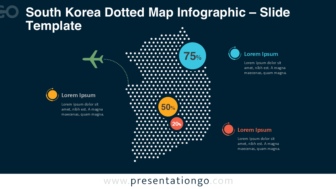
- Includes light and dark background versions
- Compatible with PowerPoint and Google Slides
- Easy-to-use layout for geographic data presentation
Design and Structure
The infographic is built around a central dotted silhouette of South Korea, ensuring immediate geographic recognition. Circular data markers and curved connectors draw attention to key statistics without overwhelming the layout.
The balanced composition works well on both light and dark backgrounds, maintaining strong contrast and readability. Accent colors help differentiate data points and guide the audience’s focus.
Practical Applications
- Market and business performance analysis
- Demographic and statistical reporting
- Logistics and transportation presentations
- Country profiles and regional overviews
- Educational and research-based slides
Summary
The South Korea Dotted Map Infographic provides a reliable and visually appealing solution for presenting geographic information. With its clean design and flexible editing options, it supports clear communication across business, education, and data-driven presentations.