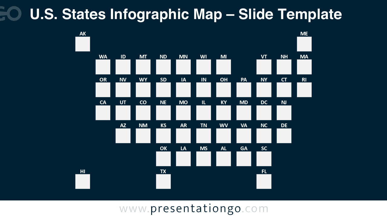
The U.S. States Infographic Map provides a grid-based visualization system featuring uniform square representations of all 50 states, designed for PowerPoint and Google Slides presentations.
A Clean Grid Map Layout to Present All 50 U.S. States
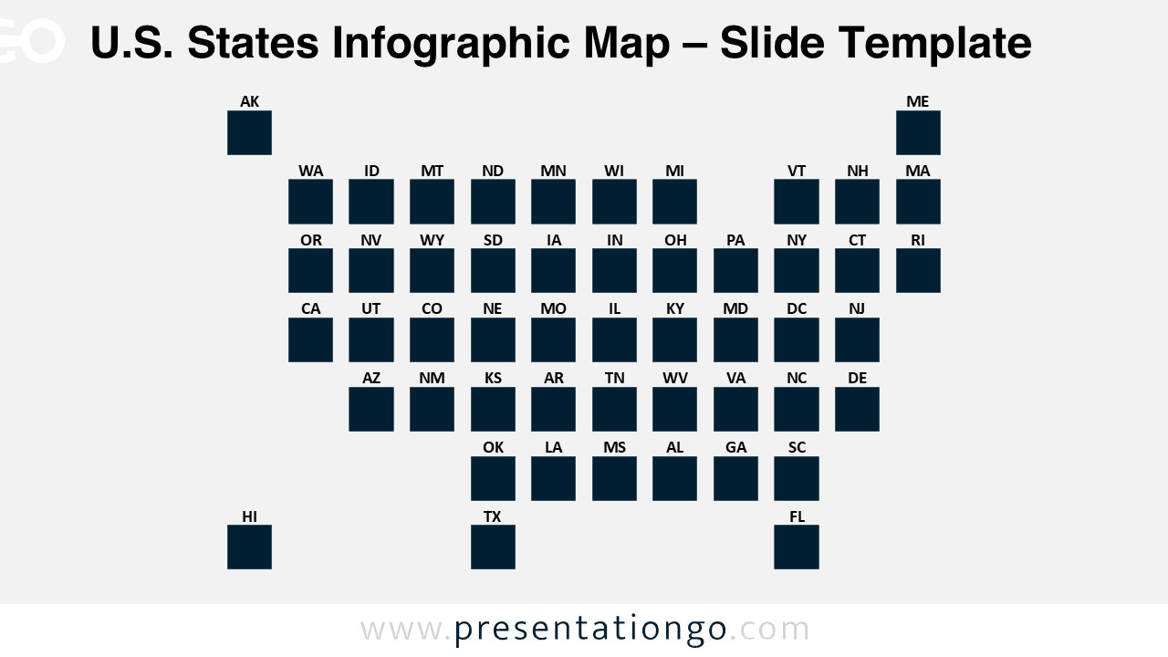
This template features a simplified and highly organized grid where each U.S. state appears as a uniform square. The grid arranges these squares clearly and consistently, and each one includes its official two-letter postal abbreviation. The design maintains an abstract sense of U.S. geography while offering equal visual space for all states. It places Alaska, Hawaii, and Maine outside the main grid to reflect their true geographic separation while keeping the layout clean and logical.
Presenters frequently use infographic maps to visualize geographical data, highlight regional trends, and simplify state-by-state comparisons. This grid-style map suits scenarios where spatial accuracy isn’t critical. Instead, its uniform layout ensures that every state receives equal attention, making it easier to highlight sales data, demographic differences, or political trends. For example, presenters might illustrate renewable energy adoption rates or variations in healthcare coverage across the country.
This download provides two fully editable slide layouts—one with a light background and one with a dark theme. The template includes labeled squares that users can customize with new shapes, colors, or icons. It supports both Standard (4:3) and Widescreen (16:9) formats and works in PowerPoint (PPTX) and Google Slides.
For example, when visualizing “Poverty Rate Percentage by State (2023),” you can easily modify the square colors to represent varying poverty levels. You can also replace the default squares with icons or even images. To learn how to do this, read our blog tutorial “How To Replace Existing Icons in A PowerPoint Slide.”

Download the 1-slide U.S. States Infographic Map to showcase clean and uniform comparisons across all 50 states.
Widescreen (16:9) size preview:


This template offers:
- 2 unique slides
- Options for both light and dark themes
- Pre-populated with icons and text placeholders
- Fully customizable shapes for complete control
- Available in both Standard (4:3) and Widescreen (16:9) ratios
- Offered in both PowerPoint PPTX and Google Slides formats