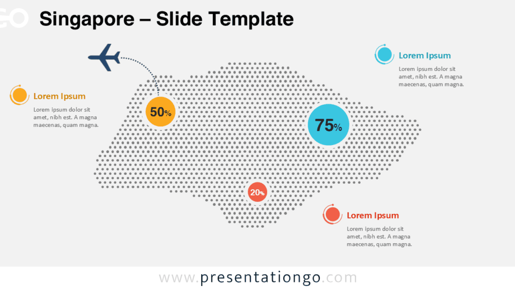
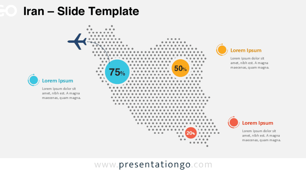
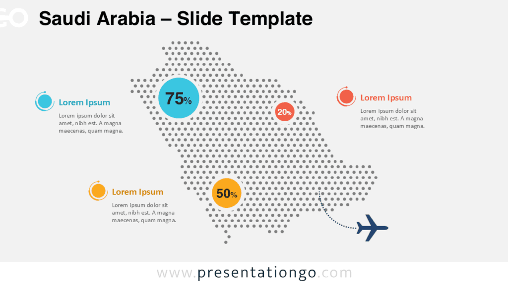
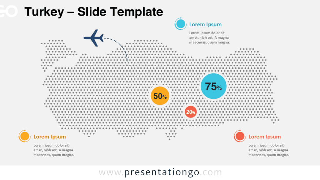
The Malaysia Dotted Map Infographic is a clean and professional visual solution designed to present country-level data with clarity and impact. Built for PowerPoint and Google Slides, this infographic helps transform complex regional information into an easy-to-understand geographic representation.
Using a modern dotted map style, the layout highlights both Peninsular Malaysia and East Malaysia while maintaining strong visual balance. The minimalist design ensures your data remains the focal point, making it suitable for business, education, and institutional presentations.
Dotted Map Preview
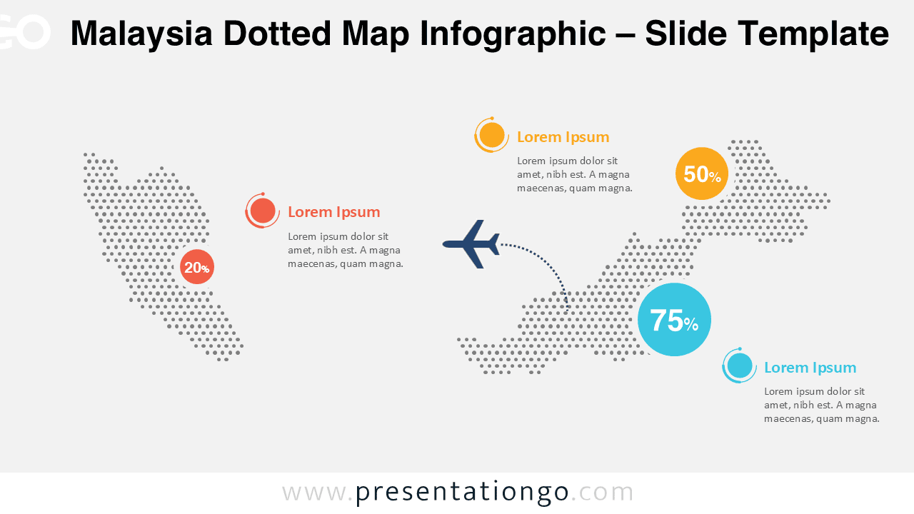
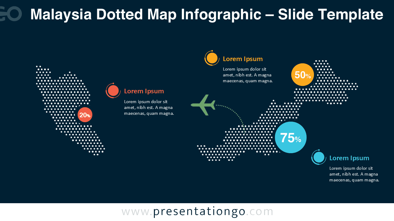
Diagram Features and Customization Options
- Fully editable dotted map vector shapes with clean, scalable elements
- Customizable arrows, connectors, and directional paths for routes or flows
- Editable callout circles and data markers for percentages and key values
- Flexible text placeholders for region labels, metrics, and descriptions
- Simple shape-based markers that can be replaced, recolored, or removed
- Includes both light and dark background versions for presentation flexibility
- Easy color customization to match corporate branding or themes
- Fully compatible with PowerPoint and Google Slides
Design and Structure Overview
The infographic uses evenly distributed dots to form a precise silhouette of Malaysia, creating a modern and data-friendly visual language. Strategic spacing allows room for annotations without clutter, while high-contrast color accents draw attention to key figures and regions.
Both slide versions share the same layout, ensuring consistency while allowing you to adapt the