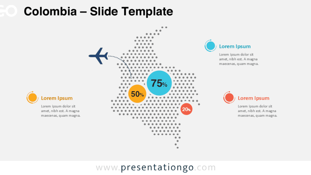
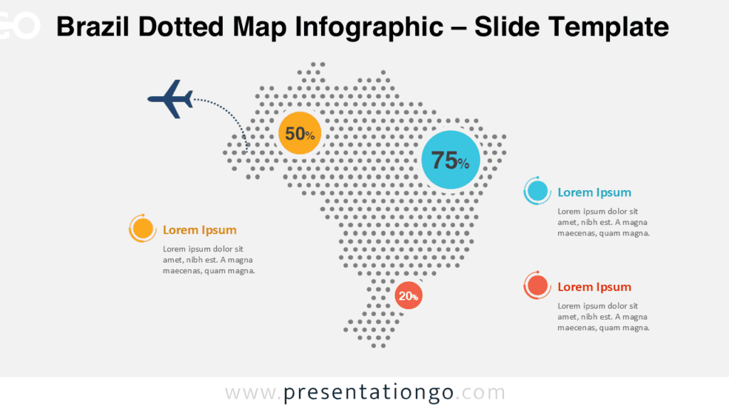
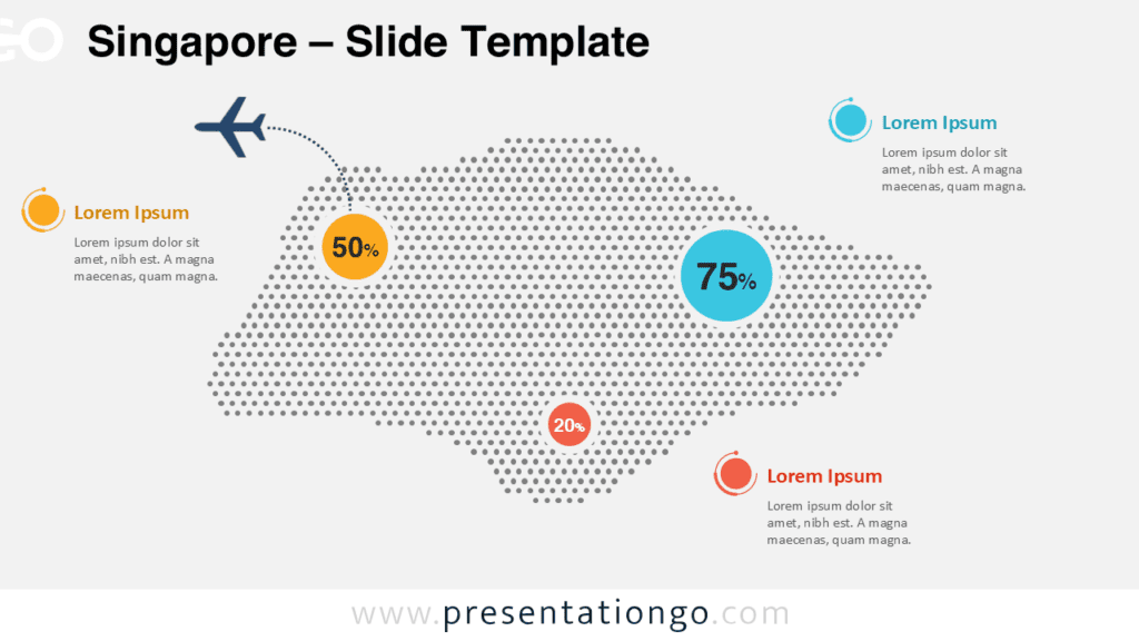
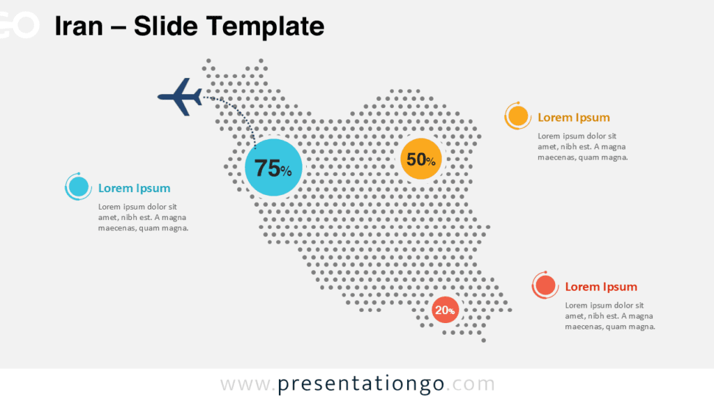
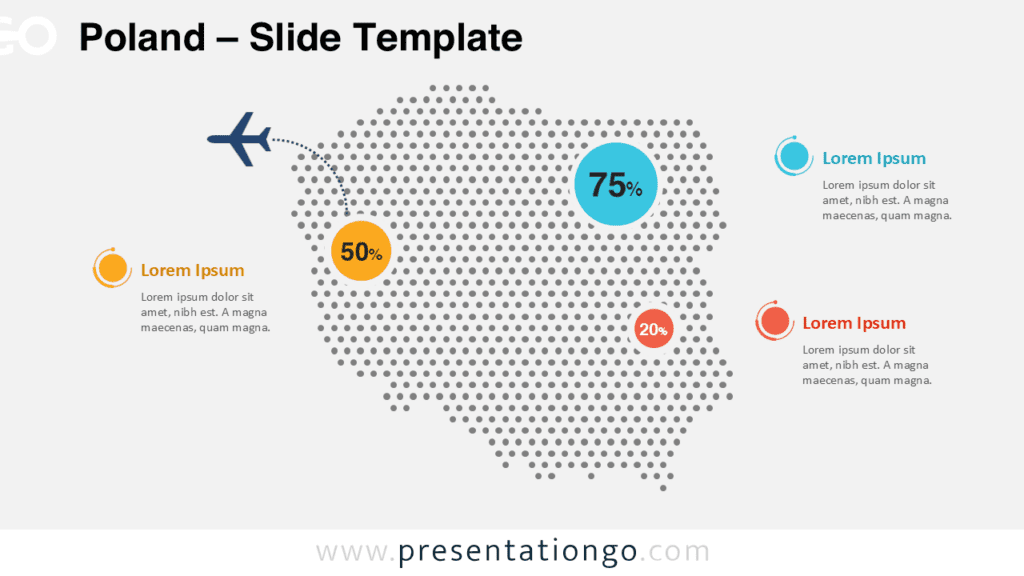
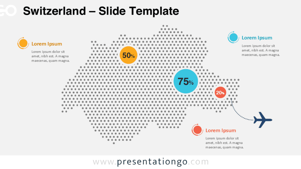
The Argentina Dotted Map Infographic is a clean and modern visual designed to help you present country-level data clearly and professionally. Built with a dotted map layout, this infographic allows you to highlight statistics, locations, or key insights related to Argentina in a visually engaging way. It works seamlessly in both PowerPoint and Google Slides, making it ideal for business, academic, and institutional presentations.
Map Preview
Features and Customization Options
- Editable dotted map shapes for full customization
- Editable arrows and connector lines
- Editable text placeholders for labels and data points
- Includes editable icon placeholders
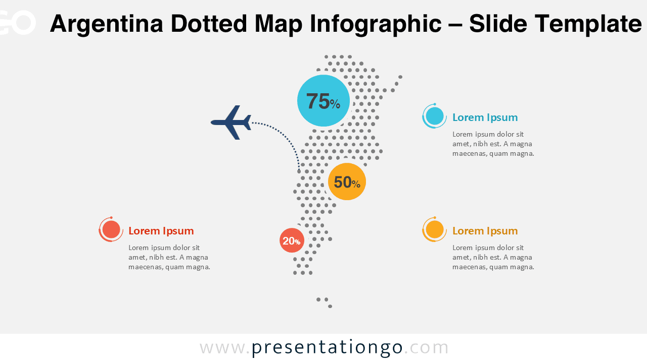
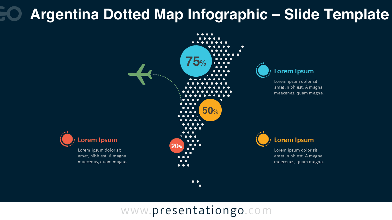
- Light and dark background versions included
- Compatible with PowerPoint and Google Slides
Design and Structure
This infographic uses a precise dotted pattern to form the silhouette of Argentina, creating a balanced and modern geographic layout. Circular markers are used to display percentages or key figures, while connector lines help guide attention to important data points. The high-contrast color palette ensures excellent readability on both light and dark backgrounds.
Practical Applications
- Country-level statistics and data visualization
- Market analysis and regional performance reports
- Logistics, transportation, and supply chain mapping
- Economic, demographic, or social data presentations
- Business reports, dashboards, and strategy decks
Summary
The Argentina Dotted Map Infographic offers a flexible and professional way to visualize geographic data. With fully editable elements and compatibility with PowerPoint and Google Slides, it adapts easily to a wide range of presentation needs. Its clean design and dual background options make it a reliable choice for clear and impactful communication.