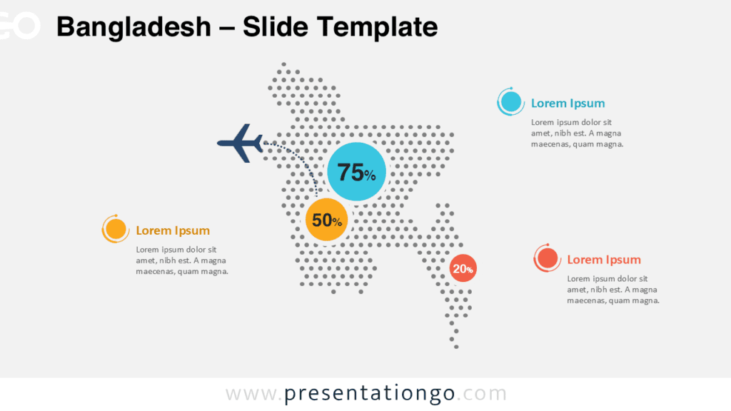
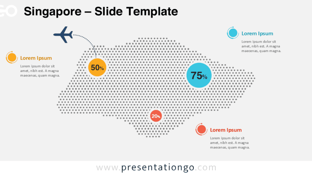
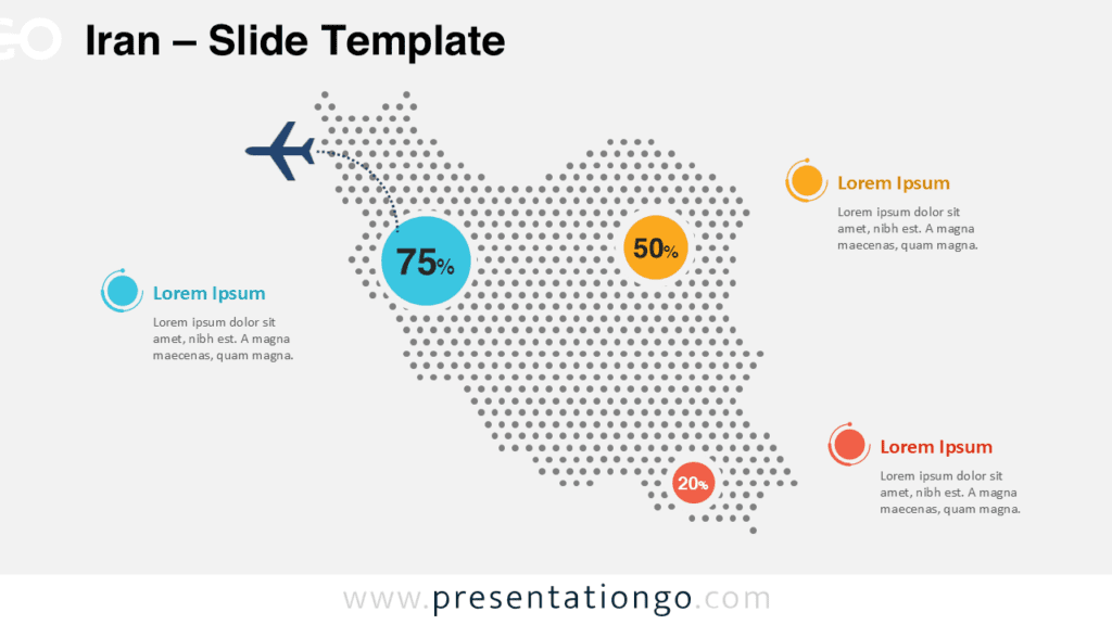
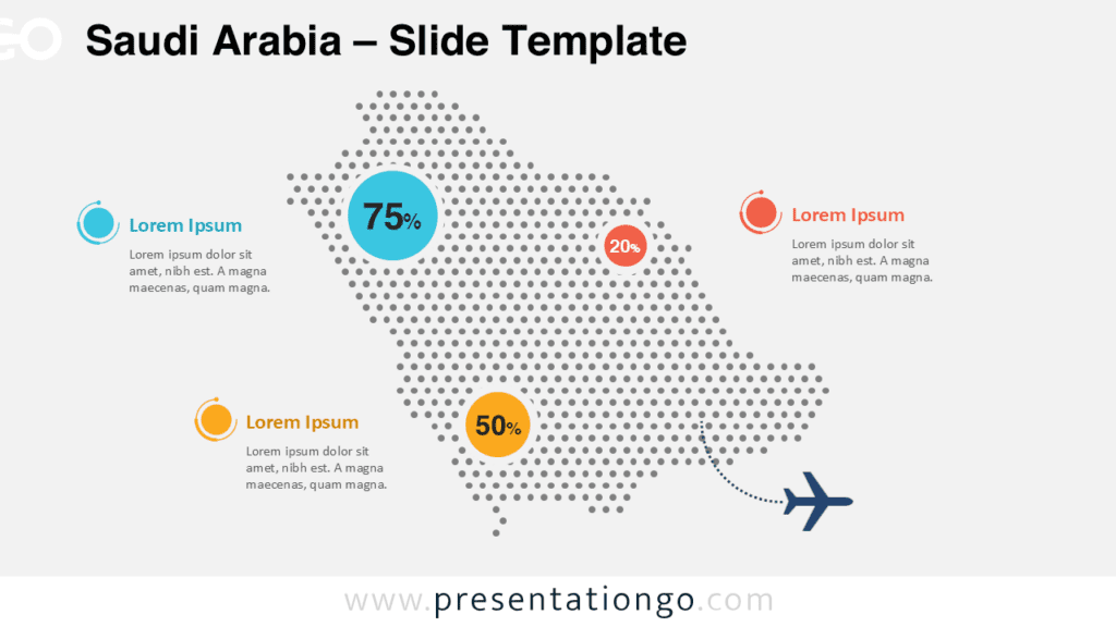
The India Dotted Map Infographic is a clean and modern visual tool designed to help you present geographic data clearly and professionally. Built with a dotted country silhouette, this infographic allows presenters to highlight regional insights, percentages, and key metrics without overwhelming the audience.
The layout works perfectly for business reports, educational content, and strategic presentations where clarity and visual balance matter.
Map Preview
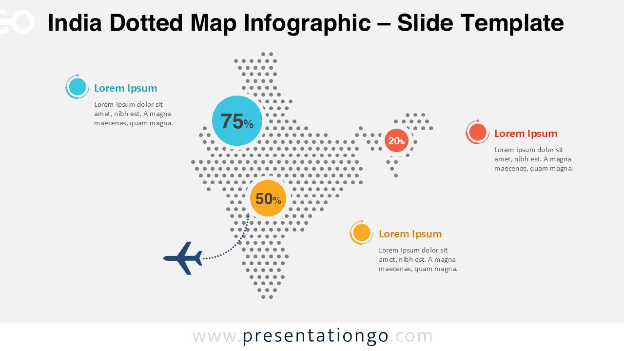
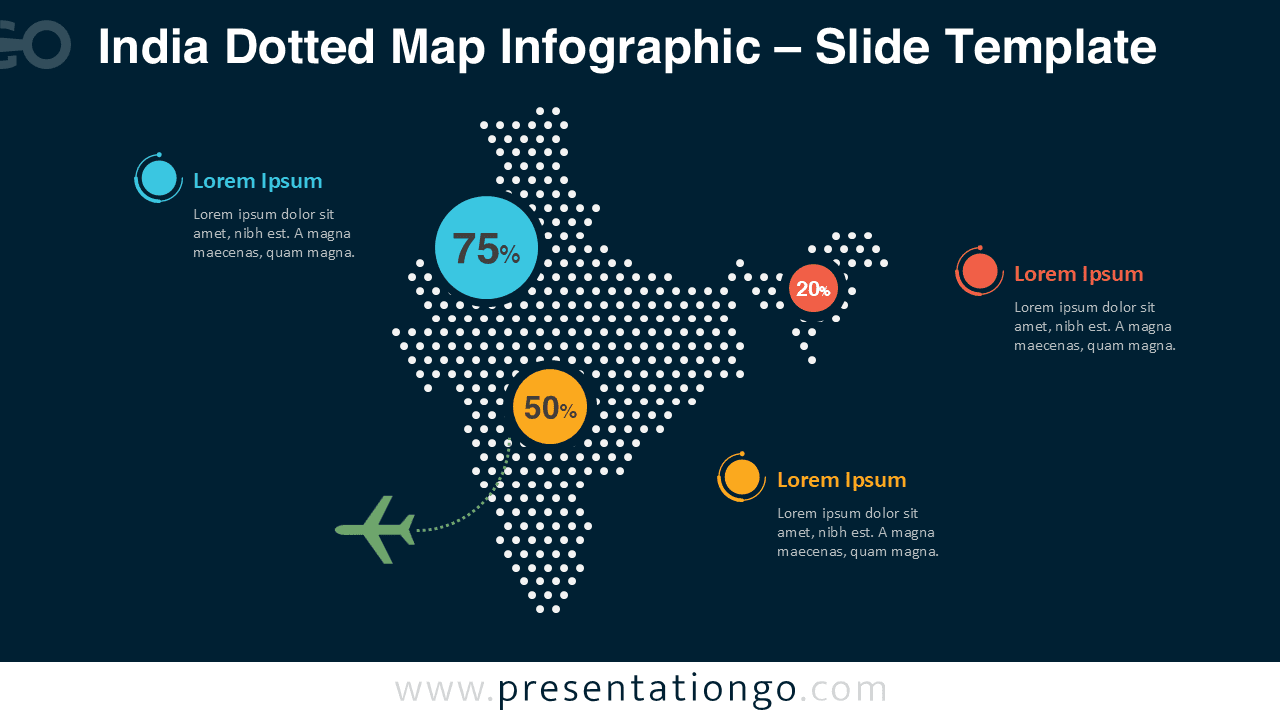
The infographic includes two visual versions, optimized for light and dark slide designs, ensuring strong contrast and excellent readability in any presentation context.
Features and Customization Options
- Fully editable dotted map of India
- Customizable colors for dots, callouts, and data circles
- Editable percentage values and text placeholders
- Optimized for both light and dark presentation backgrounds
- Compatible with PowerPoint and Google Slides
Design and Structure
The map uses evenly spaced circular dots to form the shape of India, creating a modern and neutral visual style. Data points are emphasized with circular markers and clear numeric percentages, connected to the map with subtle dotted lines.
This structure guides attention naturally while keeping the slide clean and professional.
Practical Applications
- Market analysis and regional performance reporting
- Logistics, transportation, and infrastructure presentations
- Educational geography or demographic lessons
- Business expansion and country overview slides
- Statistical summaries and data-driven storytelling
Summary
The India Dotted Map Infographic provides a flexible and visually appealing way to communicate geographic information.
With its editable layout and compatibility with PowerPoint and Google Slides, it is a practical solution for professionals, educators, and analysts.