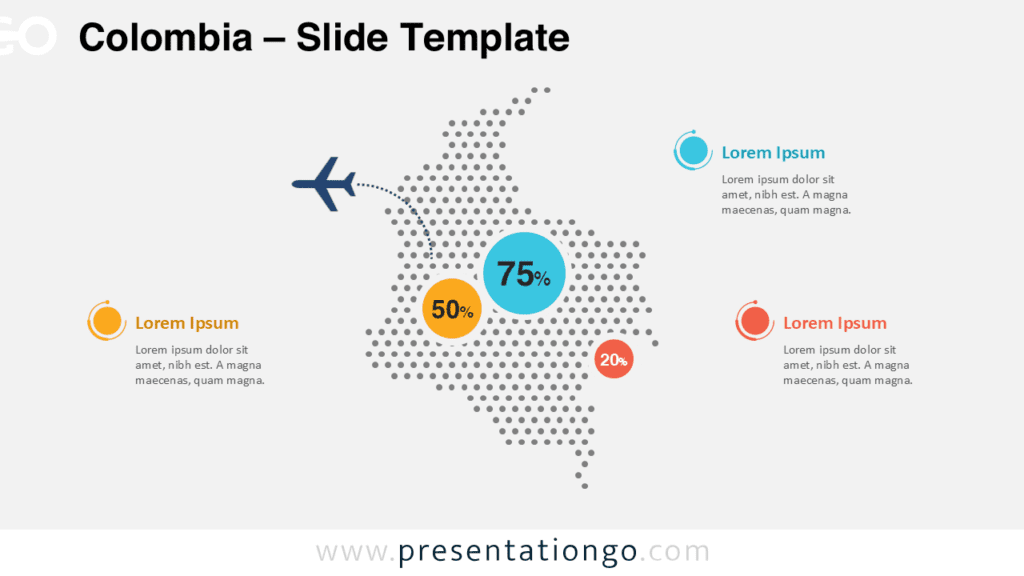
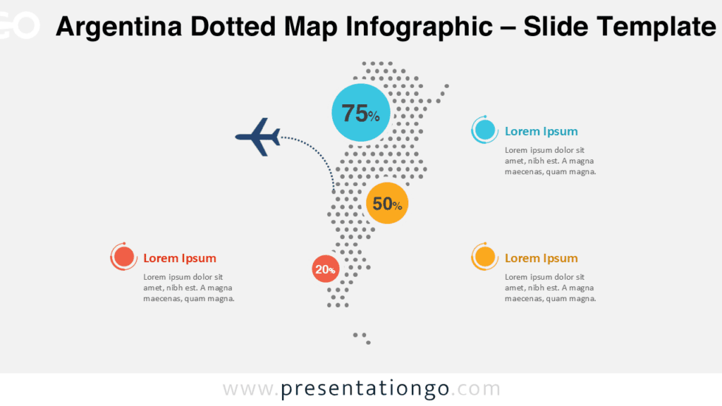
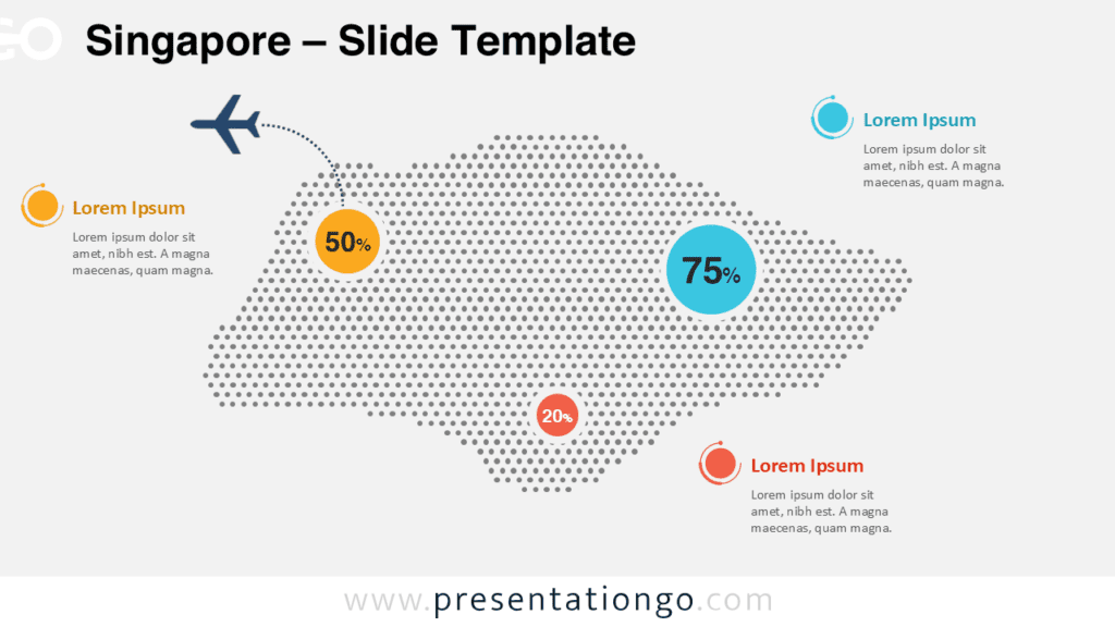
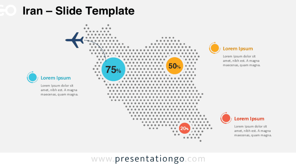
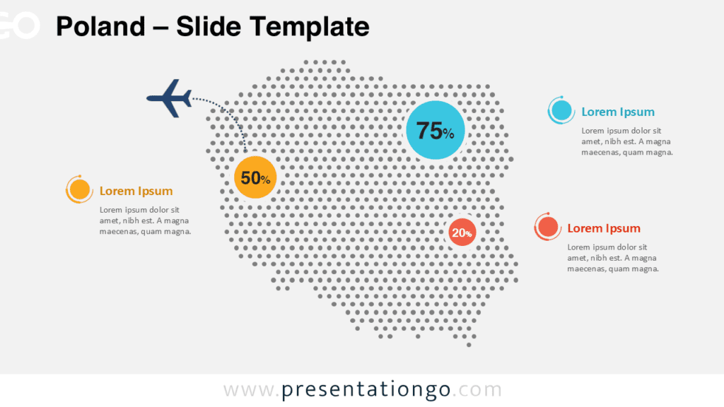
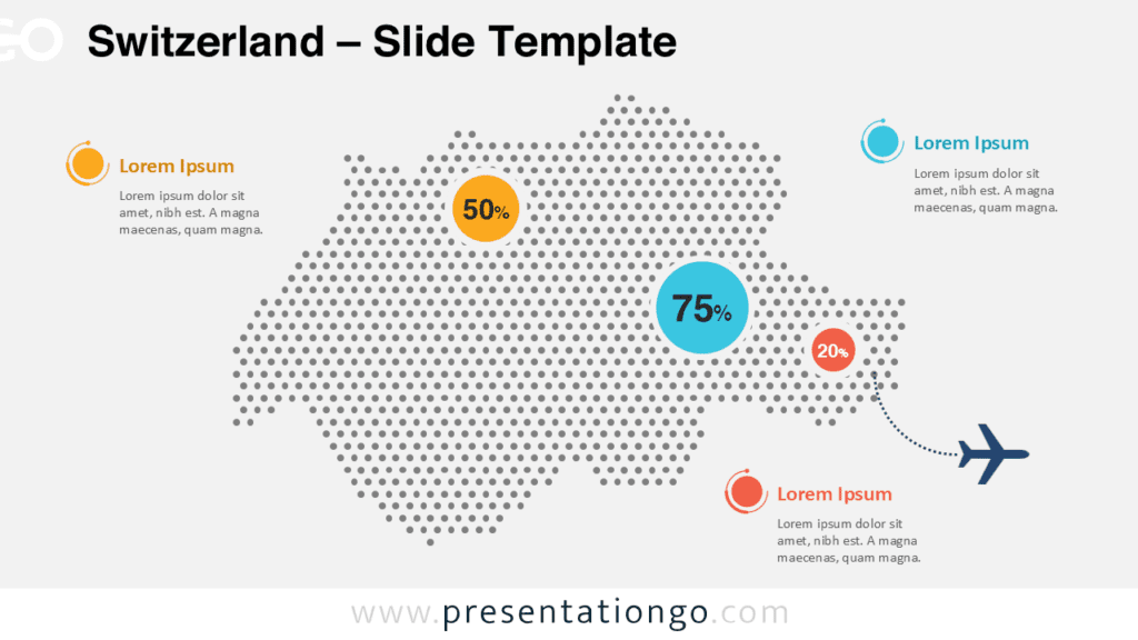
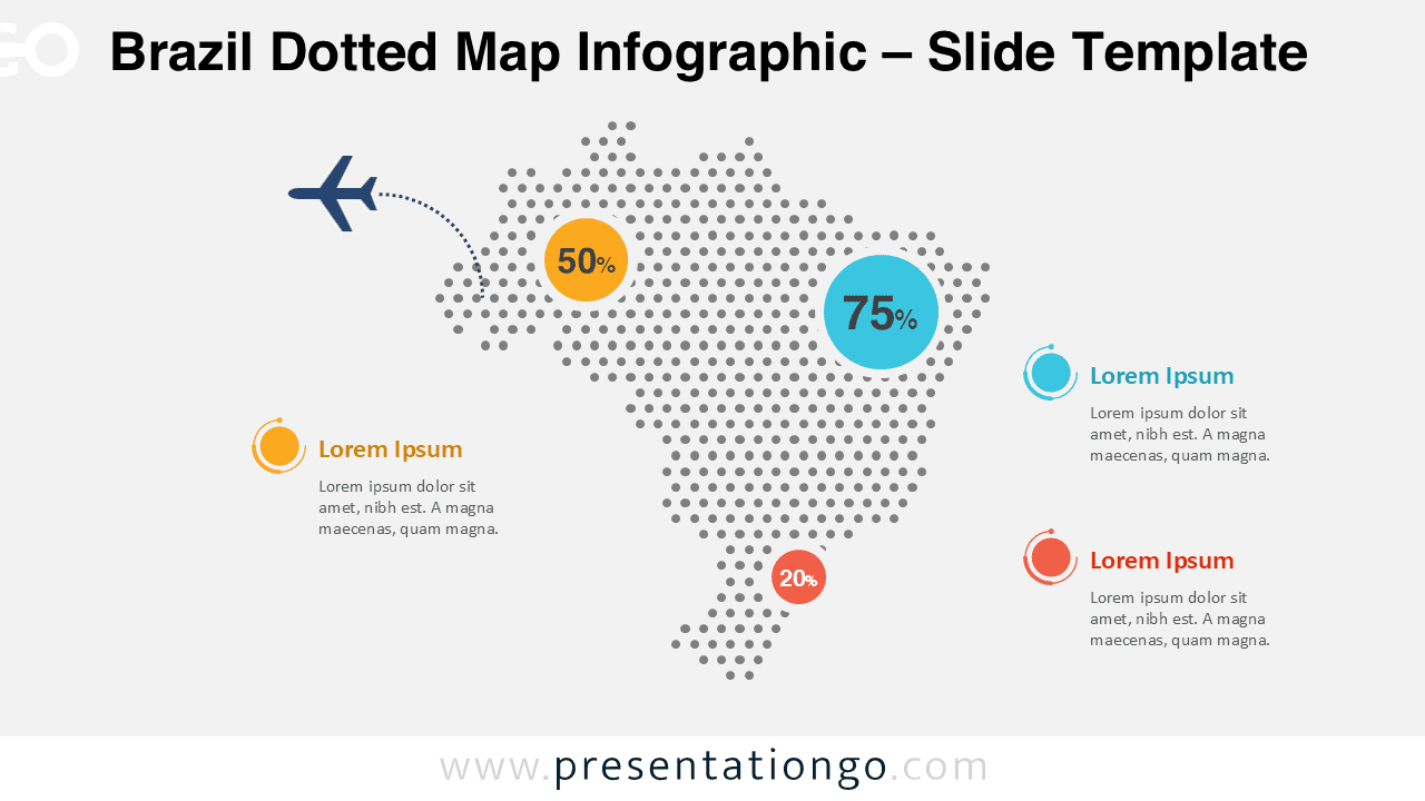
The Brazil Dotted Map Infographic is a clean and professional visual designed to help presenters communicate geographic data with clarity and impact.
Built with evenly spaced dots forming the recognizable outline of Brazil, this infographic offers a modern alternative to traditional solid maps.
Map Preview
Features and Customization Options
- Editable dotted map of Brazil with precise country shape
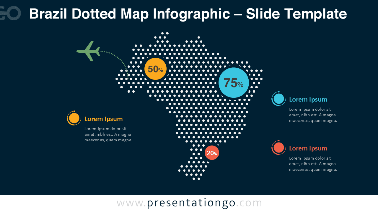
- Light and dark slide versions for flexible presentation use
- Customizable colors, text, and data markers
- Designed for PowerPoint and Google Slides compatibility
- Clear layout optimized for geographic data visualization
Design and Structure
This infographic uses a dot-based construction to create a balanced and contemporary map of Brazil. Accent colors highlight key data points, while circular markers draw attention to important percentages or metrics.
The minimalist design ensures your message stays focused on the data without unnecessary visual noise.
Practical Applications
- Market and regional analysis in Brazil
- Business reports and strategic presentations
- Educational geography lessons
- Demographic and statistical data visualization
- Logistics, operations, and expansion planning
Summary
The Brazil Dotted Map Infographic provides a clear and visually engaging way to present country-level information. Its modern dot style and flexible customization options make it a reliable choice for professional and educational presentations.