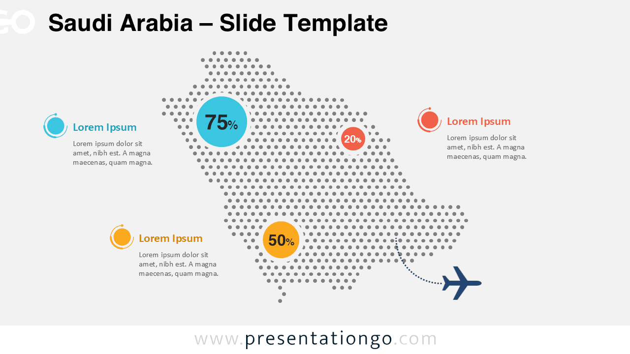
The Saudi Arabia Dotted Map Infographic provides a modern and visually engaging way to present geographic data and regional insights. Designed for PowerPoint and Google Slides, this infographic uses a clean dotted map layout to represent the shape of Saudi Arabia while highlighting key statistics and information directly on the map.
This infographic allows presenters to emphasize regional performance, market data, logistics routes, or demographic insights in a simple and professional visual format. The dotted map style creates a contemporary look that works well in business, academic, and government presentations.
Diagram Preview
Features and Customization Options
- Editable Saudi Arabia dotted map graphic
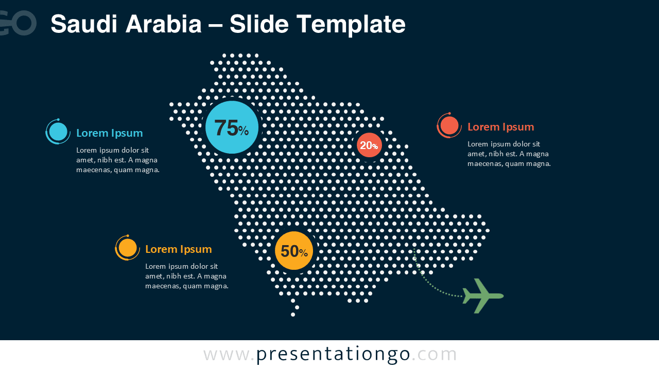
- Includes both light and dark slide versions
- Three highlighted data points for statistics or insights
- Fully customizable shapes and colors
- Editable text placeholders for descriptions
- Vector-based graphics for easy resizing
- Compatible with PowerPoint and Google Slides
Design and Structure
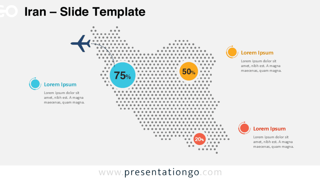
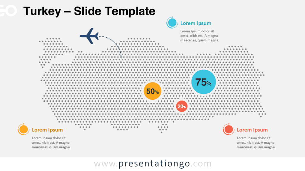
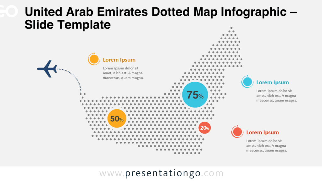
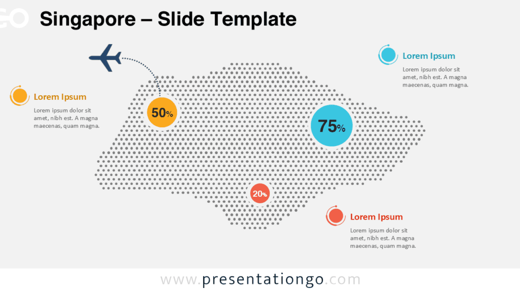
The infographic centers on a dotted representation of Saudi Arabia, constructed using evenly spaced circular markers to form the country’s silhouette. This design style keeps the map minimal while still maintaining clear geographic recognition.
Three circular data markers appear directly on the map to display percentages or numerical values. These markers connect visually to text descriptions positioned around the map, allowing presenters to explain regional statistics or insights clearly.
The layout balances the map and explanatory text so audiences can quickly understand the relationship between geographic locations and the accompanying data. A travel-inspired visual element can also illustrate transportation routes, tourism flows, or international connections.
Practical Applications
- Saudi Arabia market analysis presentations
- Regional economic or demographic reports
- Logistics and transportation route visualizations
- Tourism and travel industry presentations
- Government or policy analysis briefings
- Business expansion planning in the Middle East
Summary
The Saudi Arabia Dotted Map Infographic helps presenters communicate geographic insights clearly and effectively. Its clean dotted design, highlighted data markers, and editable layout make it easy to adapt for many presentation scenarios.
Whether you need to explain market distribution, highlight regional statistics, or illustrate transportation routes, this infographic provides a professional and visually appealing solution for PowerPoint and Google Slides presentations.