The Four-Tier Comparison PowerPoint Diagram helps you compare four options across several criteria in one clear slide. Its stacked horizontal layout keeps every tier distinct while preserving a consistent reading pattern. Use it for service levels, departments, packages, programs, or any structured four-part comparison.
Each tier includes dedicated space for a main label and three supporting information areas. This structure makes detailed comparisons easier to scan without turning the slide into a dense table.
Diagram Preview
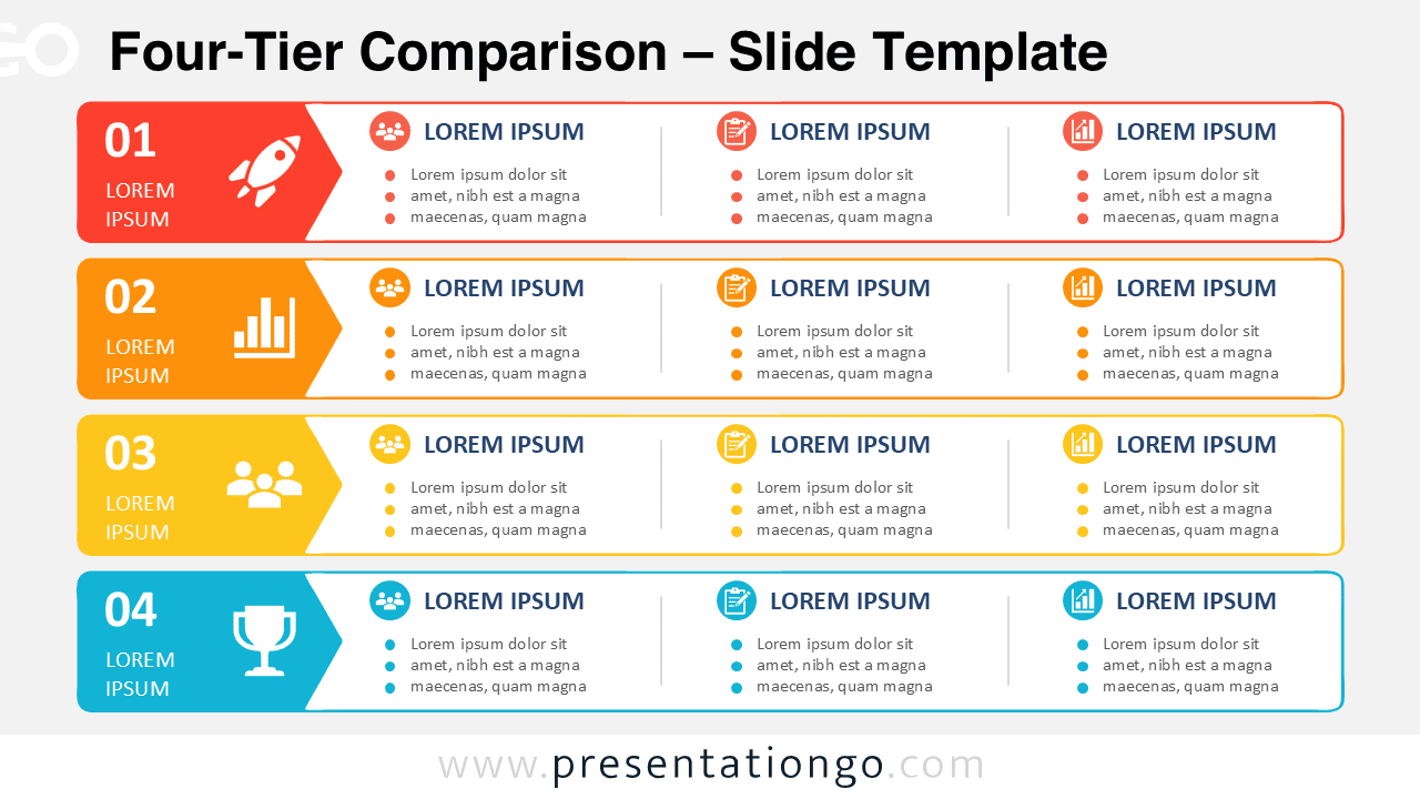
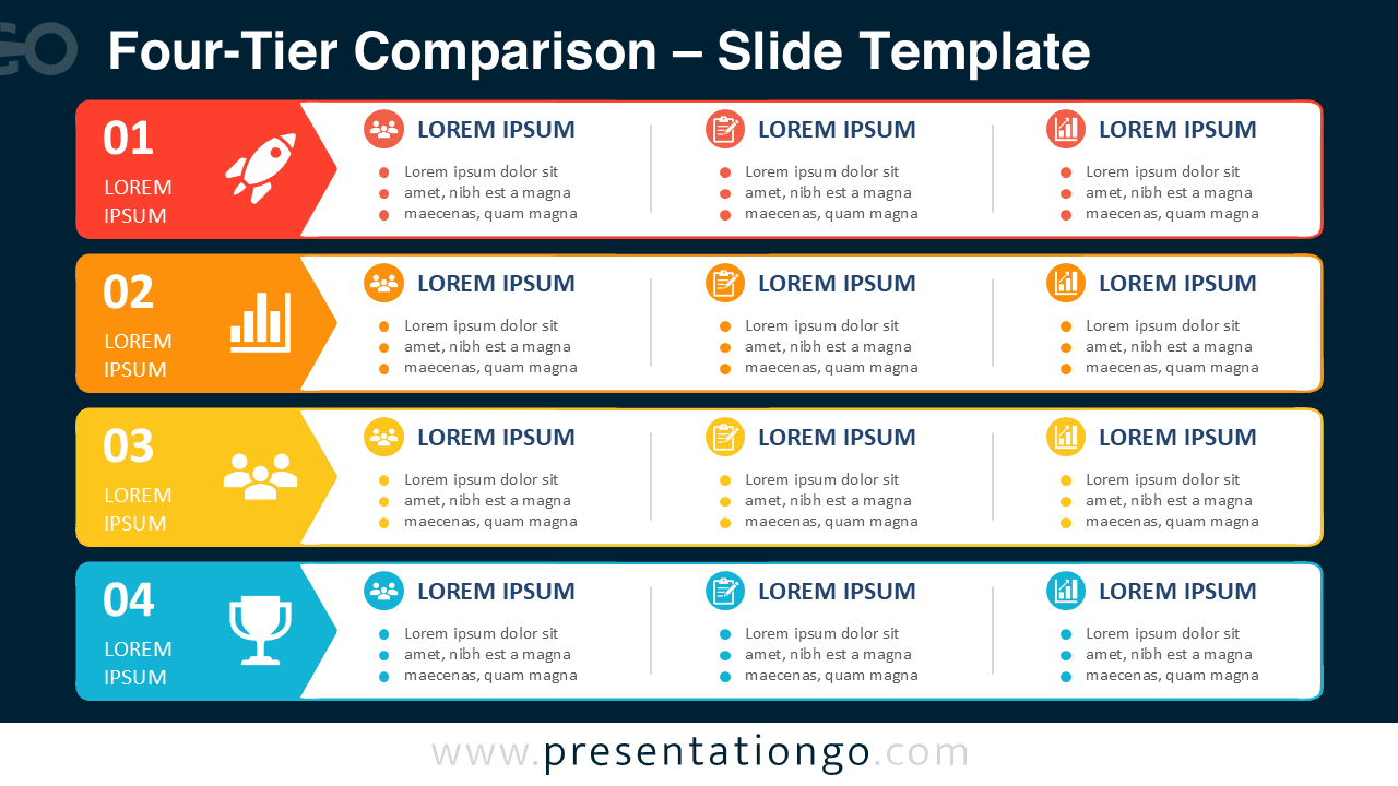
The diagram arranges four horizontal cards in a vertical stack. Each card starts with a prominent tier label and continues with three aligned content columns. You can use those columns for categories such as target audience, key deliverables, expected ROI, responsibilities, benefits, or performance criteria.
Because every row follows the same structure, viewers can compare information horizontally and vertically. The repeated format also helps maintain visual consistency when each tier contains different amounts of information.
Features and Customization Options
- Compatible with Microsoft PowerPoint and Google Slides
- Four-tier comparison diagram, fully editable
- Editable text, shapes, sizes, and icon placeholders
- Office library icons are included for illustration purposes only
- Icons are easy to recolor, resize, or replace
- Includes both light and dark background versions
Design and Structure
The Four-Tier Comparison PowerPoint Diagram uses four full-width horizontal rows with equal spacing between them. A dedicated label area anchors the left side of every row. The larger content area then divides into three consistent columns for supporting information.
This arrangement combines the clarity of a comparison table with the visual hierarchy of an infographic. Large tier labels help viewers navigate the slide quickly, while headings and bullet points provide room for supporting details.
Practical Applications
- Compare four service packages or subscription tiers
- Present responsibilities across four departments
- Organize four levels of a customer segmentation model
- Compare audiences, deliverables, and expected results
- Present four stages of a maturity framework
- Summarize product plans or membership levels
- Structure four strategic priorities with supporting criteria
- Compare business units using consistent evaluation categories
Summary
The Four-Tier Comparison PowerPoint Diagram provides a practical way to organize detailed information across four clearly defined levels. Its repeated row structure supports quick comparisons while keeping multiple criteria aligned and easy to follow.
You can adapt the labels, headings, text, shapes, and icon placeholders to match your own content. The result works well for business, strategy, marketing, operations, consulting, and other presentations that require a structured four-option comparison.