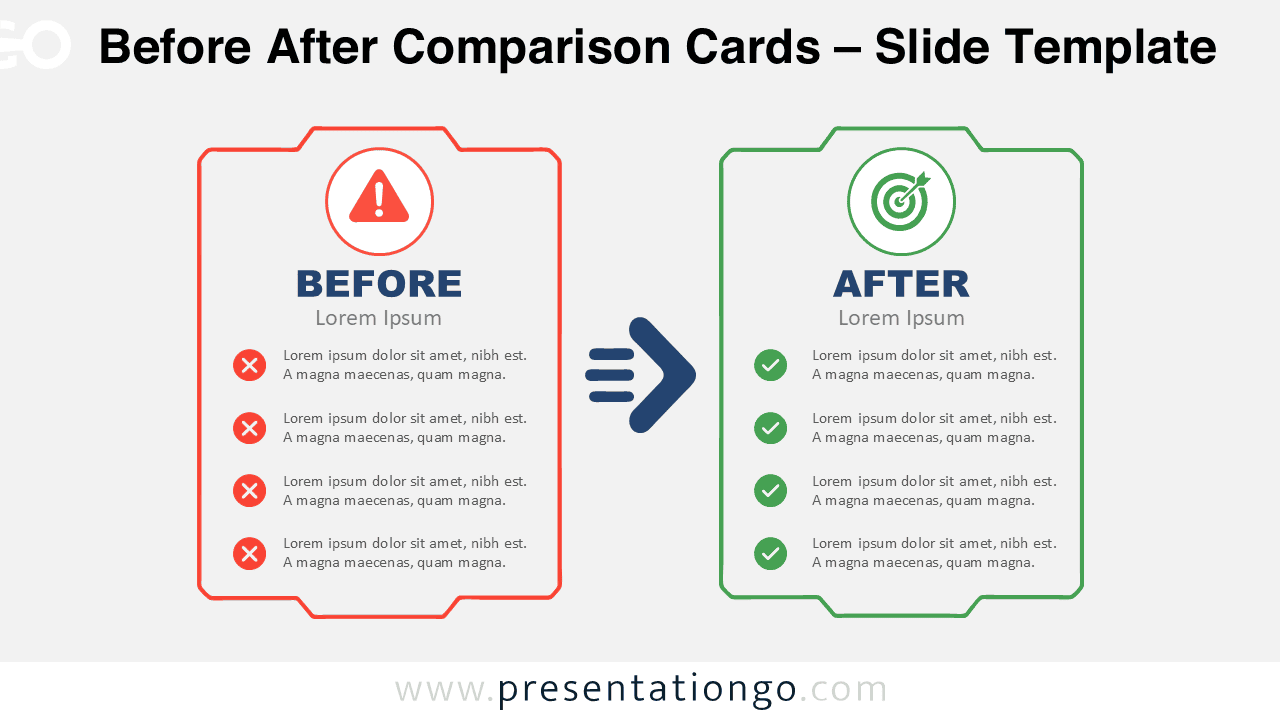
The Before After Comparison Cards diagram provides a simple way to communicate change between two clearly defined states. It places the current situation on the left and the improved situation on the right. A central arrow creates a natural visual flow between both sides. The layout works especially well when you need to explain transformation without overloading the slide.
You can use the diagram in PowerPoint and Google Slides for business, operational, technical, or strategic presentations. Each card provides space for a heading, supporting text, and four concise points. This structure keeps the comparison focused while giving each side equal visual importance.
Diagram Preview
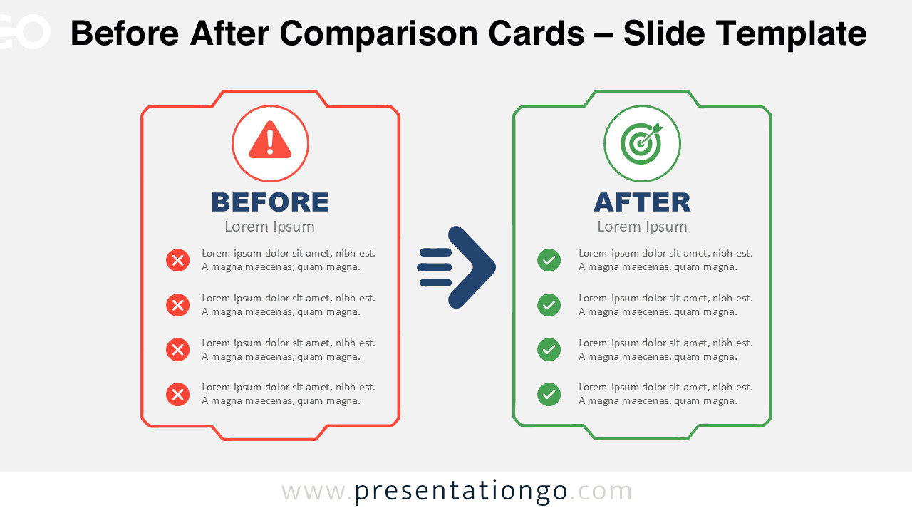
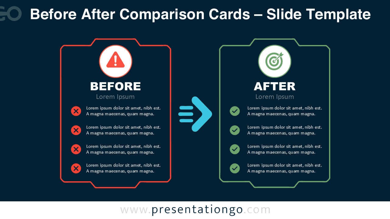


The Before After Comparison Cards layout combines two matching content panels with a directional transition element. The left card can describe an existing condition, challenge, or process. The right card can present the desired result, improved process, or future state. This familiar structure helps audiences understand the relationship quickly.
Features and Customization Options
- Compatible with Microsoft PowerPoint and Google Slides
- 2 slides × 2 backgrounds
- Editable text, shapes, colors, and icon placeholders
- Office library icons for illustration purposes only
- Icons are easy to modify, recolor, resize, or replace
- Includes both light and dark background versions
Design and Structure
The diagram uses a balanced side-by-side composition that makes differences easy to scan. Each card contains four supporting points beneath a prominent state label. A large directional arrow separates the cards and reinforces the idea of movement from one condition to another.
The Before After Comparison Cards design supports short, focused content rather than dense explanations. You can replace the sample labels with terms such as As-Is and To-Be, Current and Future, Problem and Solution, or Old and New. Editable elements let you adapt the diagram to different presentation contexts while preserving its clear visual hierarchy.
Practical Applications
- Compare current-state and future-state processes
- Present business transformation initiatives
- Explain workflow improvements
- Show legacy versus modern systems
- Contrast problems with proposed solutions
- Illustrate operational improvements
- Communicate change-management goals
- Summarize before-and-after project results
Summary
Before After Comparison Cards help presenters explain transformation through a direct two-state comparison. The combination of matching cards, concise content areas, and a central transition arrow keeps the message easy to follow. The layout works across many business and professional topics.
Because the text, shapes, icons, and main visual elements are editable, you can quickly adapt the diagram for your own story. Use it whenever your presentation needs to show where something started, what changed, and where it is heading.