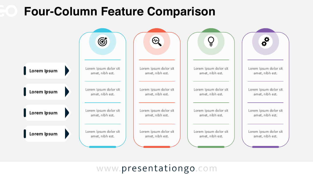
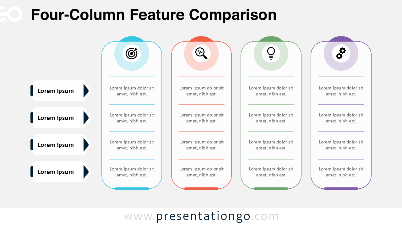
The Four-Column Feature Comparison diagram is designed to help presenters compare multiple items, services, or ideas in a clear and structured way.
This diagram works perfectly in both PowerPoint and Google Slides, offering an intuitive layout that supports decision-making and analytical discussions.
Diagram Preview


Features and Customization Options
- Four vertical columns for clear side-by-side comparison
- Editable text areas for features, benefits, or specifications
- Includes editable icon placeholders for visual clarity
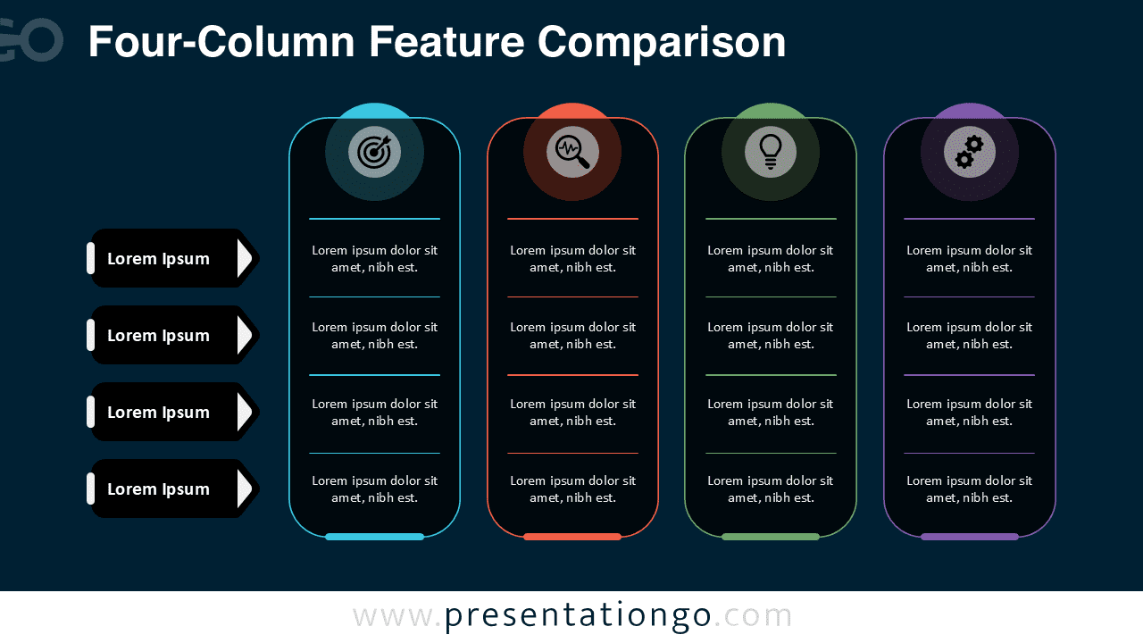
- Available in light and dark background versions
- Fully customizable colors, shapes, and typography
Design and Structure
The layout is built around four rounded vertical columns, each representing a separate item or category. Icons at the top of each column provide immediate visual cues, while horizontal dividers help organize information into digestible sections. The balanced spacing and consistent alignment ensure that comparisons remain easy to read, even when detailed information is presented.
Practical Applications
- Product or service feature comparisons
- Pricing plan or offer differentiation
- Strategy or solution evaluation
- Marketing and sales presentations
- Training and educational comparisons
Summary
The Four-Column Feature Comparison diagram offers a professional and flexible way to present comparisons visually. Its clean structure, editable icons, and dual background versions make it a reliable choice for business, marketing, and strategic presentations.