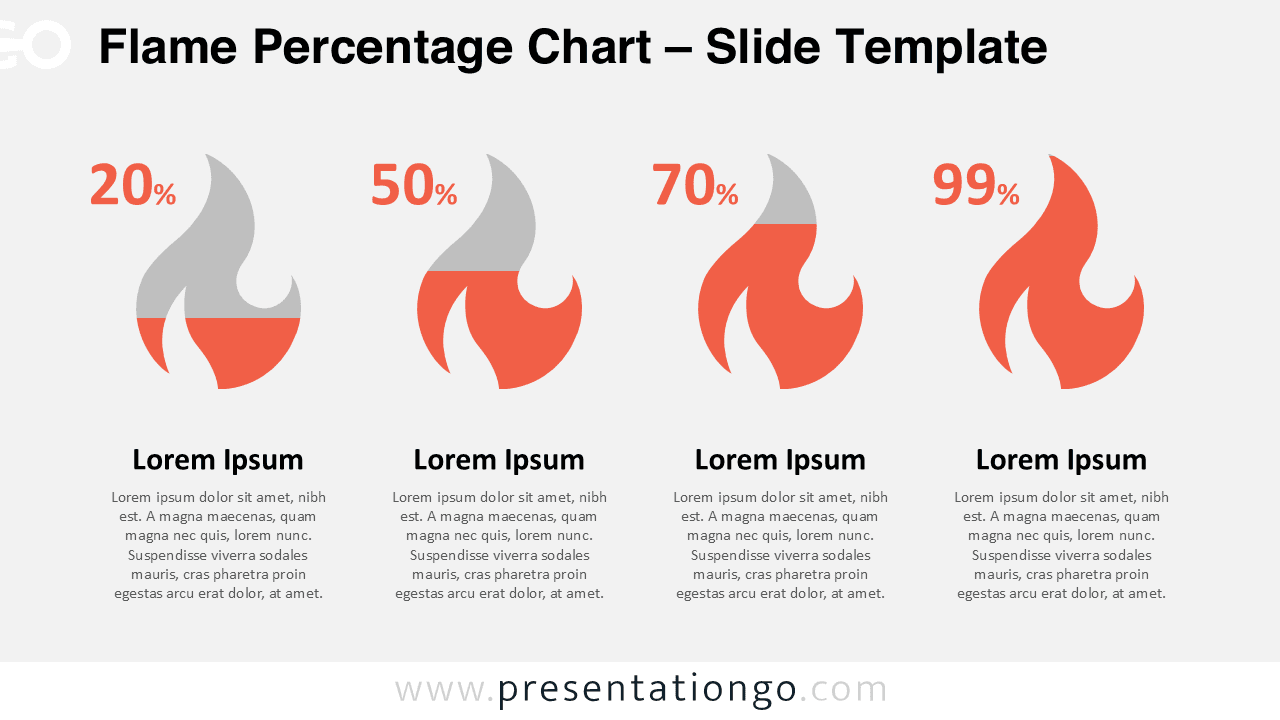
The Flame Percentage Chart for PowerPoint is a free data-driven diagram that turns four percentages into an intuitive visual story. Instead of standard bars or columns, this slide uses stylized flame shapes that rise with your values, instantly suggesting intensity, urgency, or energy. Each flame displays a percentage on top and a short description underneath, which helps your audience understand the numbers and compare them at a glance. This template is designed exclusively for Microsoft PowerPoint and is not available as a Google Slides version.
Template Preview


Features & Customization
- Single-slide data-driven chart that links directly to an Excel worksheet in PowerPoint
- Four editable flame placeholders that adapt to your percentage values
- Includes light and dark background options for different presentation styles
- Fully customizable colors, fonts, and text using native PowerPoint tools
- Optimized for widescreen (16:9) layouts in recent versions of PowerPoint
Design Overview
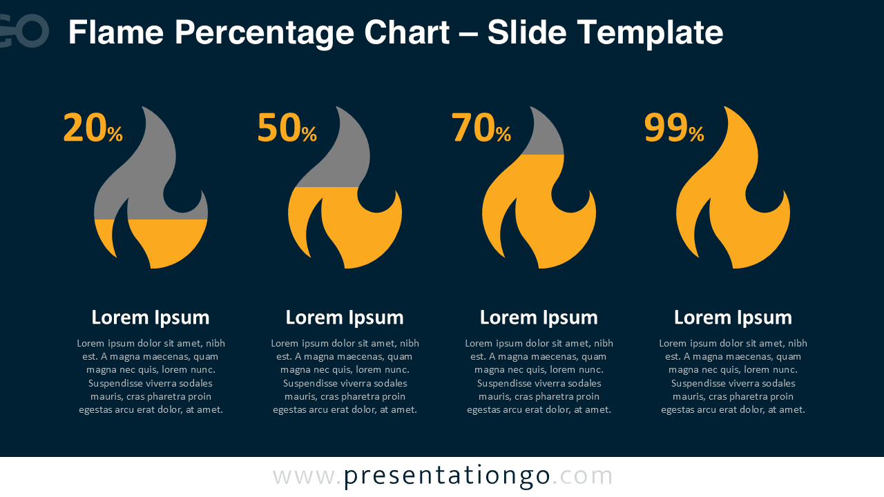
The slide arranges four large flame graphics along a horizontal axis. In the light version, the flames combine warm orange tones with soft gray on a pale background, creating a clean and modern business look. The dark version switches to a deep blue background with bright yellow and gray flames, which works especially well on screens and in low-light rooms.
Every flame and text block aligns precisely, so the layout feels balanced and professional. The generous white space around the chart allows your audience to concentrate on the differences between the four percentages without distractions. Because the graphics are vector-based placeholders, you can resize or rearrange them without losing quality or breaking the composition of the slide.
Practical Applications
- Show progress toward strategic goals, milestones, or OKR completion rates in PowerPoint reports
- Compare risk levels, incident severity, or priority tiers using a heat-inspired metaphor
- Highlight customer satisfaction scores, engagement metrics, or loyalty indices across four segments
- Visualize product performance, campaign results, or sales growth for different markets or periods
- Use individual flames as callouts on other PPT slides to mark hot topics or critical issues
Summary
The Flame Percentage Chart for PowerPoint offers a simple but memorable way to present four key percentages in one slide. Its data-driven flames transform abstract numbers into an immediate sense of intensity, while the clean layout keeps every comparison clear. Because the diagram relies on standard PowerPoint features, you can customize colors, fonts, and data quickly and reuse the slide across many presentations without needing a separate Google Slides file.