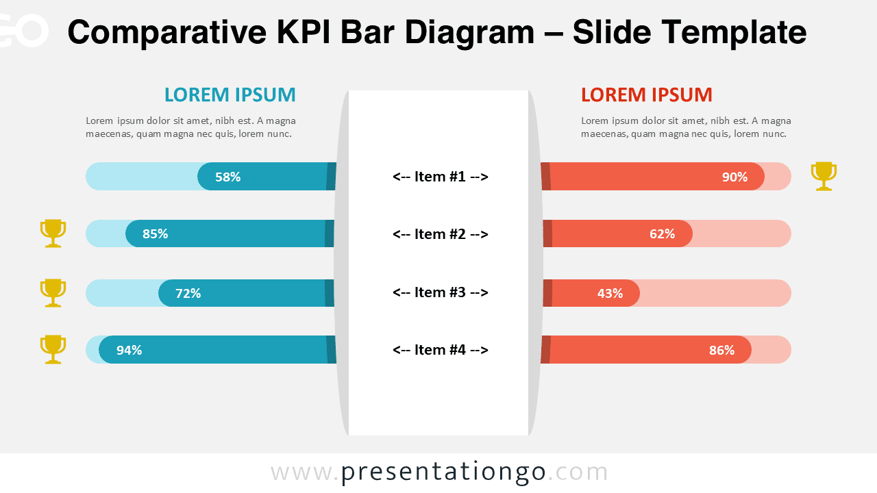
The Comparative KPI Bar Diagram is a practical visual tool designed to present performance metrics side by side. It helps audiences quickly compare values, results, or benchmarks between two entities.
This diagram works well for business reports, performance reviews, and analytical presentations. Its clean layout and balanced structure support clear data storytelling without visual overload.
Diagram Preview
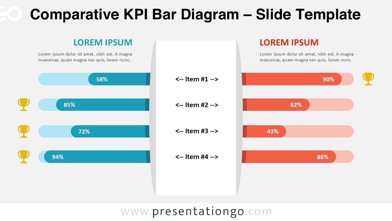
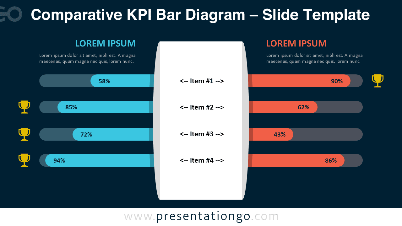


Diagram Features and Customization Options
- Editable shapes and text placeholders for full content customization
- Includes editable icon placeholders to highlight achievements or key results
- Light and dark background versions included
- Compatible with PowerPoint and Google Slides
- Manual bar length adjustment to match your own data values
- Percentage labels can be edited or removed as needed
Design and Structure
The layout is built around a central label column listing four comparison items. On each side, horizontal bars display corresponding values for two datasets.
The mirrored structure makes differences and trends immediately visible. Color contrast separates the two sides clearly while maintaining visual balance. The dark version improves readability in low-light environments, while the light version suits printed or classic slides.
Practical Applications
- KPI and performance comparisons
- Benchmark analysis
- Business reporting and dashboards
- Sales, marketing, or operational metrics
- Before-and-after result comparisons
Summary
The Comparative KPI Bar Diagram offers a clear and flexible way to present side-by-side metrics. With editable bars, icons, and layouts, it adapts easily to different data scenarios and presentation styles.