The Puzzle Percentage Chart is a single-slide PowerPoint diagram that helps you present four key metrics as clear percentages. Each value appears inside a bold, modern puzzle piece so your audience understands the comparison instantly. Because the layout uses data-driven elements, you only need to edit the values once to refresh the entire visual.
Diagram Preview
This diagram arranges four puzzle pieces in a horizontal row, each with a percentage label, title, and description. The clean light gray background and turquoise accent color keep the focus on your data. Use it as a standalone slide or combine it with other charts in the same deck.
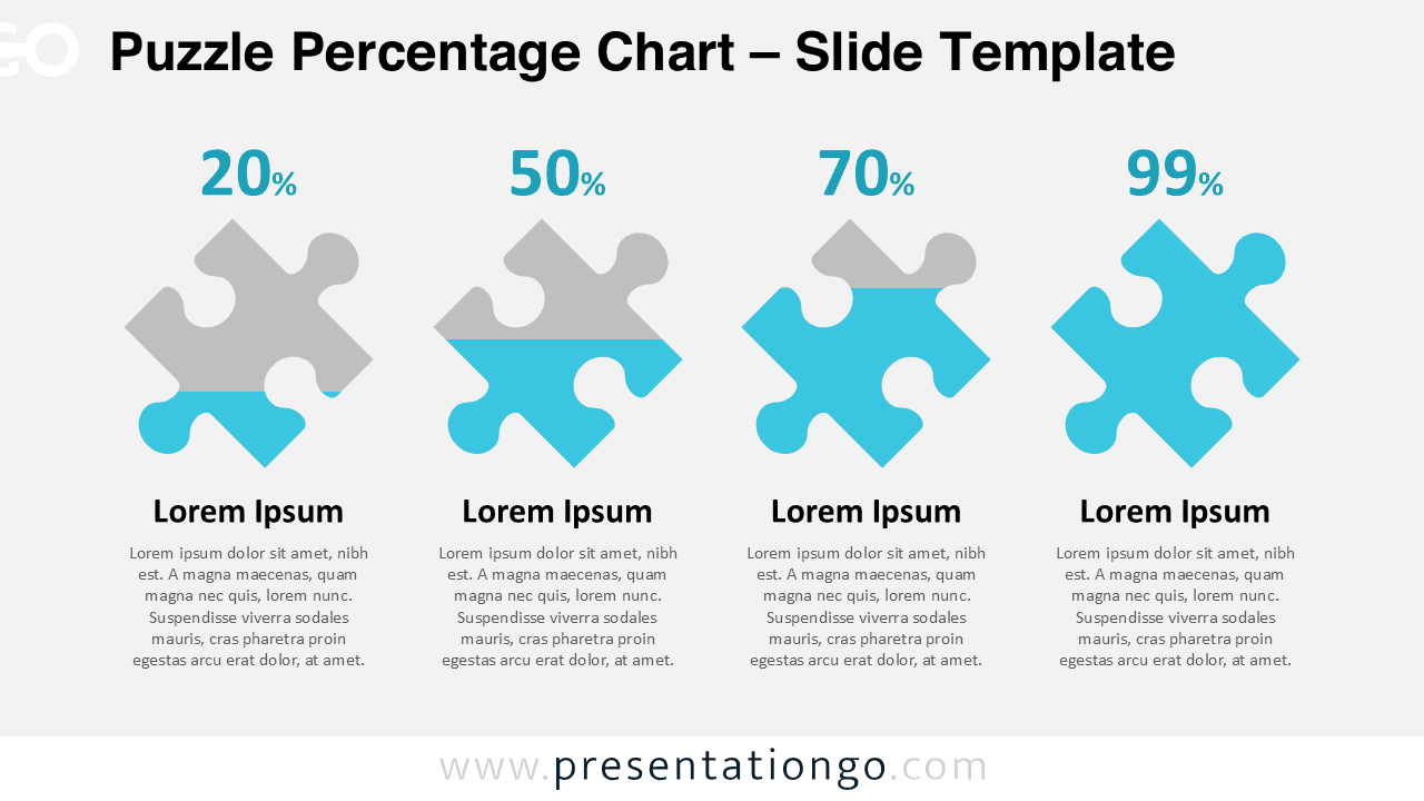
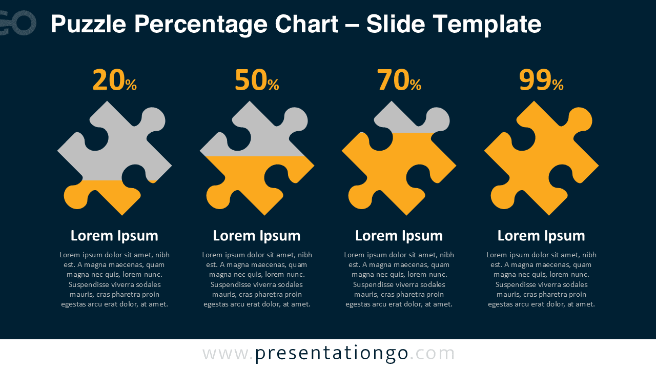


Diagram Features and Customization Options
- Single-slide data-driven percentage chart with four puzzle pieces.
- Editable chart values so you can quickly update each percentage.
- Fully editable PowerPoint shapes for colors, outlines, and sizes.
- Editable text placeholders for titles, labels, and descriptions.
- Designed for 16:9 widescreen PowerPoint presentations.
- Easy to duplicate and adapt for additional metrics or scenarios.
Design and Layout Overview
The Puzzle Percentage Chart uses a flat design style with a four-column grid. Each puzzle piece combines a light gray top and a turquoise bottom for a modern business look. Above every piece, the percentage value appears in a clear, bold font, making it the first element your audience sees. Below, a title and short paragraph provide space to explain the meaning of each number. Generous margins, consistent typography, and aligned blocks create a professional and easy-to-scan layout.
You can quickly adapt the design to match your brand by changing the puzzle colors, font styles, or text alignment. Because all elements remain vector-based PowerPoint shapes, the diagram scales without losing quality. You can also remove or duplicate puzzle pieces to adjust the number of metrics shown on the slide.
Practical Applications
- Present business KPIs such as revenue growth, customer retention, or satisfaction scores.
- Show marketing performance data like conversion rates, email open rates, or campaign results.
- Display survey outcomes, poll responses, or feedback percentages for different groups.
- Communicate project progress across phases or workstreams using completion percentages.
- Compare performance of products, services, or teams in a clear, visual format.
Summary
The Puzzle Percentage Chart PowerPoint template gives you a simple yet engaging way to present four percentages side by side. Its data-driven structure saves time whenever you update metrics or reuse the slide. With fully editable shapes and text, you can customize the diagram to match any corporate or educational presentation and keep your audience focused on the numbers that matter most.