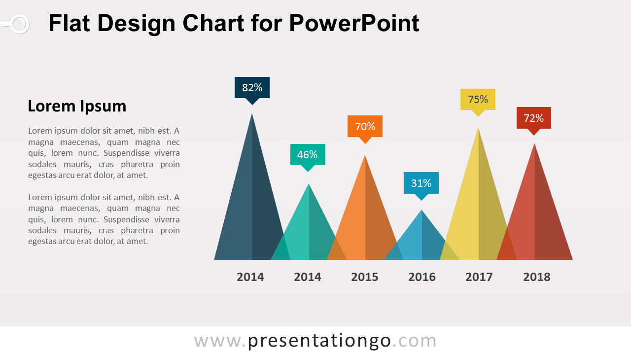
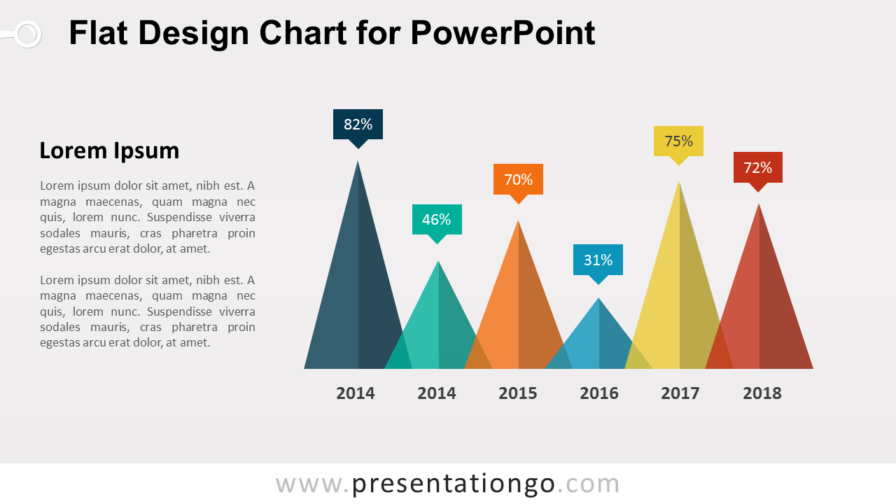
The Flat Design Triangle Chart for PowerPoint compares six quantitative values through overlapping triangular shapes. Each triangle pairs with a percentage callout and category label, while the text area provides room for context or analysis. Use the layout for KPIs, performance results, survey findings, trends, or other six-point comparisons.
Diagram Preview



Features and Customization Options
- Includes 16:9 and 4:3 versions for Microsoft PowerPoint
- Includes 2 editable slides with matching layouts
- Six editable triangle data shapes
- Editable text, shapes, colors, and sizes
- 100% editable vector shapes — no quality loss when resized
- Includes both light and dark background versions
Design and Structure
The Flat Design Triangle Chart uses six overlapping triangles arranged along a shared horizontal baseline. Different triangle heights create an immediate visual comparison between values, while percentage callouts above each peak identify the exact figures. Labels below the shapes connect each value to its corresponding year, period, or category.
A supporting text area sits beside the chart for commentary, findings, or a short explanation of the data. You can edit the values, callouts, labels, triangle sizes, and supporting text directly in PowerPoint. The package includes both 16:9 and 4:3 presentation sizes for different slide setups.
Practical Applications
- Compare six percentage values
- Present KPI or performance results
- Show year-over-year figures
- Summarize survey findings
- Compare category-based metrics
- Highlight quantitative trends
Summary
The Flat Design Triangle Chart provides an editable PowerPoint layout for comparing six quantitative values. Its overlapping triangles, percentage callouts, labels, and supporting text area make it suitable for KPIs, performance summaries, surveys, trends, and category comparisons.