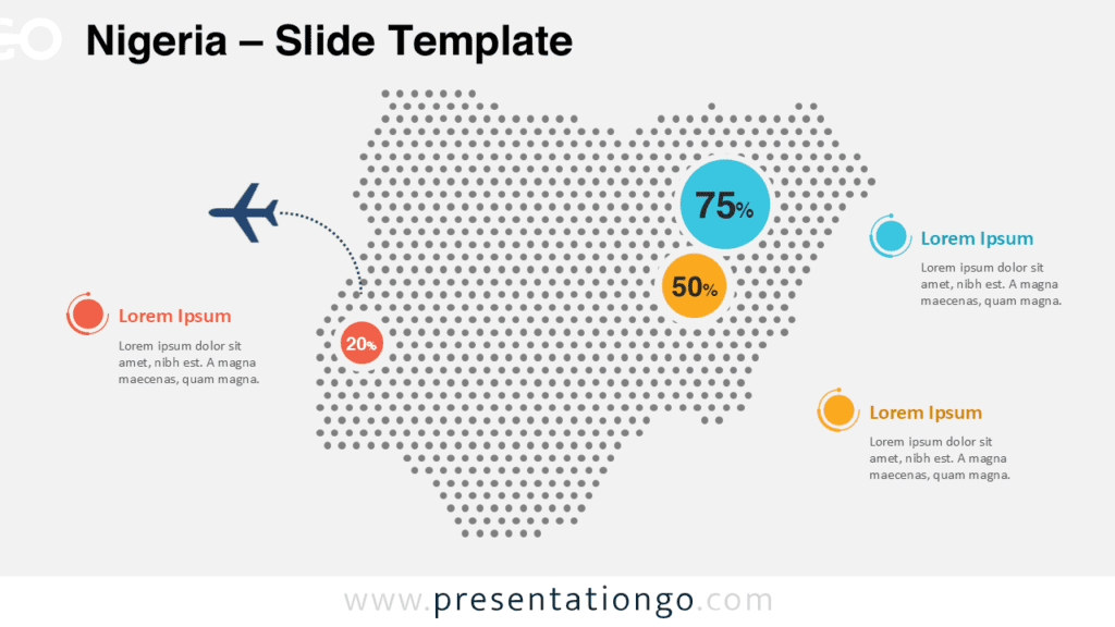
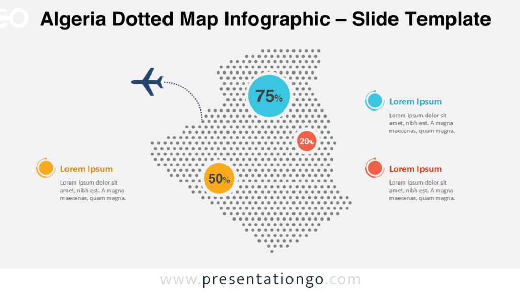
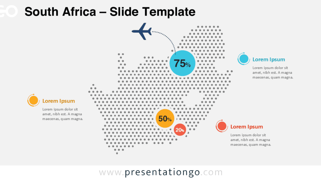
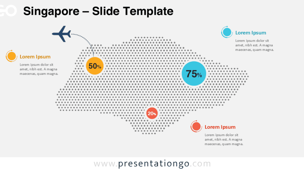
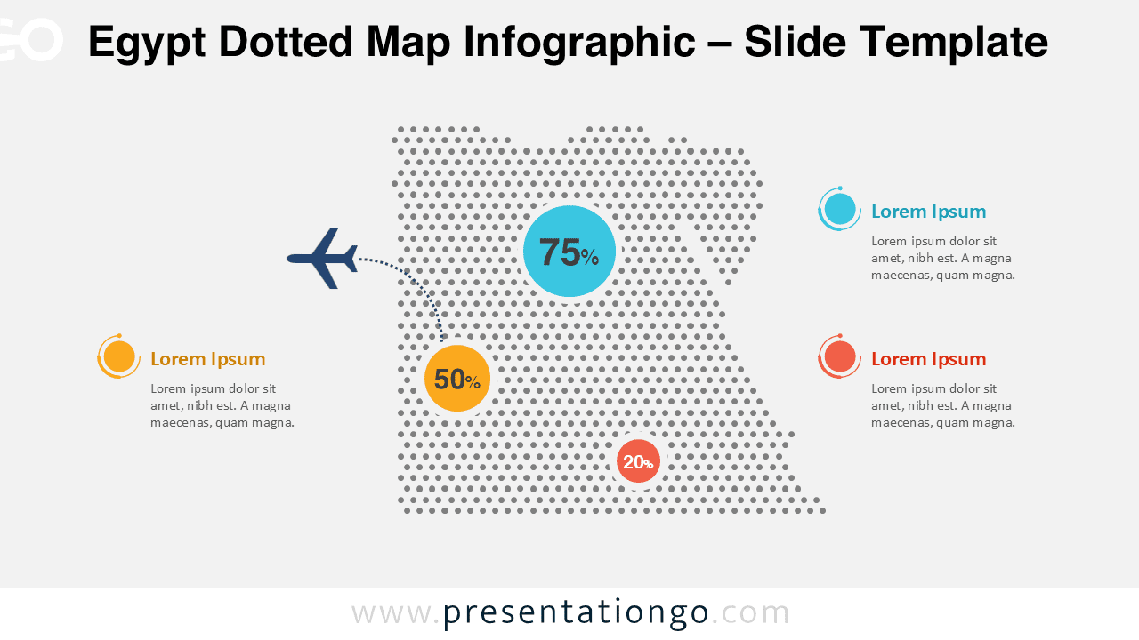
The Egypt Dotted Map Infographic is a clean and modern visual designed to present geographic data clearly and effectively. This slide is ideal for highlighting statistics, regional insights, or location-based information related to Egypt.
Built with a dotted map style, this infographic offers strong visual structure while remaining flexible for multiple presentation contexts. All elements are fully editable and optimized for both PowerPoint and Google Slides.
Map Preview
Features and Customization Options
- Editable dotted map shape of Egypt
- Editable shapes, arrows, and text placeholders
- Includes editable icon placeholders
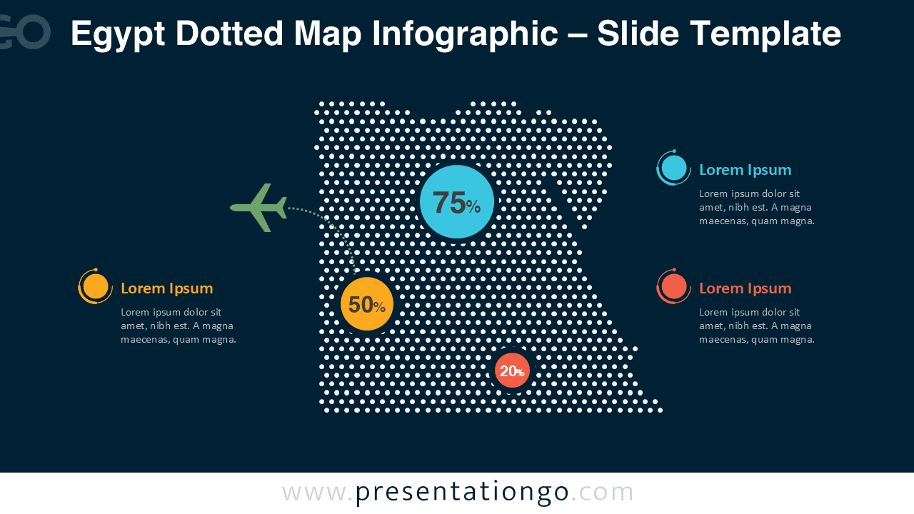
- Light background slide and dark background slide included
- Colors, sizes, and positions can be customized easily
- Compatible with PowerPoint and Google Slides
Design and Structure
The infographic uses a precise dotted silhouette of Egypt combined with circular data markers and connector lines. This structure allows you to draw attention to specific locations while keeping the overall design balanced and readable.
The contrasting color accents help separate data points, while the light and dark background versions ensure compatibility with different presentation themes and environments.
Practical Applications
- Geographic data and statistical reporting
- Market analysis and regional performance reviews
- Economic, demographic, or population presentations
- Logistics, transportation, and distribution mapping
- Educational or academic geography slides
Summary
The Egypt Dotted Map Infographic provides a professional and flexible way to present country-level data. With fully editable elements and dual background versions, it adapts easily to a wide range of presentation needs in both PowerPoint and Google Slides.