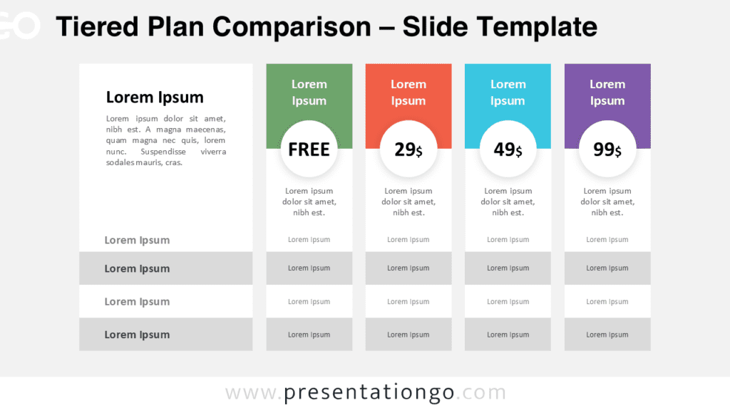
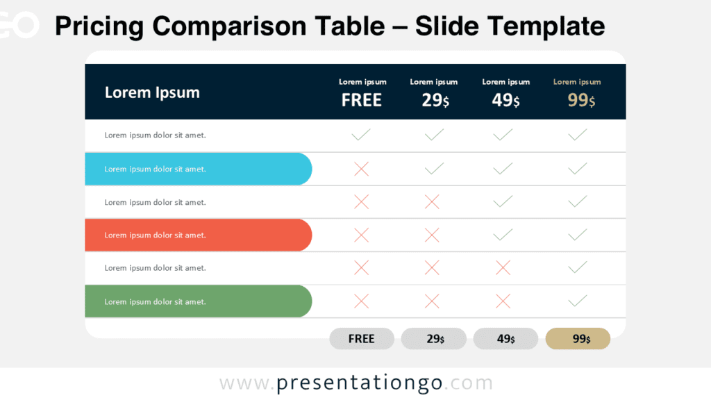
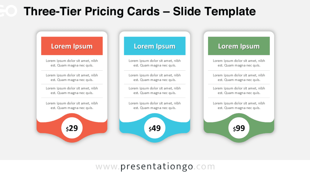
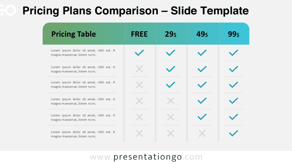
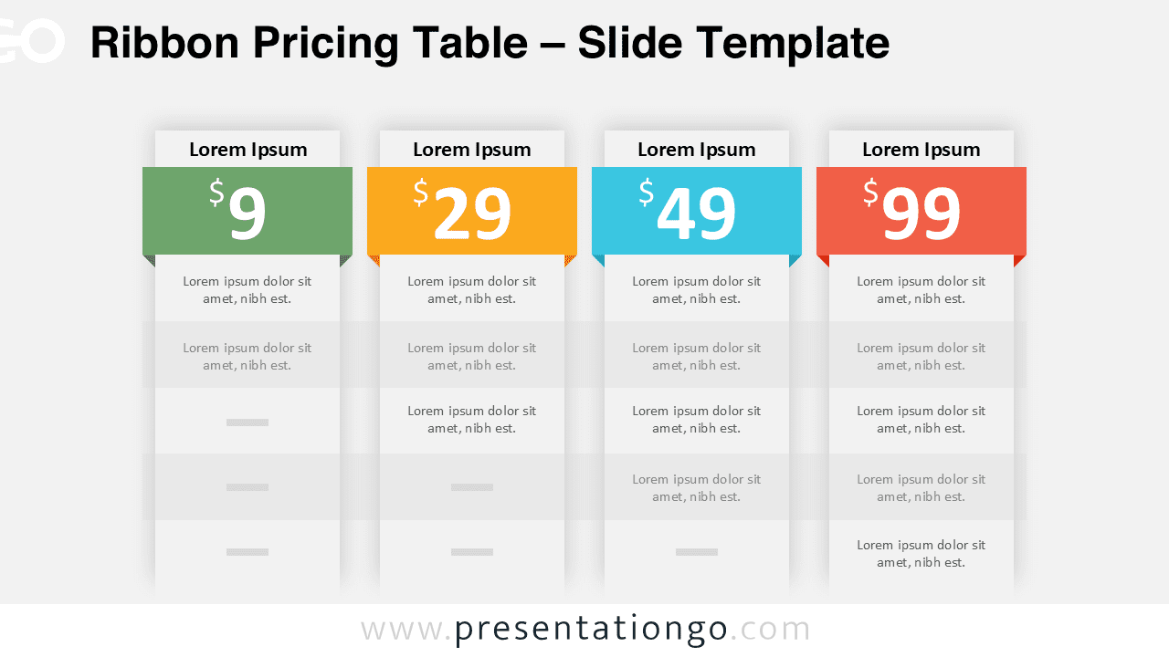
The Ribbon Pricing Table helps you compare plans with zero clutter. You can present four tiers side by side in PowerPoint and Google Slides. Each column highlights a plan name, a large price, and a tidy feature list.
Use this diagram when your audience needs fast decisions. You can show upgrades, bundles, or service levels in one glance. The ribbon headers add hierarchy and keep attention on differences.
Diagram Preview
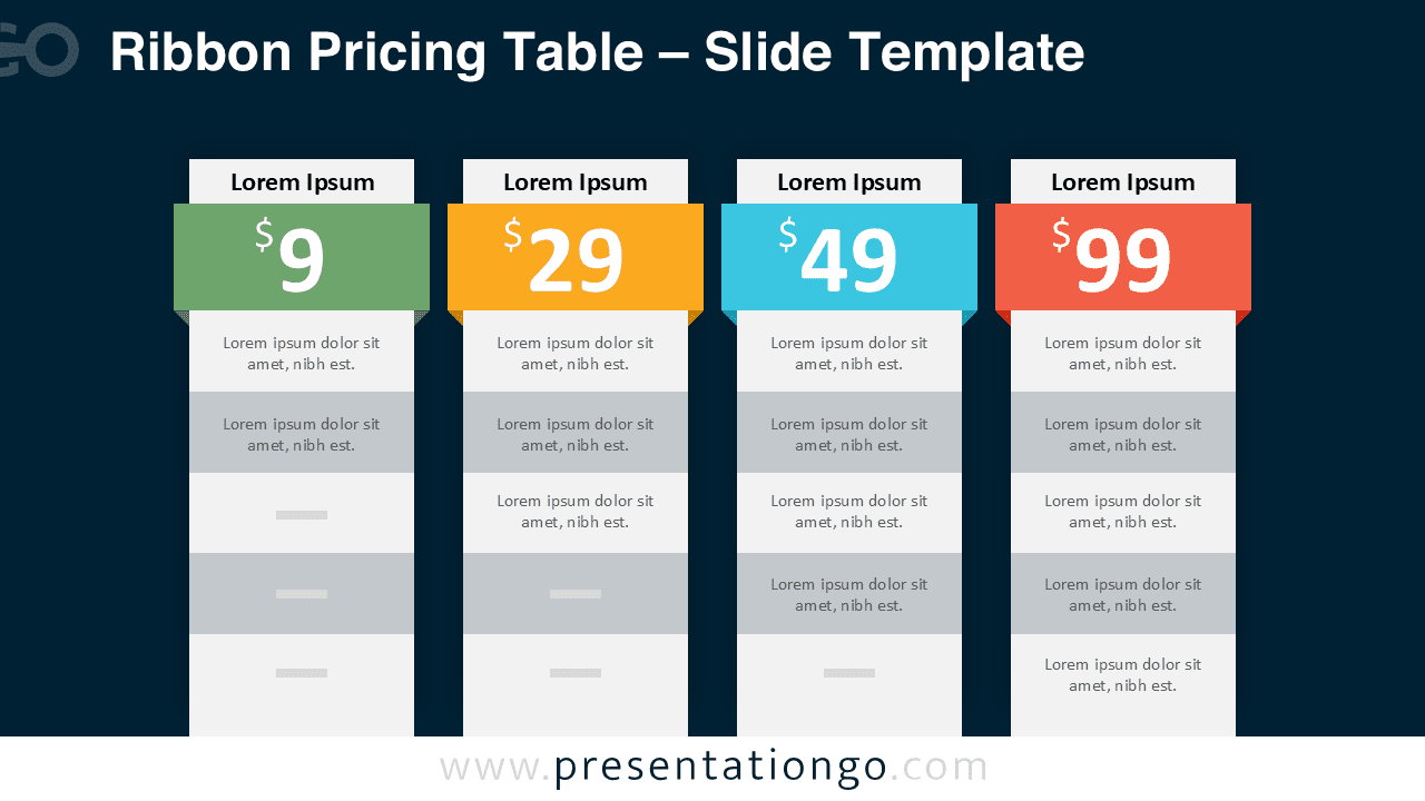
This design includes two versions for flexible styling. Choose the bright version for clean documents and print exports. Choose the dark version for modern decks and stage screens.
Features and Customization Options
- Four pricing columns with consistent spacing and alignment.
- Ribbon headers that spotlight each plan level.
- Big price area that improves scan speed and clarity.
- Easy edits for text, colors, and feature rows.
- Two background versions to match different slide themes.
Design and Structure
The layout uses stacked cards with subtle shadows. Each card keeps a simple rhythm from header to footer.
Color accents help viewers track plans from left to right. You can swap the palette to match a brand guide quickly.
Practical Applications
- SaaS subscription tiers for product pages and sales decks.
- Service packages for proposals, agencies, and consultants.
- Ticket levels for events, workshops, and training offers.
- Bundle comparisons for e-commerce or partner programs.
- Internal pricing reviews for teams and stakeholders.
Summary
The Ribbon Pricing Table delivers a clear tier comparison in one slide. Add your plan names, prices, and benefits, then present with confidence. You get a polished pricing layout that stays readable in exports.