The Two Option Comparison diagram helps you present two alternatives in a clear and balanced visual format. Its side-by-side structure makes differences easy to understand at a glance. You can use it to compare ideas, strategies, products, solutions, or competing approaches. The central “VS” element reinforces the comparison and keeps the audience focused on the relationship between both choices. This layout works especially well when each option deserves equal visual weight.
Diagram Preview
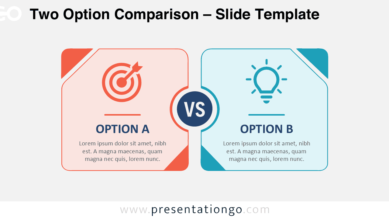
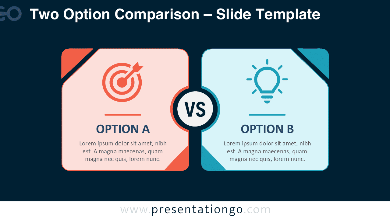
The Two Option Comparison uses two large content areas connected by a central comparison marker. Each side includes room for a heading, supporting text, and a visual symbol. The structured layout guides viewers naturally from one option to the other. It also keeps information separated without making the slide feel disconnected. The design works in both PowerPoint and Google Slides, making it useful for many presentation styles and topics.
Features and Customization Options
- Fully editable text areas let you replace the sample content with your own information.
- Editable shapes allow you to adjust the layout, size, borders, and visual emphasis.
- The icons come from the Microsoft Office icon library and are easy to modify.
- You can resize, reposition, recolor, or replace the icons to match your presentation.
- The central VS element can be edited to suit comparisons, alternatives, or competing choices.
- The slide works with PowerPoint and Google Slides for convenient editing and reuse.
- The balanced two-column structure keeps both options equally visible and easy to compare.
Design and Structure
The layout centers on two matching panels that create a strong sense of balance. A circular VS marker sits between them and establishes the main comparison immediately. Decorative corner details add character while preserving a clean professional appearance. Each panel places the icon first, followed by a heading and short explanation. This hierarchy helps audiences scan the content quickly.
The Two Option Comparison also gives you enough flexibility for different types of information. You can keep each side brief for executive presentations or add concise supporting details for analysis. The visual symmetry prevents one alternative from appearing more important unless you intentionally change the emphasis. That makes the diagram especially useful for neutral evaluations and structured decision-making.
Practical Applications
- Compare two business strategies before selecting a preferred direction.
- Present two products, services, or packages side by side.
- Explain the advantages and limitations of competing approaches.
- Contrast two project proposals or implementation options.
- Evaluate two solutions during a decision-making presentation.
- Show before-and-after alternatives or current and proposed approaches.
- Compare concepts, ideas, methods, or recommendations during workshops.
- Present two choices to stakeholders while keeping the evaluation visually balanced.
Summary
The Two Option Comparison provides a straightforward way to organize two alternatives on one slide. Its symmetrical structure keeps information clear, while the central marker makes the comparison instantly recognizable. Editable content gives you control over the message and visual hierarchy. Office library icons add familiar visual cues and remain easy to modify. Whether you are comparing strategies, products, ideas, or solutions, this diagram helps audiences understand both options quickly in PowerPoint and Google Slides.