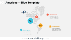
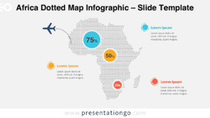
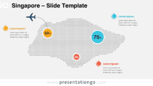
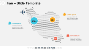
The Asia Dotted Map Infographic is a clear and modern way to present geographic data in both PowerPoint and Google Slides. This editable diagram helps you highlight regional insights using percentage markers, clean labels, and bold accent colors. It works well for business analysis, education, marketing reports, and any presentation that requires a visual overview of Asia.
Diagram Preview
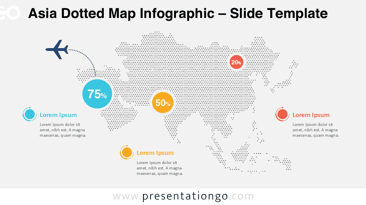
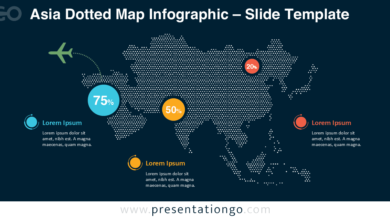
Diagram Features and Customization Options
- Fully editable dotted map of Asia
- Three percentage markers with bold color coding
- Editable text labels for regional descriptions
- Includes editable icon placeholders
- Customizable colors, fonts, and shapes
- Works in standard 16:9 widescreen layout
- Compatible with both PowerPoint and Google Slides
Design and Structure
This infographic features a dotted silhouette of Asia built from evenly spaced circular points. Each region includes a percentage marker supported by an accent color to create immediate visual contrast. The diagram also includes icon-style callouts that add clarity to each data point. A stylized plane icon introduces a thematic touch that can be adapted for logistics, travel, or general data storytelling. The design is available in light and dark versions, making it easy to match different presentation themes.
Practical Applications
- Market share or distribution across Asian regions
- Regional performance comparison for business or finance
- Educational data presentations focusing on Asian countries
- Survey results or demographic breakdowns
- Travel, logistics, or transportation presentations
Summary
The Asia Dotted Map Infographic provides a simple yet powerful way to visualize regional percentages and insights across Asia. With editable labels, icons, and colors, it adapts easily to any topic or industry, helping your audience understand geographic data quickly and effectively.