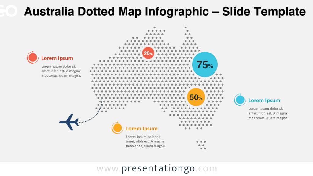
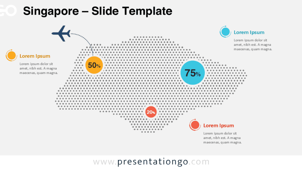
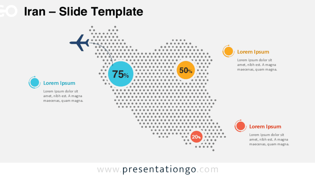
The Oceania Dotted Map Infographic gives you a clear way to present regional information in PowerPoint and Google Slides. It highlights Australia and New Zealand with a dotted layout, bold percentage circles, and clean text callouts. You can use it to explain statistics, market presence, travel routes, tourism flows, or geographic comparisons. The design stays simple, modern, and easy to read on different presentation themes.
Map Preview


Features and Customization Options
- Editable dotted map of Oceania with Australia and New Zealand.
- Bold percentage markers to emphasize key figures.
- Built-in callout areas for short insights and annotations.
- Two coordinated visual styles for different presentation themes.
- Easy customization of colors, values, and text in PowerPoint and Google Slides.
Design Overview
This infographic uses a balanced composition that keeps the map at the center of attention. The dotted structure gives the layout a clean and contemporary feel, while large circular markers draw attention to the most important numbers. Smaller text blocks support the visual story without creating clutter.
A route line and airplane shape add motion to the layout and help frame travel, logistics, or connection topics.
Practical Applications
You can use this Oceania map infographic in many presentation contexts. It works well for tourism and travel slides about destinations across the region. It also fits business reports that show regional growth, market coverage, or expansion plans.
In education, it supports geography lessons focused on Australia and New Zealand. In logistics presentations, it can illustrate routes, transport links, or distribution areas. It also suits statistical slides about population, sales, performance, or regional comparisons.
- Tourism and travel presentations about Oceania destinations.
- Business reports showing regional growth or market coverage.
- Geography lessons focused on Australia and New Zealand.
- Logistics presentations with route or distribution references.
- Statistical slides about population, sales, or performance.
Summary
The Oceania Dotted Map Infographic helps you communicate regional information with speed and clarity. It combines a recognizable map shape with editable callouts and strong data markers. You can adapt it for corporate, educational, or travel-related presentations. If you need a modern map visual for Oceania, this slide offers a flexible and polished solution.