Free waffle chart for PowerPoint and Google Slides. Three grids of 10×10 small cells with colored ones to represent the data. Great to visualize and compare quantitative data. Editable graphics with text placeholders.
Waffle Chart
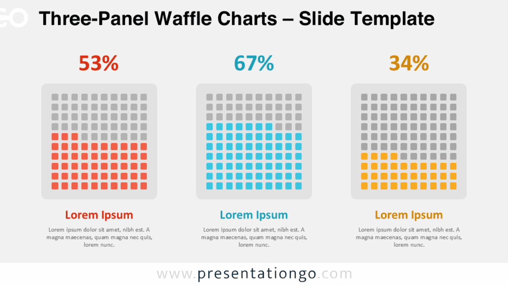
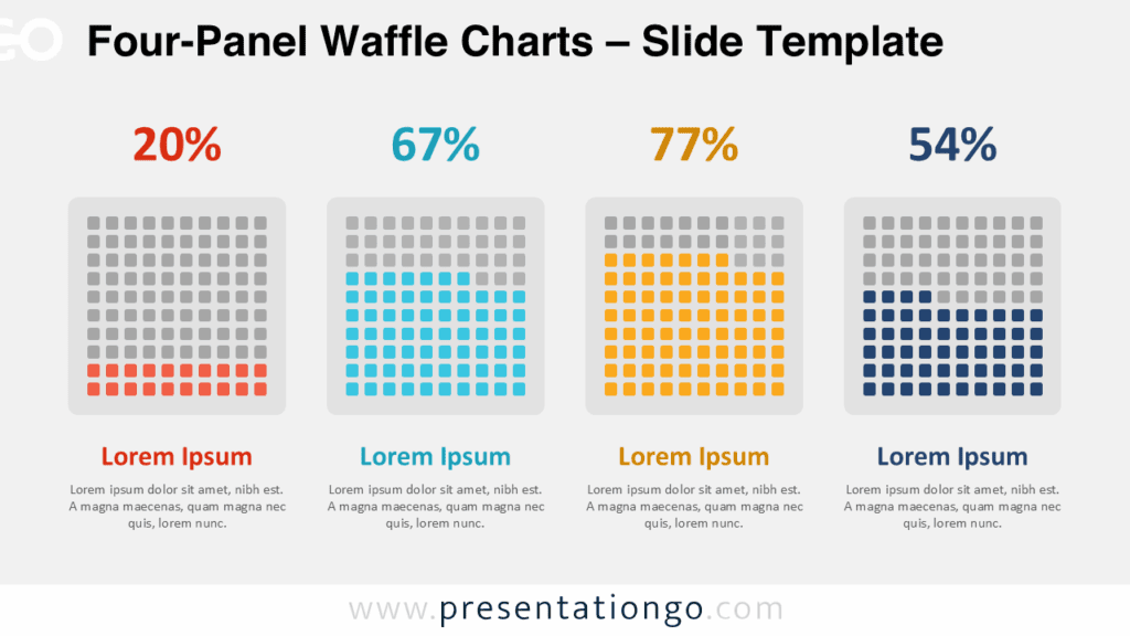
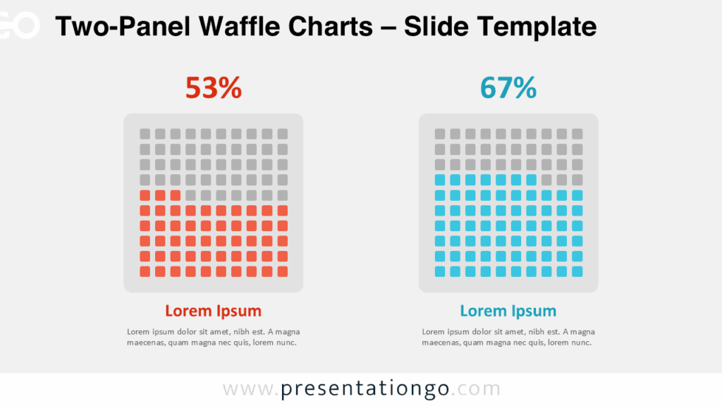
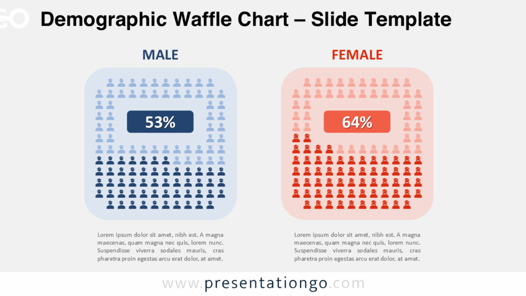
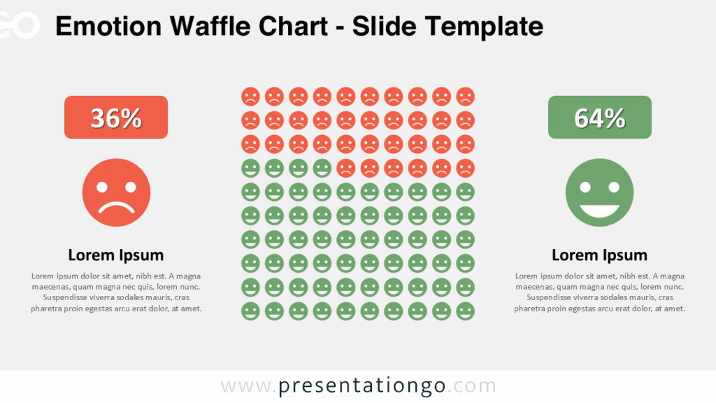
Waffle charts are very powerful infographics for data visualization. They are indeed very convenient charts to visualize and easily understand quantitative data, mainly a percentage. They are also sometimes used to illustrate progress toward a goal.
More specifically, these waffle charts represent three 10 x 10 cell grids, displayed side-by-side. They are very simple and straightforward charts: each box represents 1 percentage point summing up to a total of 100%. The vivid color of the grid will show the data.
You will find in the document the grid with 2 design variants: squares and circles.
Finally, the 3 grids put together on the same slide allow you to compare different data.
Shapes are 100% editable: colors and sizes can be easily changed.
Widescreen (16:9) size preview:


This ‘Waffle Chart for PowerPoint and Google Slides’ features:
- 3 unique slides
- Light and Dark layout
- Ready to use template with text placeholders
- Completely editable shapes
- Standard (4:3) and Widescreen (16:9) aspect ratios
- PPTX file and for Google Slides
Free fonts used:
- Helvetica (System Font)
- Calibri (System Font)