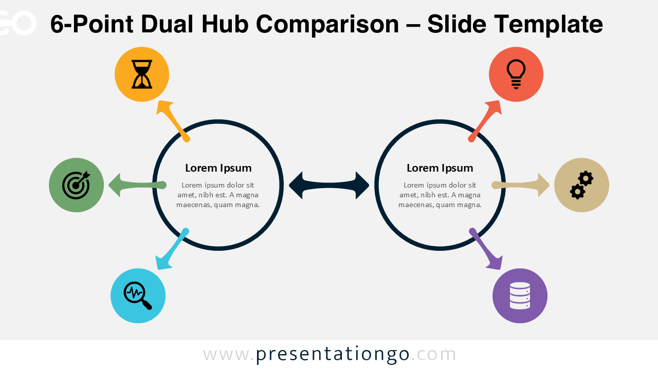
The 6-Point Dual Hub Comparison diagram offers a clear and structured way to present relationships between two core elements. Designed for PowerPoint and Google Slides, this diagram helps you organize and communicate complex ideas with clarity and visual balance.
Diagram Preview


Features and Customization Options
- Fully editable shapes and text elements
- Includes six connected points for structured comparisons
- Two central hubs to highlight key concepts or entities
- Uses icons from the Office icon library for consistency
- Icons are easy to change directly within PowerPoint or Google Slides
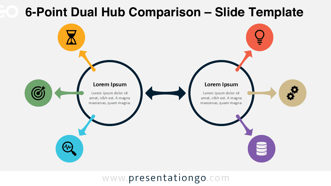
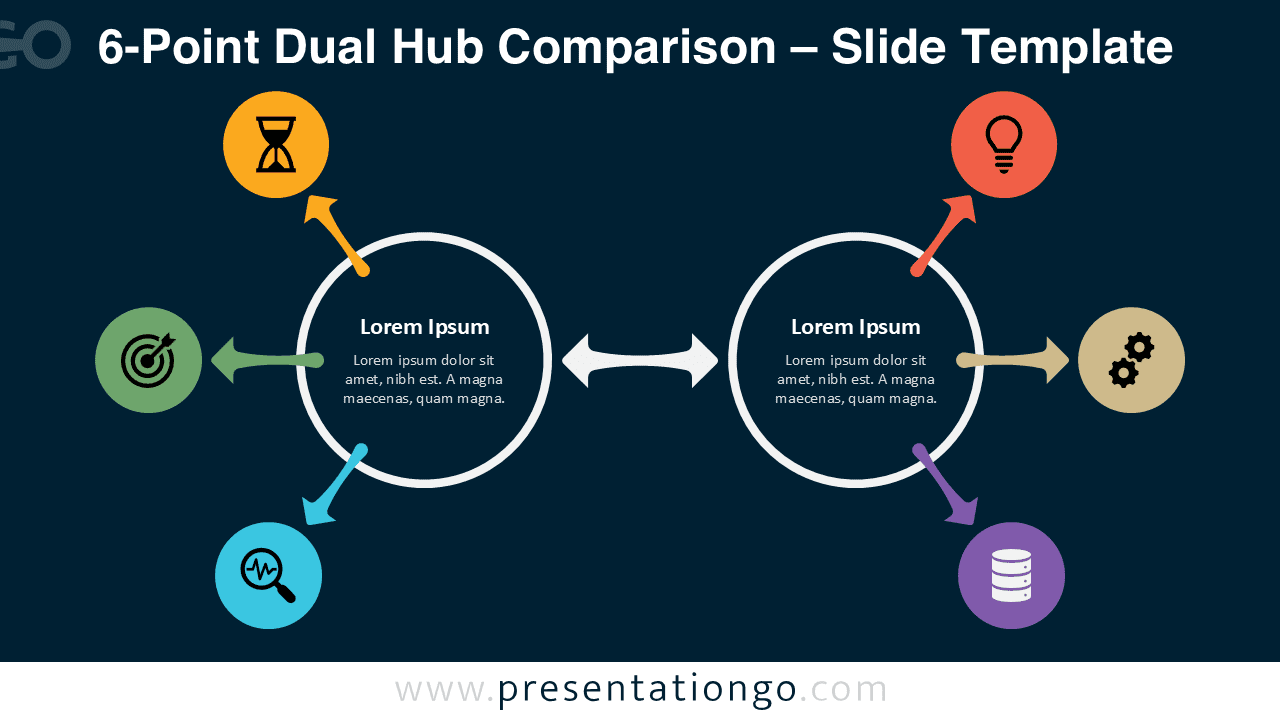
- Available in light and dark background versions
- Compatible with PowerPoint and Google Slides
Design and Structure
This diagram features two central circular hubs connected by a bidirectional arrow, representing interaction or comparison. Each hub distributes information outward through three directional arrows, creating a total of six points. Each point includes a colored circular node with an icon placeholder, allowing you to visually categorize information.
The balanced radial layout ensures clarity while maintaining visual appeal. The use of distinct colors for each node helps differentiate elements, while the central connection reinforces the relationship between both sides. This structure is particularly effective for side-by-side comparisons or dual-process explanations.
Practical Applications
- Comparing two business strategies or models
- Explaining input and output systems
- Presenting before-and-after scenarios
- Mapping relationships between two departments or concepts
- Visualizing parallel workflows or processes
Summary
The 6-Point Dual Hub Comparison diagram is a versatile and visually engaging tool for structured presentations. Its clean layout and customizable elements make it suitable for a wide range of professional uses, from business strategy to educational content. Use it to simplify complex comparisons and deliver impactful presentations.