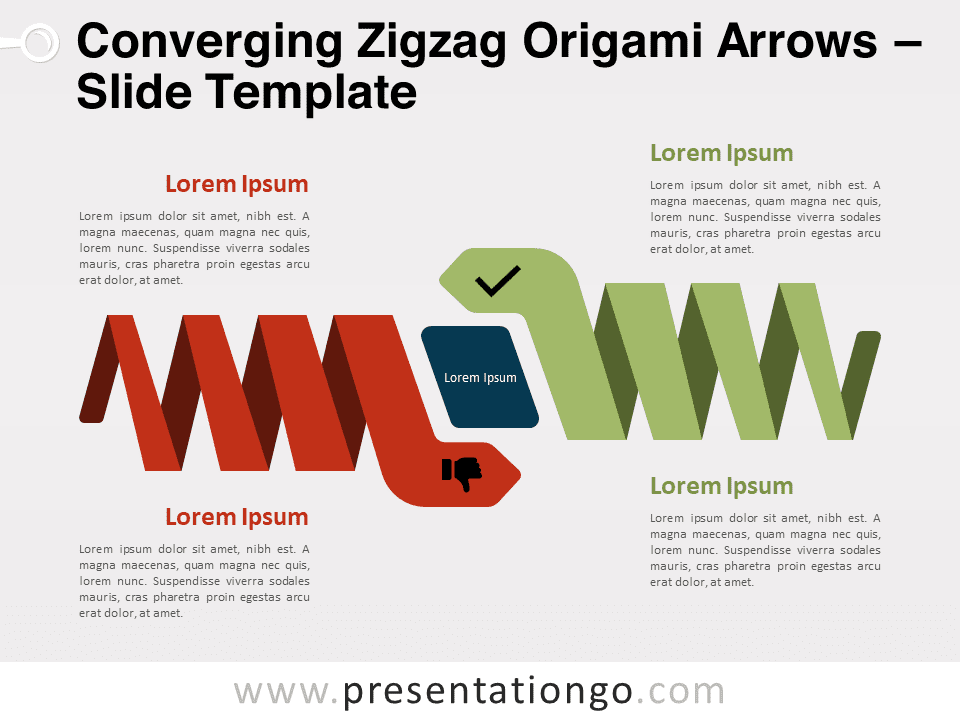
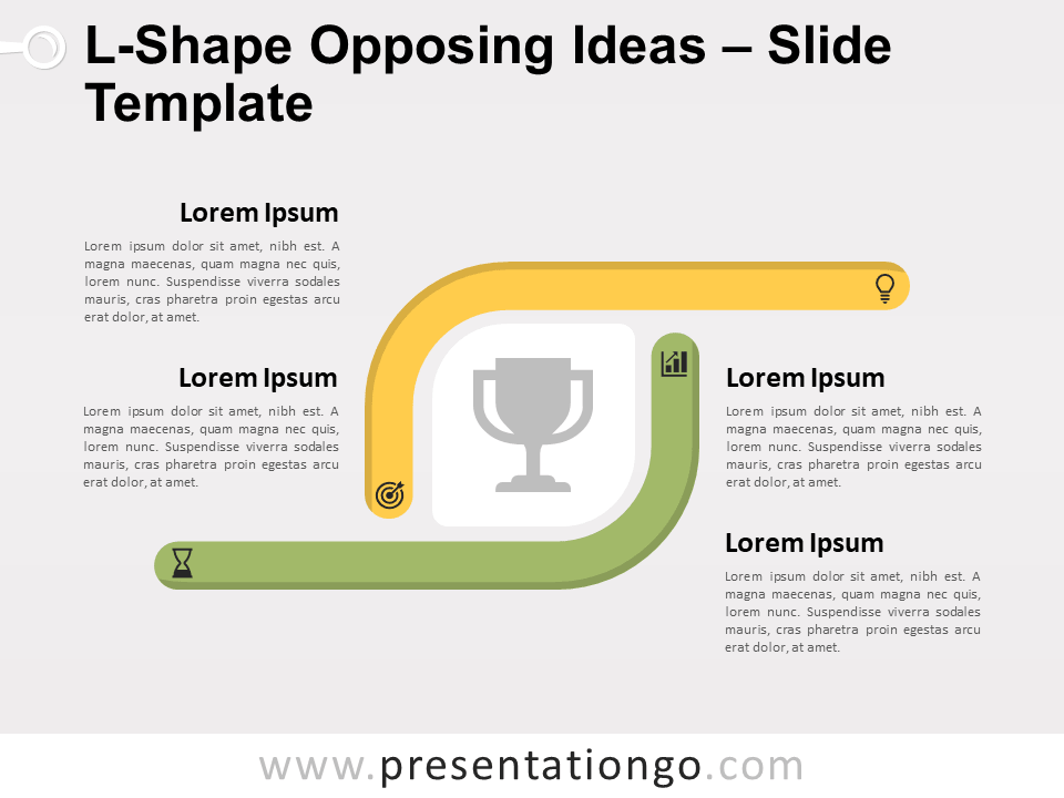
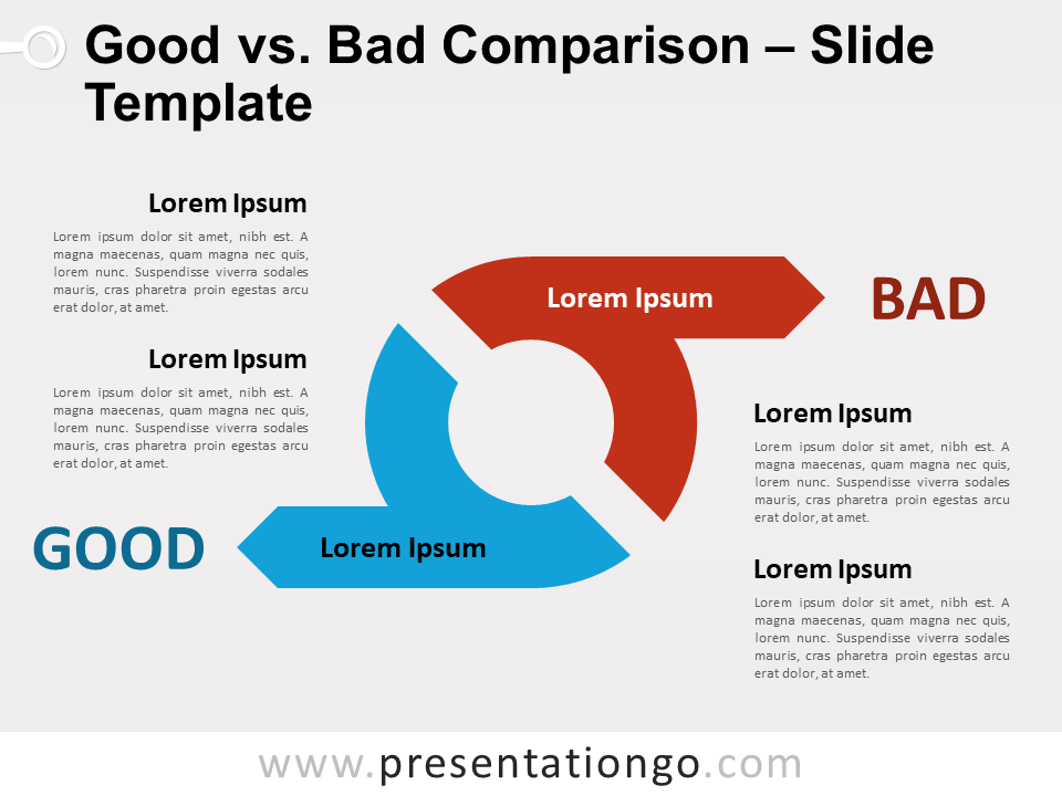
Free Good vs. Bad for PowerPoint and Google Slides. A green and red text box with an icon tile. Perfect to compare positive versus negative ideas or concepts. Editable graphics with icons and text placeholders.
Good vs. Bad
Presenters know very well that comparison slides can be very effective. In fact, these layouts will perfectly help your summarize all your information.
Let’s say for example that you presented your audience with a long and quite detailed flow of charts, quantitative results. While we always state at PresentationGO that your slides must be straightforward and with a minimum amount of information, your audience expects a certain level of detail (you sometimes just can’t avoid that). And that when your comparison will come in handy: 1 key slide will sum up your previous detailed content.
More specifically, this slide displays side by side a text box with a 3D tile. This tile will embed an icon that you will choose to fit your purpose. Also, a check and a cross symbol will further accentuate the positive and negative meanings.
Finally, this Good vs. Bad slide is an interesting option layout for you to structure and to compare your main ideas. The green side will list the positive points and the red will be for your negative ones.
Shapes are 100% editable: colors and sizes can be easily changed.
Includes 2 slide option designs: Standard (4:3) and Widescreen (16:9).
Widescreen (16:9) size preview:
This ‘Good vs. Bad for PowerPoint and Google Slides’ features:
- 2 unique slides
- Light and Dark layout
- Ready to use template with icons and text placeholders
- Completely editable shapes
- Uses a selection of editable PowerPoint icons
- Standard (4:3) and Widescreen (16:9) aspect ratios
- PPTX file and for Google Slides
Free fonts used:
- Helvetica (System Font)
- Calibri (System Font)


