Free good vs. bad comparison slide for PowerPoint and Google Slides. Illustration of 2 transversally-cut ring shapes and horizontal diverging arrows. Editable graphics with text placeholders.
Good vs. Bad Comparison
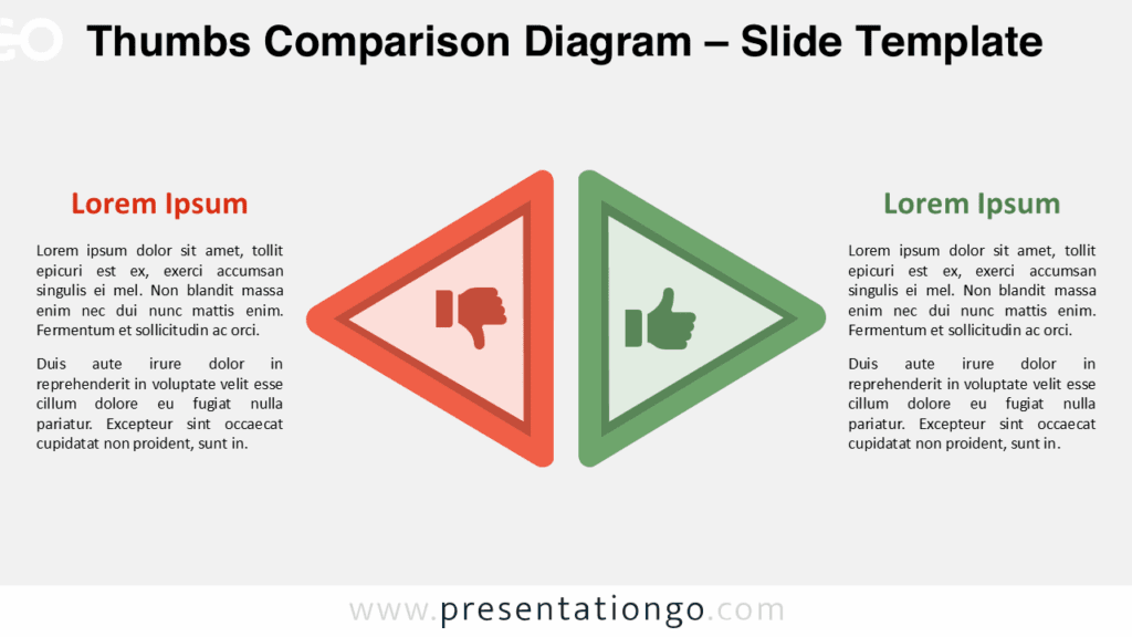
Use this illustration to compare 2 dichotomous, opposite ideas or concepts, like “good vs. bad”, “positive vs. negative”, “strengths vs. weaknesses” (for the SWOT analysis), etc.
Shapes are 100% editable: colors and sizes can be easily changed.
Includes 2 slide option designs: Standard (4:3) and Widescreen (16:9).
Widescreen (16:9) size preview:


This ‘Good vs. Bad Comparison for PowerPoint and Google Slides’ features:
- 2 unique slides
- Light and Dark layout
- Ready to use template with text placeholders
- Completely editable shapes
- Standard (4:3) and Widescreen (16:9) aspect ratios
- PPTX file and for Google Slides
Free fonts used:
- Helvetica (System Font)
- Calibri (System Font)