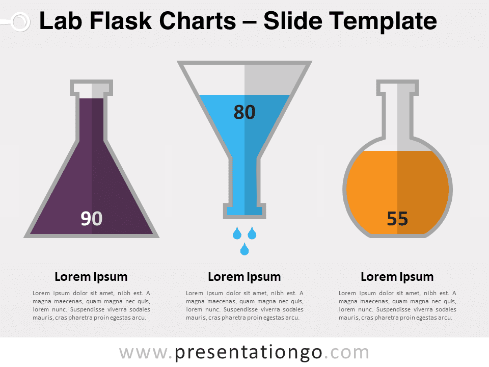
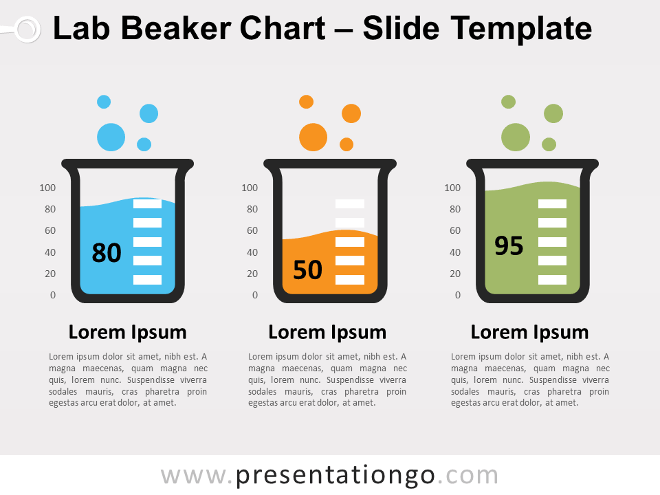
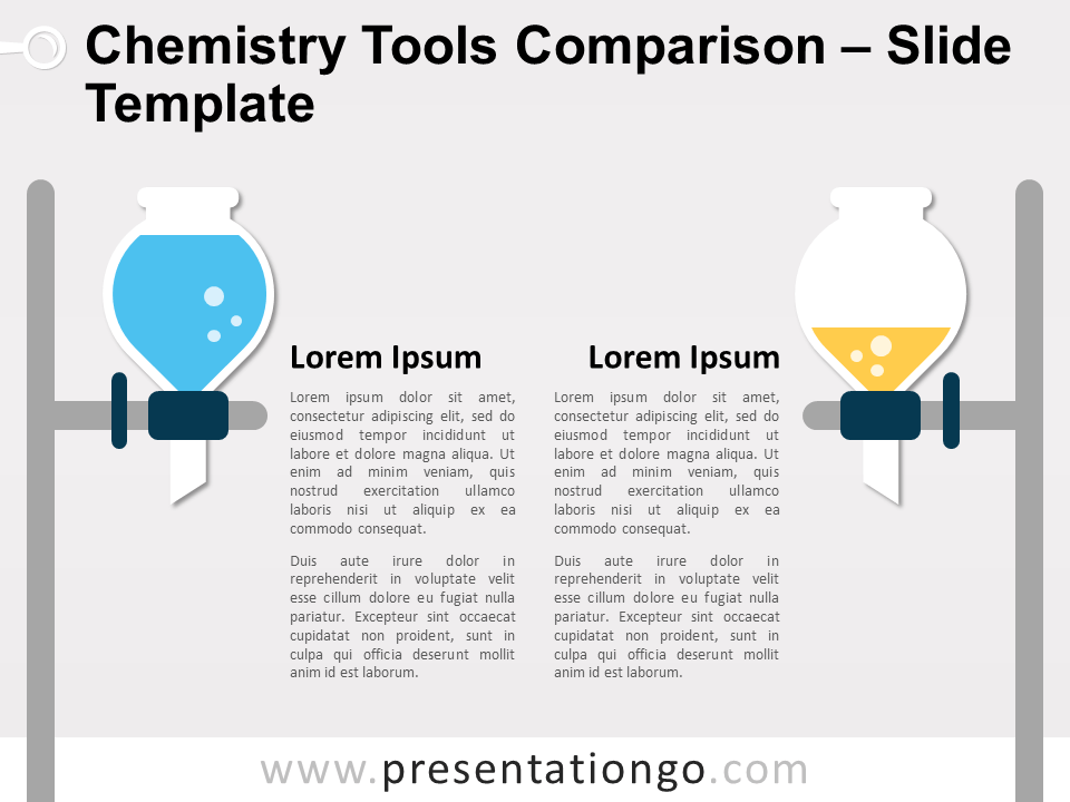
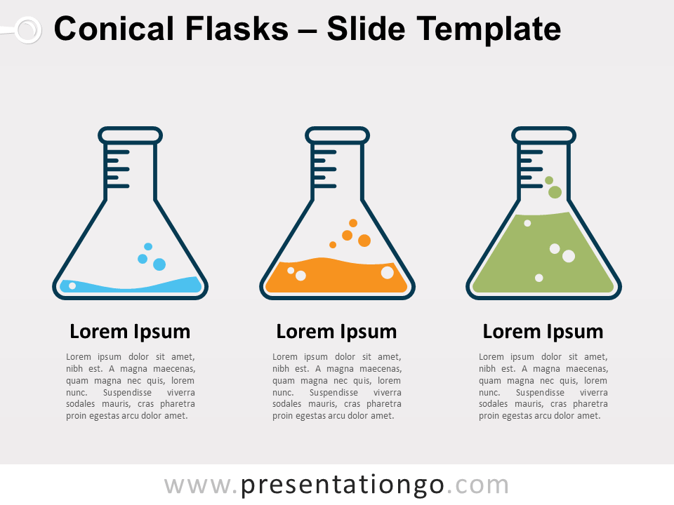
Unveil a new dimension of data storytelling with our Lab Flask Charts for PowerPoint and Google Slides – a sleek, purpose-driven design that transforms figures into visual narratives. Ideal for educators and analysts, this template turns data into captivating, easy-to-understand visual charts.
Lab Flask Charts
In the realm of presentations, data visualization is not just a benefit; it’s a necessity. It converts rows of data into a clear visual context, making insights more accessible and memorable. Imagine lab flasks, not just as containers but as dynamic data charts that shift with your story, providing a snapshot of information at a glance. This creative embodiment of data engages the audience, enhancing both comprehension and retention.
Whether you’re illustrating chemical reactions for a science class or showcasing quarterly financial results, our lab flask charts provide an innovative twist. For educators, it’s a gateway to a more interactive learning experience. For business professionals, it’s a tool to present data trends and forecasts with a novel visual hook. These charts are particularly effective when depicting growth measurements, comparative analyses, or any data that benefits from a clear, vertical scale representation.
In conclusion, the Lab Flask Charts template is a powerful ally for any presenter aiming to make an impact. It’s not just about showing data; it’s about telling a story that sticks. With its editable features and dual-layout compatibility, it’s a versatile asset designed to elevate your presentation and engage your audience. Embrace the art of data with this unique, insightful template.
Customizing Lab Flask Charts: A Quick Guide
1) Customize Flask Chart Background to Match Your Slide

- Select the flask chart you wish to edit.
- Click on the outer shape of the flask to select the background element.
- Under the “Format” menu, choose “Shape Fill” to pick a new color.
- Choose a solid, plain color that complements or matches your slide’s background for seamless integration.
2) Editing Data in Your Flask Chart

- Click directly on the flask chart to select it.
- Position your cursor over the chart area and click to select the data graphic element.
- Right-click and choose “Edit Data” from the context menu, or go to the “Chart Tools” section on the PowerPoint ribbon and click “Edit Data.”
- A spreadsheet window will appear, allowing you to input or modify the chart data.
3) Personalize Your Data

- Once the data spreadsheet opens, locate the data series that corresponds to the flask chart.
- Enter your own data by clicking on the cell that contains the number you wish to change.
- Type in your new value, and the flask chart will automatically update to reflect this data.
Widescreen (16:9) size preview:
This ‘Lab Flask Charts’ template features:
- 2 unique slides
- Light and Dark layout
- Ready to use template text placeholders
- Completely editable shapes
- Data-driven column charts
- Standard (4:3) and Widescreen (16:9) aspect ratios
- PPTX file (PowerPoint) and for Google Slides
Free fonts used:
- Helvetica (System Font)
- Calibri (System Font)
