Free comparative bar charts for PowerPoint and Google Slides. A simple and easy-to-read option to share and compare quantitative results. Editable graphics with text placeholders.
Comparative Bar Charts
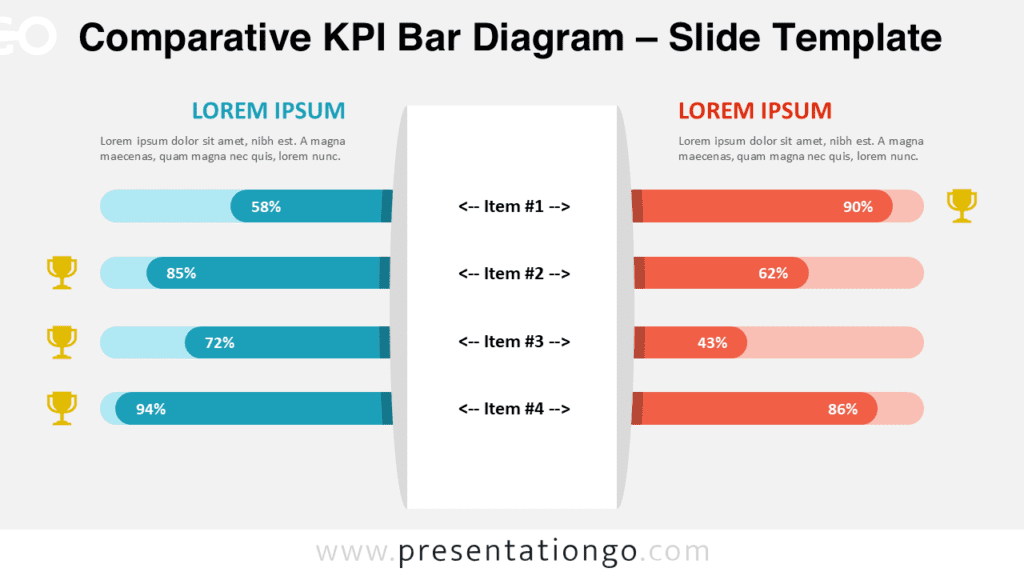
Nothing compares to a clear chart to show your quantitative results to your audience! This free Comparative Bar Charts template offers a perfect design to share your numbers and percentages and make comparisons.
In the middle of this slide stands a white column in which you can write the name of the items you would like to compare. You can indeed include up to 5 of them. On both sides stand 5 horizontal lines that you can color to show positive and negative results. Moreover, you can directly write the number or percentage inside these bars. Finally, you have 2 spaces at the top to write titles and text in order to describe the two products, services, or items you are comparing.
This free Comparative Bar Charts template is a simple and easy-to-read option for you to share and compare quantitative results. A perfect tool for data visualization!
Shapes are 100% editable: colors and sizes can be easily changed.
Includes 2 slide option designs: Standard (4:3) and Widescreen (16:9).
Widescreen (16:9) size preview:


Application example:
")
Data source: Pew Research Center
This ‘Comparative Bar Charts’ template features:
- 2 unique slides
- Light and Dark layout
- Ready to use template with text placeholders
- Completely editable shapes
- Standard (4:3) and Widescreen (16:9) aspect ratios
- PPTX file (PowerPoint) and for Google Slides
Free fonts used:
- Helvetica (System Font)
- Calibri (System Font)